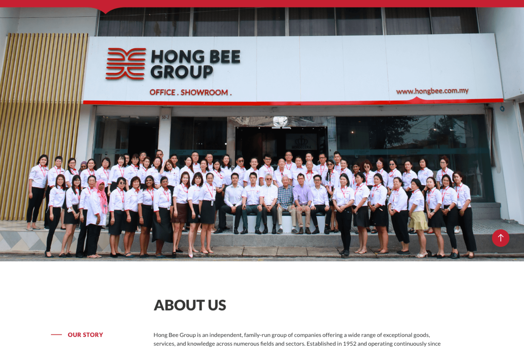
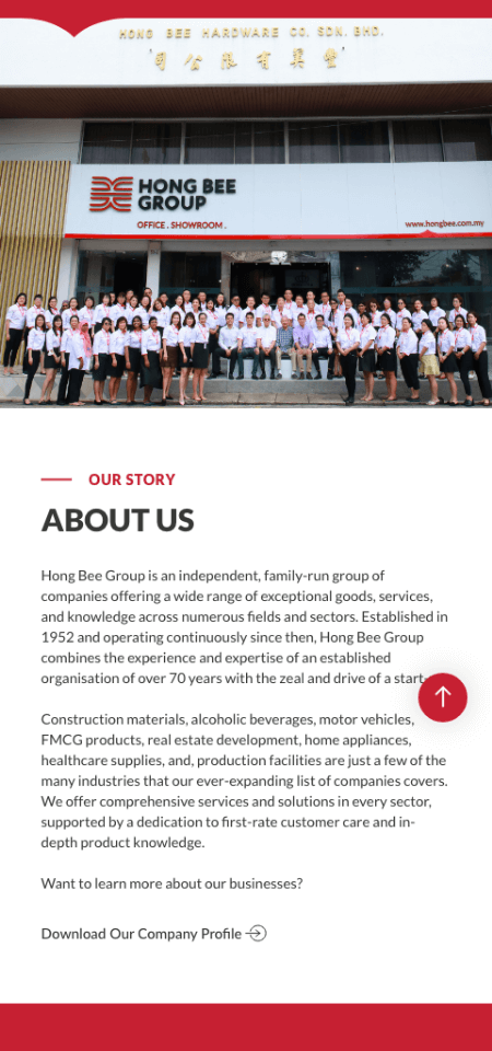
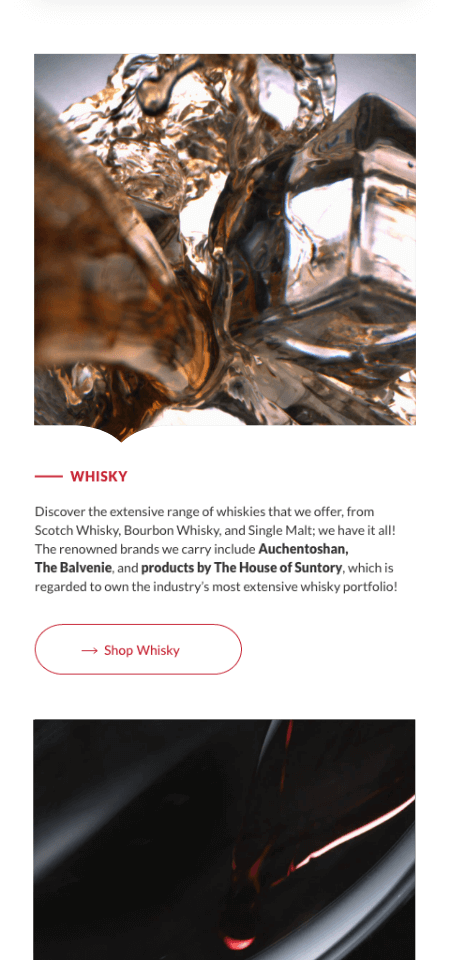
For over 70 years, Hong Bee Group has stood as a trusted, family-run organization offering a diverse range of products, services, and expertise across multiple industries. Their reputation is built on vast industry knowledge, strong customer relationships, and a culture that values both experience and growth. To the local community, Hong Bee is more than just a business, it is a name that signifies trust, reliability, and long-standing excellence.
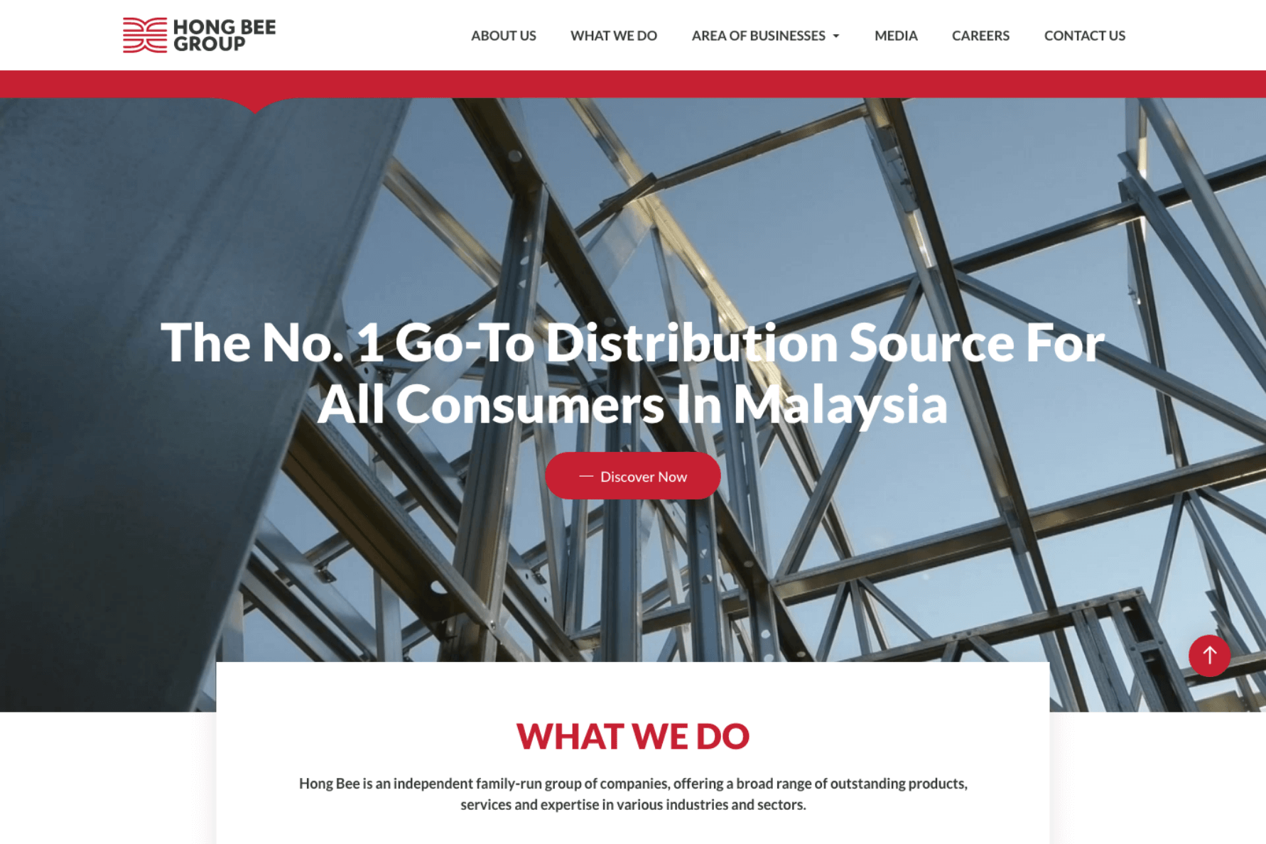
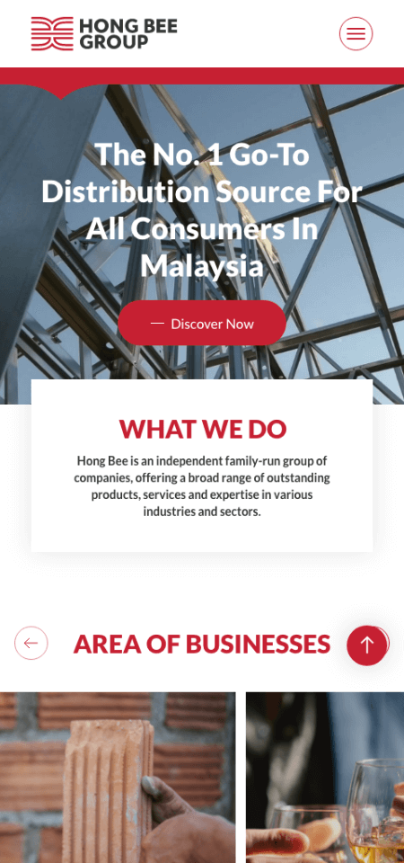
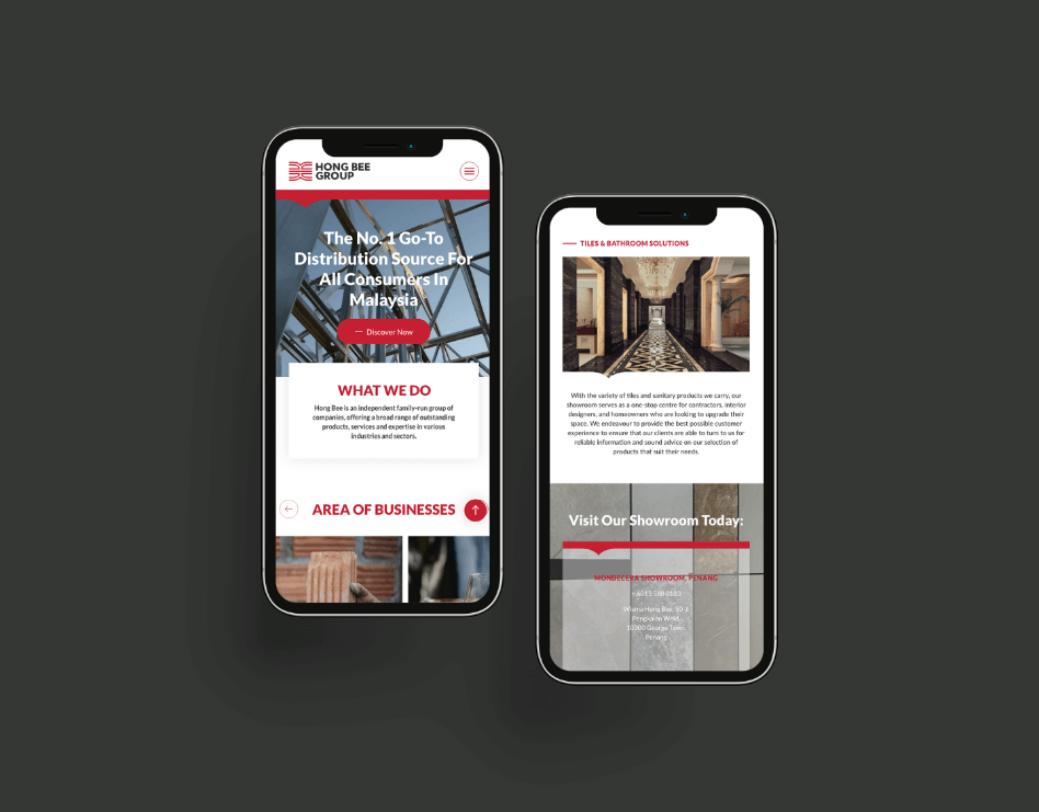
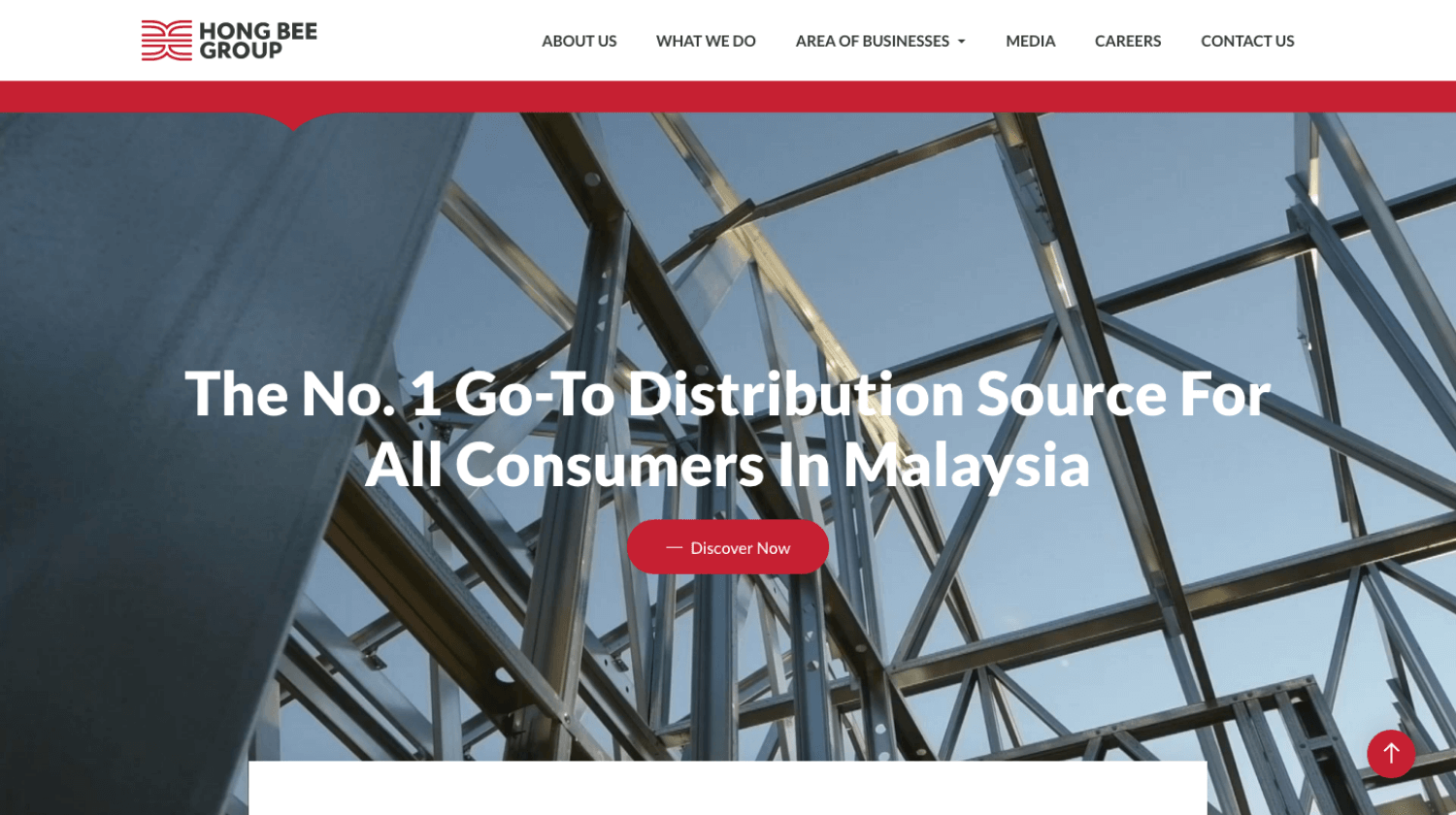
Jumix was tasked with revamping Hong Bee Group’s entire corporate website to reflect their legacy while modernizing their digital presence. The new site had to capture the breadth of industries they operate in, while also showcasing the history and values that have sustained them for decades.
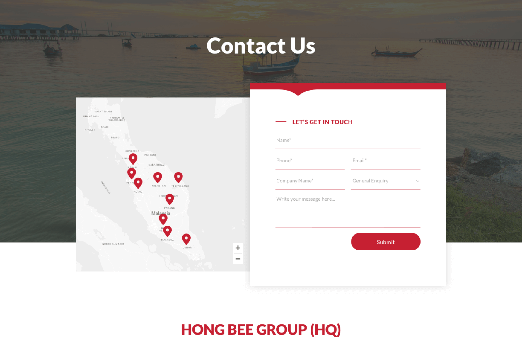
A key focus was to make Hong Bee’s signature red brand color more prominent throughout the design. By strategically weaving it into the layout, visuals, and interface, we ensured the color becomes instantly recognizable and deeply associated with the brand. This consistent visual identity helps plant the Hong Bee brand firmly in people’s minds, strengthening recall and recognition.