
Finding the perfect sleepwear has always been harder than it should be. Most options are either too stiff to truly relax in, or too plain to feel good wearing. Thirtydots was born from that exact frustration, a search across cultures, climates, and continents to understand how the world approaches rest.
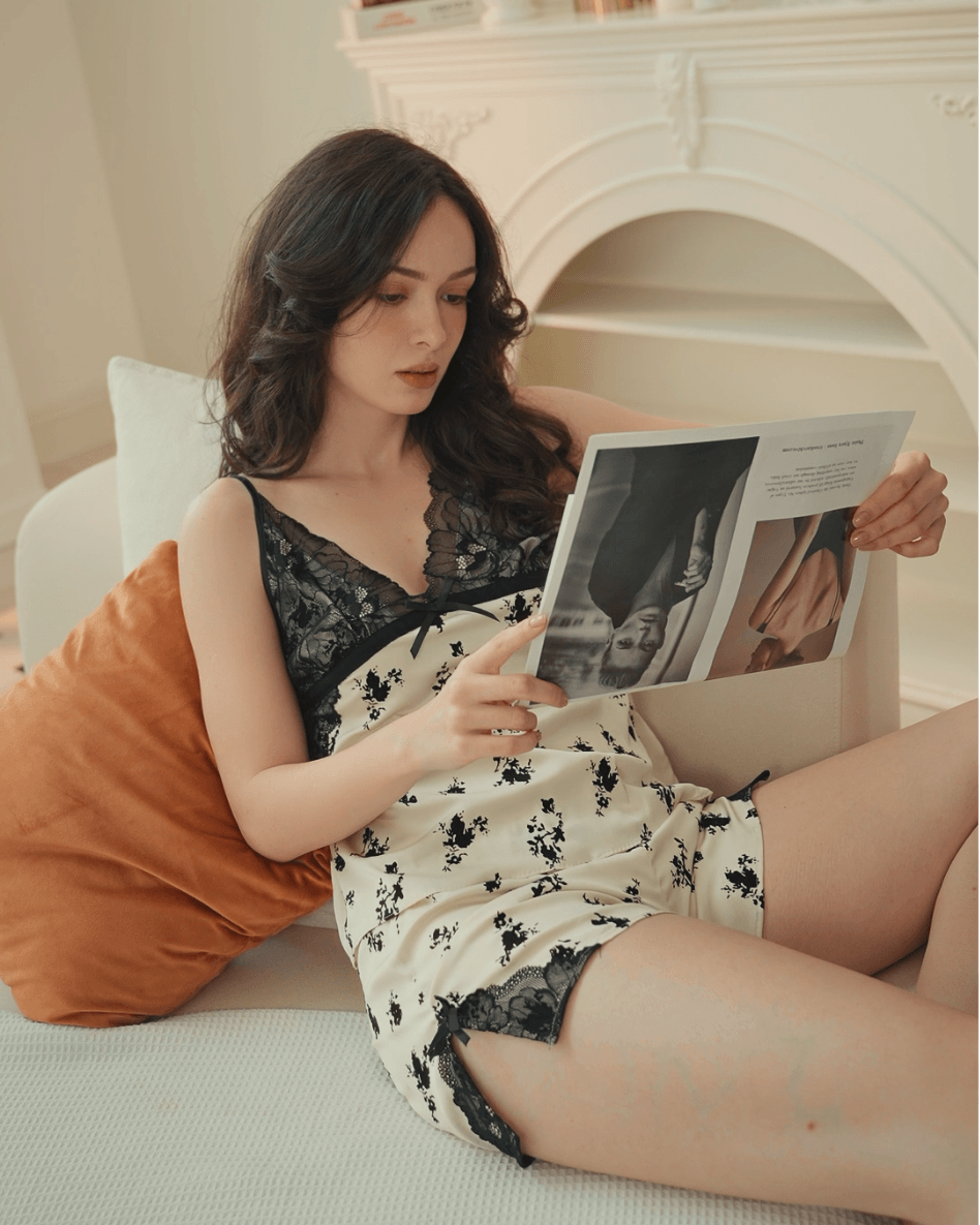
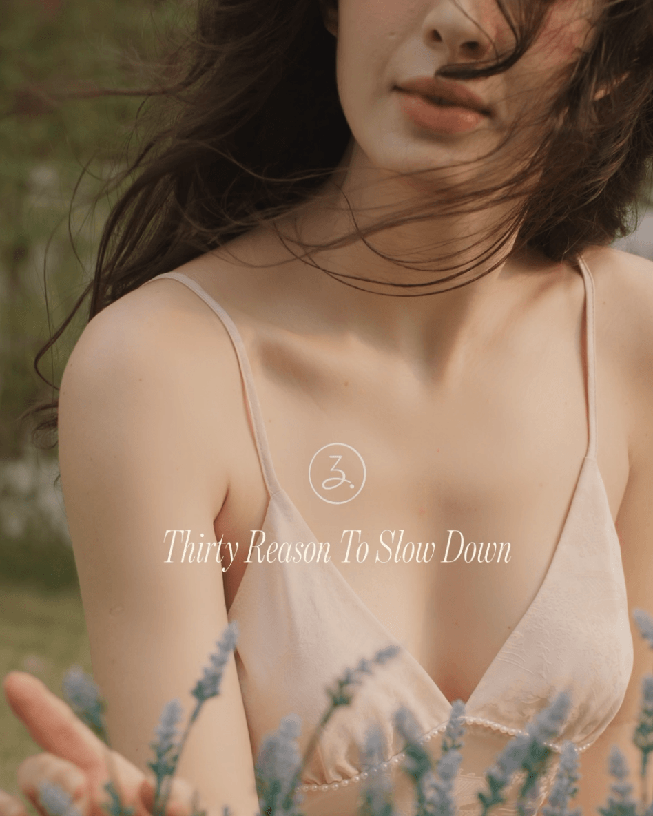
Thirtydots is a sleepwear and underwear brand designed for women who value comfort without compromising on style. Every piece is built to feel like a second skin: effortless, breathable, and timelessly sensual. Whether winding down at home or on a weekend retreat, Thirtydots turns the quiet moments into something worth wearing.
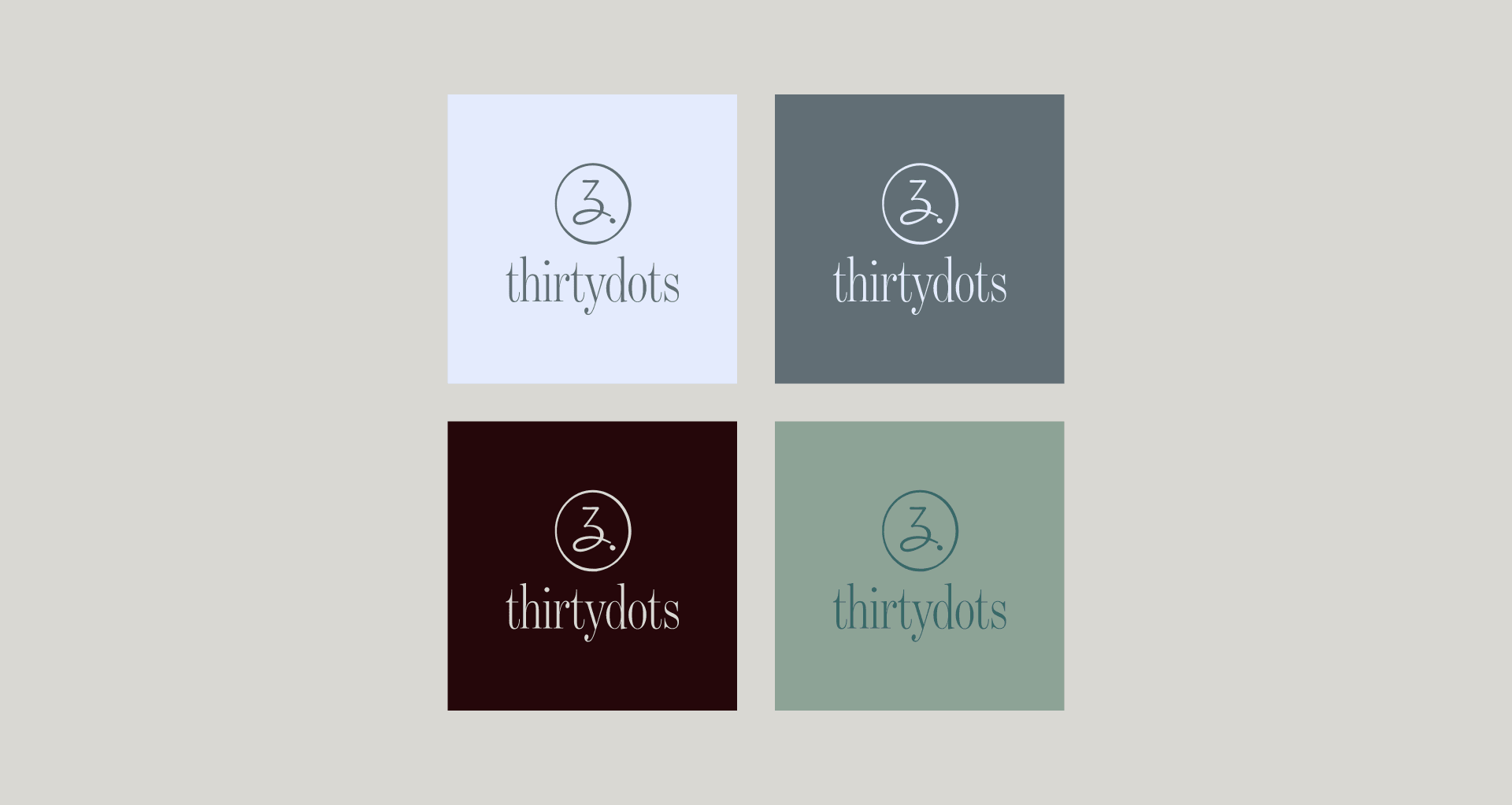
Brand Name & Logo Concept
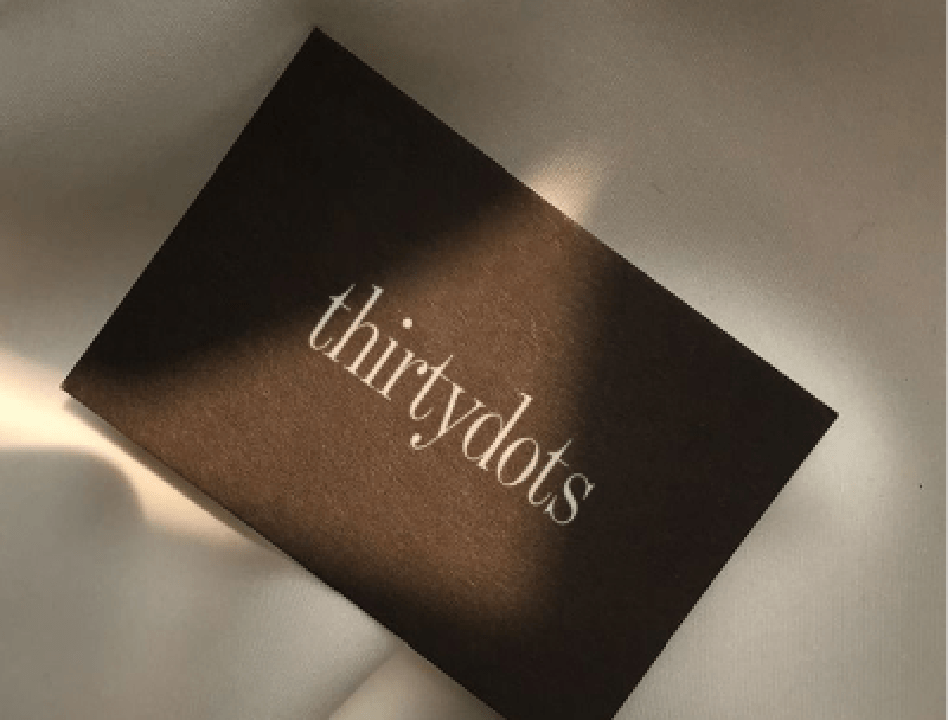
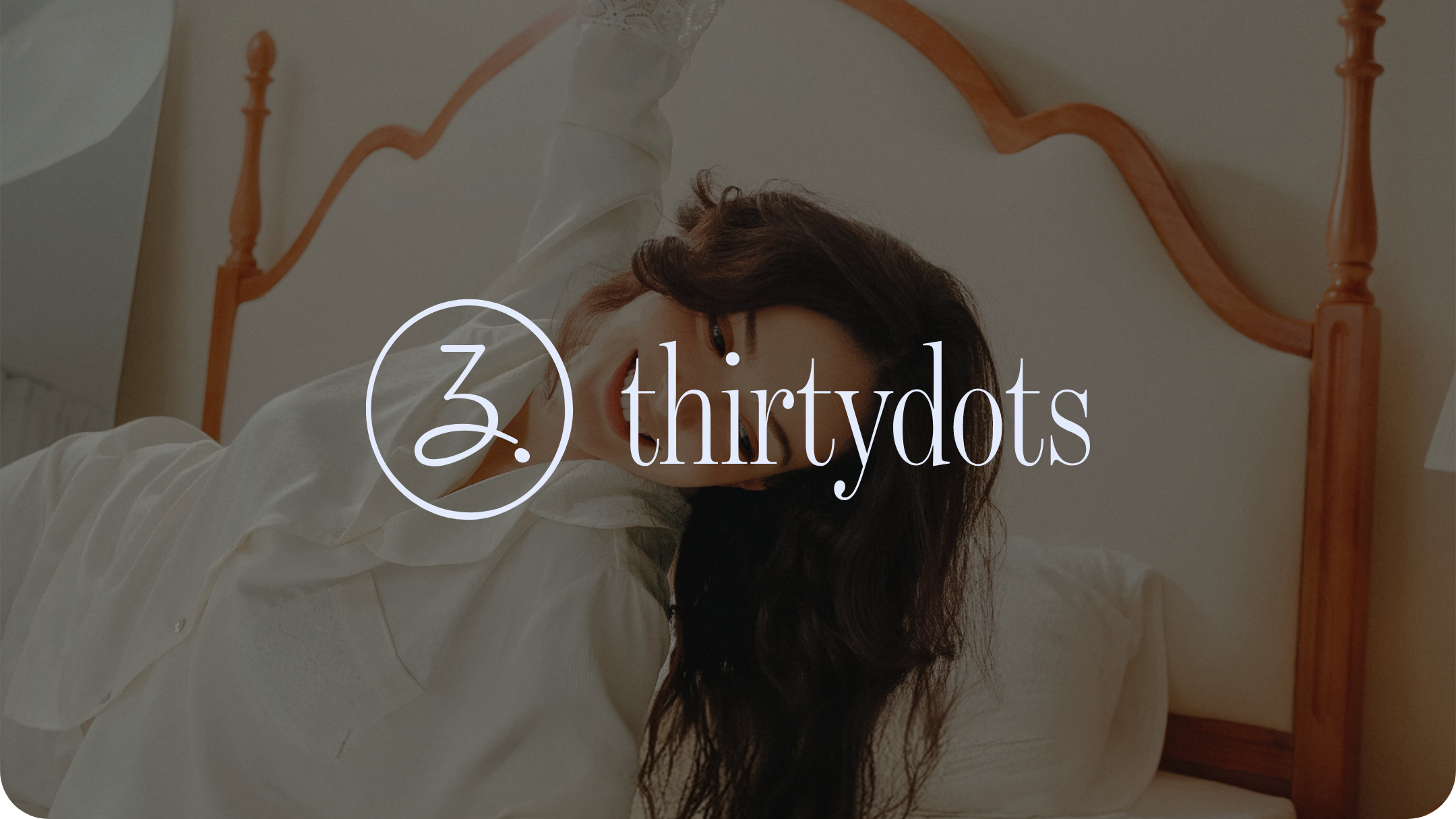
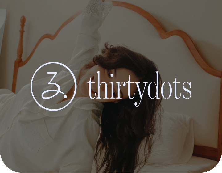
The Thirtydots logomark is soft and elegant, with a subtle hint of playfulness, a reflection of the brand’s approach to everyday comfort with a refined edge.
The icon draws its inspiration from the number “30” and the initials “T” and “D,” woven together into a fluid, handcrafted form encased in a clean circle. It’s distinctive without being loud. The wordmark pairs this with a timeless lowercase serif, where small typographic details, the curve of the “y”, the flick of the “t”, add quiet character without demanding attention. Together, they create a logo that feels as considered and personal as the brand itself.
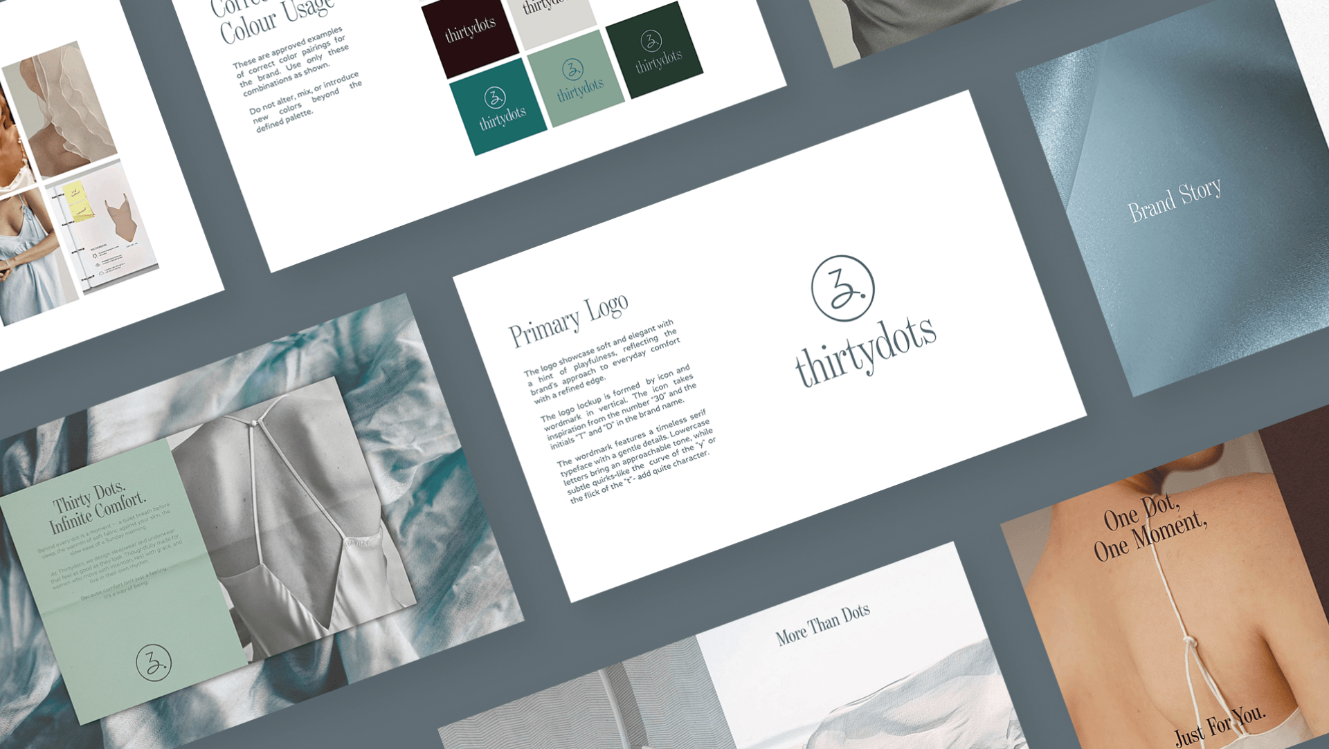
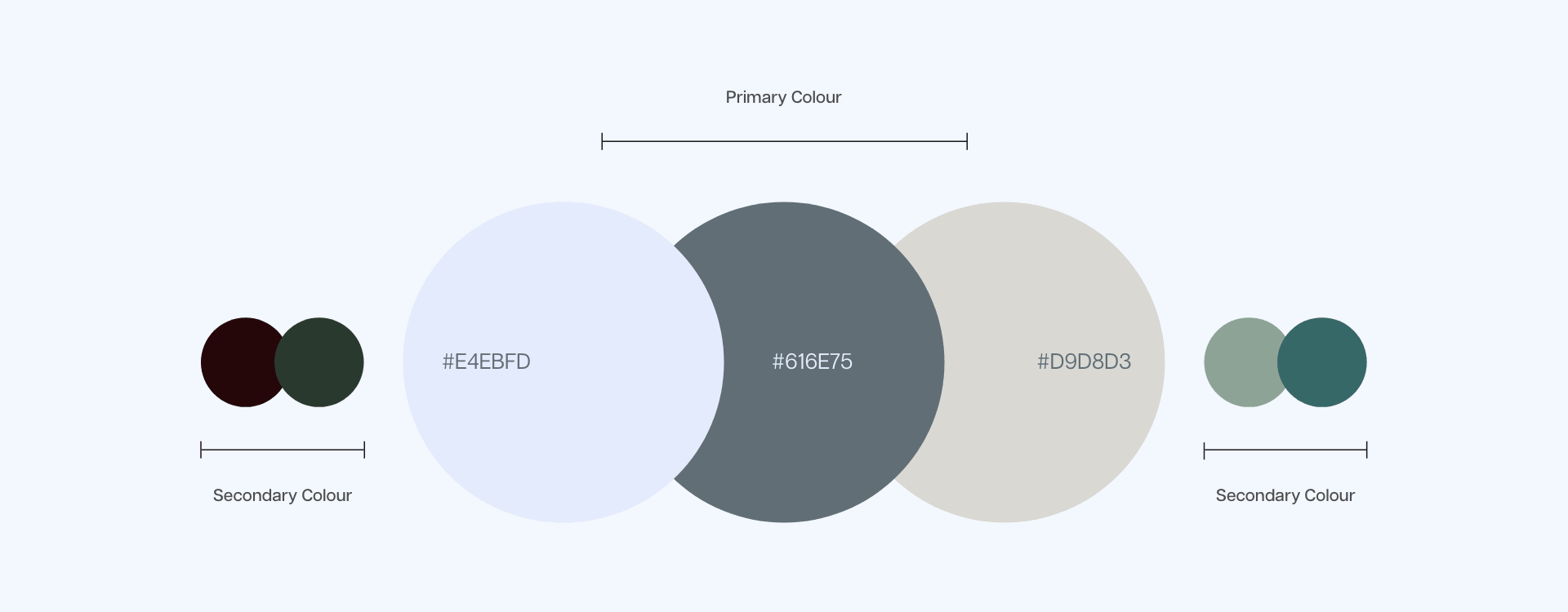
Brand Colours & Elements
Thirtydots’ color palette is built for stillness. The primary tones are a soft lavender mist, muted slate, and warm linen, creating a visual world that feels calm, intimate, and unhurried. Deeper hues of forest green, sage, and dark burgundy are introduced as supporting anchors, adding depth and quiet sophistication without disrupting the palette’s overall serenity. These are not colors that shout. They whisper. Each shade was chosen to reflect the brand’s core character: understated, well-crafted, and confident in its restraint. Together, the palette positions Thirtydots as quietly luxurious, a brand where every detail is intentional, and nothing is accidental.
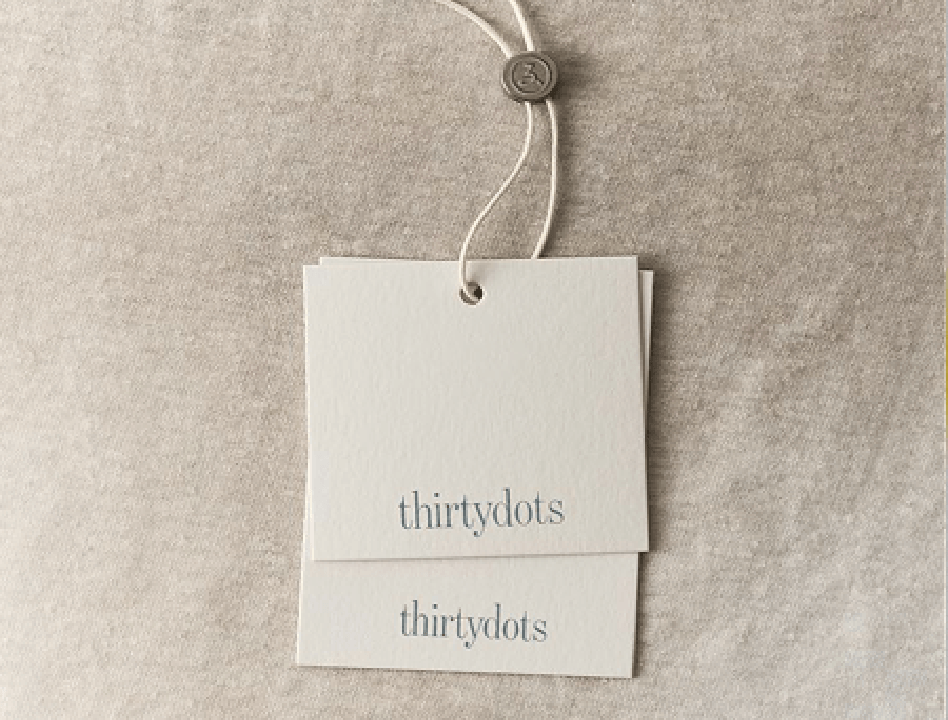
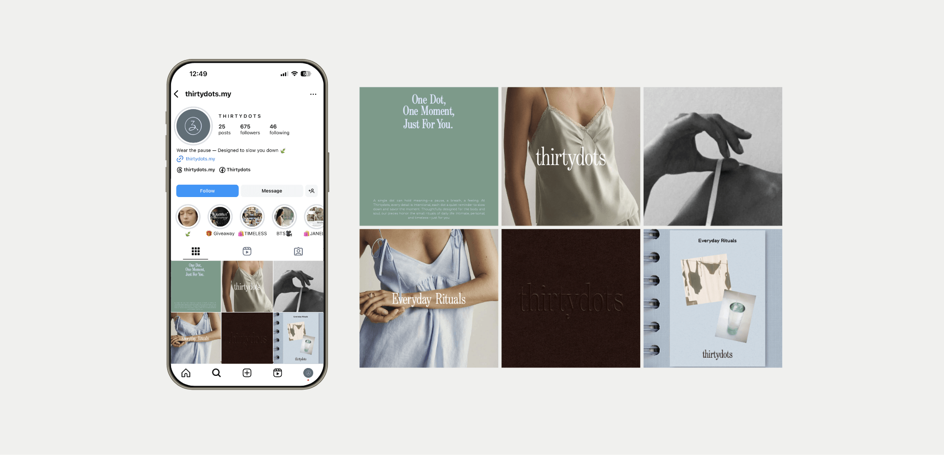
APPLICATIONS
Comfort has to be felt, and it has to be seen. For Thirtydots, we developed a full suite of brand applications designed to carry the same quiet elegance across every touchpoint. From hangtags and clothing labels to social media templates and brand visual mockups, every application was treated with the same level of care as the garments themselves.
The brand visual direction centers on timeless modernity: clean, detail-focused imagery that captures slow mornings, soft textures, and intimate moments. Social media guidelines were established to keep the feed curated and consistent, with muted tones, earthy backdrops, and a strict avoidance of cluttered layouts or off-brand colors.
The result is a brand that doesn’t just look good, it feels right, right from the first impression.