Skip to content

Responsive
Web Design

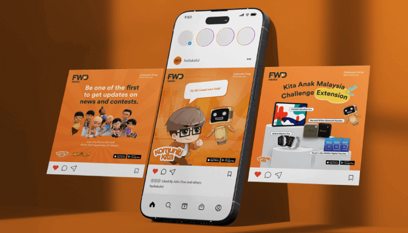
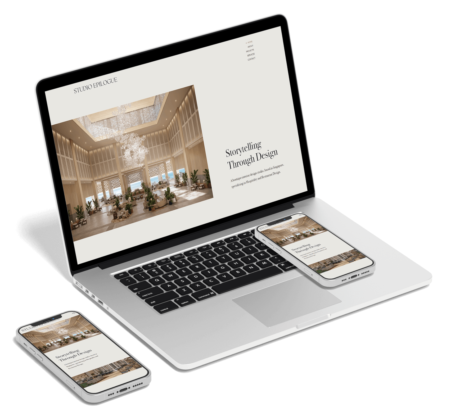
website on mobile device and others

Get a stunning website that works seamlessly on all, from desktop computers to mobile devices.

  • Ensure your website adapts seamlessly to all screen sizes and devices with responsive web design, delivering a consistent and optimal user experience.
  • Enhance user experience by allowing visitors to effortlessly navigate and interact with your site on any device.
  • Simplify maintenance by managing just one version of your website, instead of juggling multiple versions for different devices.

What is a responsive web design?

Icon | Unstoppable

Responsive web design is an approach to designing websites that aims to provide an optimal interaction experience across a wide range of devices, from desktops to phones. It involves creating a website layout that can adapt to different screen sizes.

viewport width according to browser window
Websites Crafted
588
Trusted Clients
520
Years
5 +
Millions Revenue Made for
Our Clients
38 +

Responsive Web Design Services

Transform your website with responsive design to ensure it looks great and functions flawlessly on any device.

media query on browser width

Fluid Grid Layouts

We design layouts with flexible grids percentages instead of fixed pixels for optimal responsiveness. This allows the layout to stretch and shrink smoothly without breaking.

Flexible Images

Showcase your company’s competence and professionalism with a clean, organised layout and professional design that highlights essential information and sets your services apart from the competition.

CSS Media Queries

Media queries are a CSS feature that enables the application of styles based on the characteristics of the device, such as screen width, height, and resolution. Our design adapts seamlessly to any device’s screen, ensuring your layout always looks perfect.

Responsive Typography

Just like layout and images, text needs to scale appropriately to ensure readability across devices. We achieve perfect scalability with ems or rems, and use media queries to seamlessly adjust font size for every screen size.

Hire a Responsive Web Design
Company in Malaysia

Elevate your online presence and drive business growth with a stunning, responsive website.

Logo | Google Rating

4.9 Logo | Stars 95 reviews

We’ve designed and
built more than 500 websites.

FAQs on Responsive Web Design

Responsive design improves user experience across devices and boosts engagement. It adapts to different screen sizes for consistent navigation, simplifies website management, and is favoured by search engines, enhancing site ranking and visibility.

To test responsive web design, use browser developer tools to simulate different devices, employ online tools like BrowserStack for comprehensive testing, and conduct real-device testing on various devices to identify practical usability issues.

Static web design creates fixed-layout web pages that look the same on all devices, leading to poor user experience on smaller screens. These sites are simpler and cheaper to create, but often need separate versions for different devices.

Responsive web design creates a single web page layout that adapts to different screen sizes and devices, ensuring optimal viewing. This simplifies website management by requiring only one version of the site, enhancing usability and accessibility.


Contact