FFM Online marks the digital evolution of FFM Group, Malaysia’s largest flour miller since 1966. As the first direct-to-consumer venture for FFM, this online platform needed a fresh brand identity that not only honored its legacy but also resonated with a modern, younger audience.
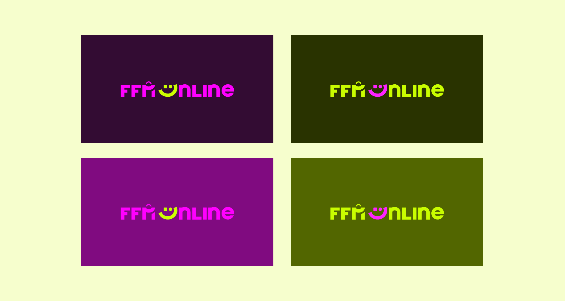
LOGO CONCEPT
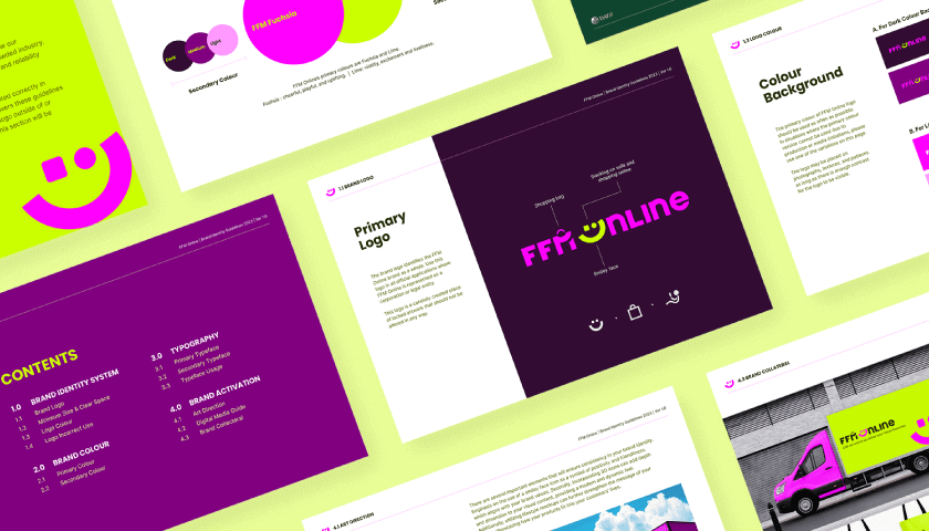
The logo for FFM Online was designed to encapsulate the essence of enjoyable and convenient shopping. The letter “M” is cleverly crafted to resemble a shopping bag, symbolizing the ease of purchasing goods online. The “O” in the logo is replaced with a smiley face, but there’s a twist—look closer, and you’ll see that the smiley is actually a person lounging comfortably on a couch. This subtle detail represents the joy and relaxation that comes with shopping from the comfort of your own home.
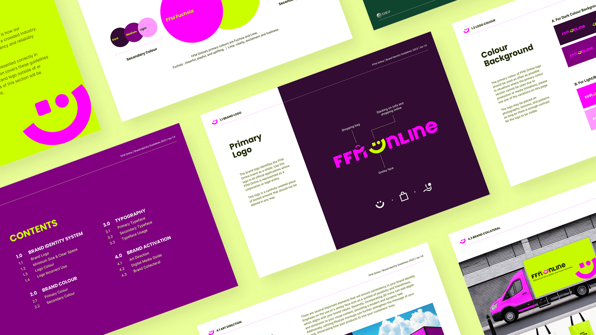

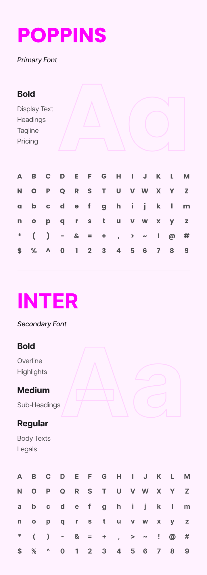
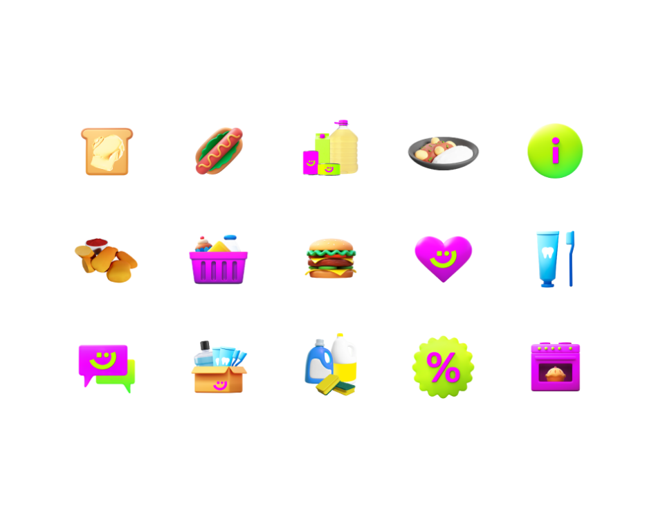
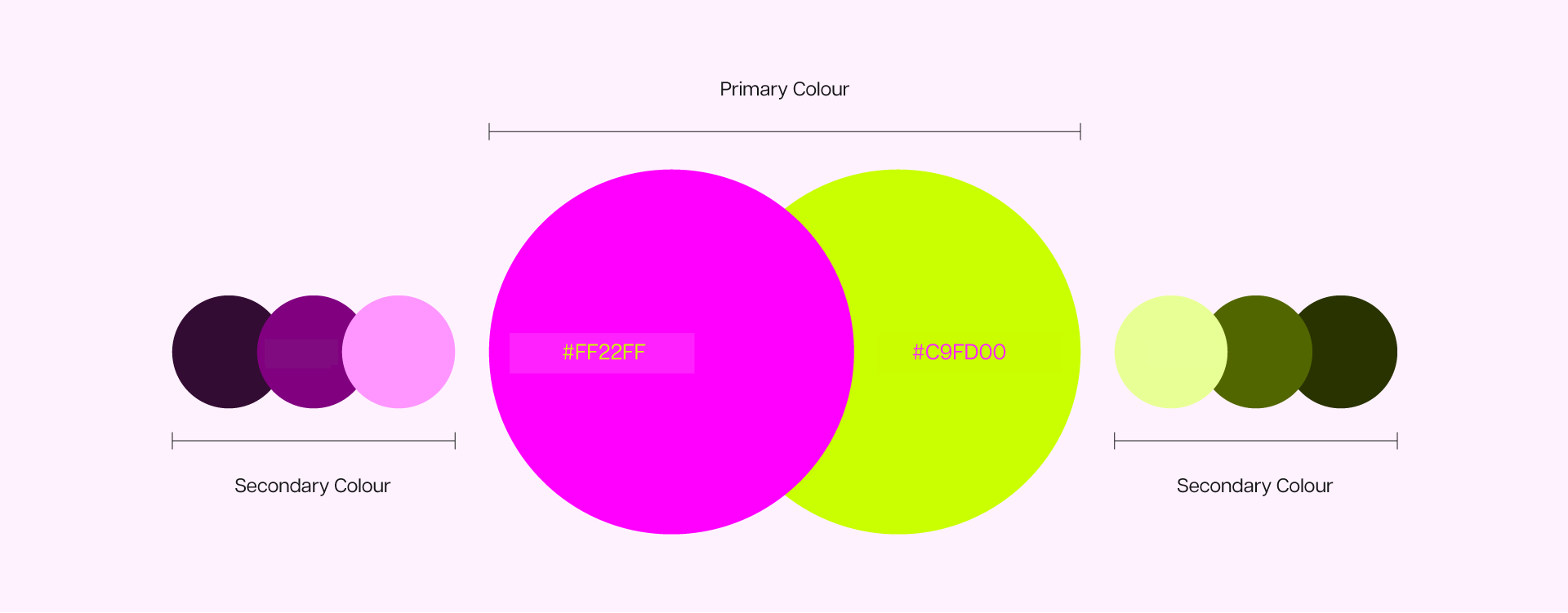
BRAND COLOURS & ELEMENTS
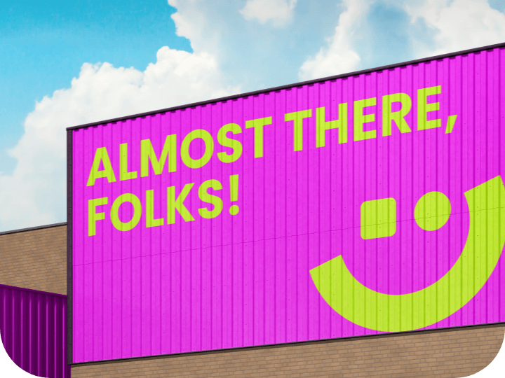
FFM is known for its vintage brand colors, reflecting its long-standing history as a wheat flour miller. However, with FFM Online, the goal was to attract a younger demographic and stand out in the crowded eCommerce space. To achieve this, we selected bold, unconventional colors that break away from tradition. These vibrant hues are designed to catch the eye and make FFM Online instantly recognizable, even amidst the noise of other online marketplaces.
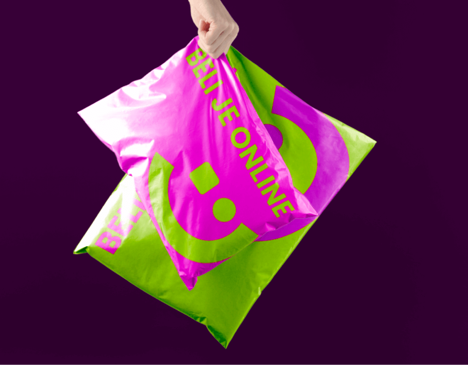
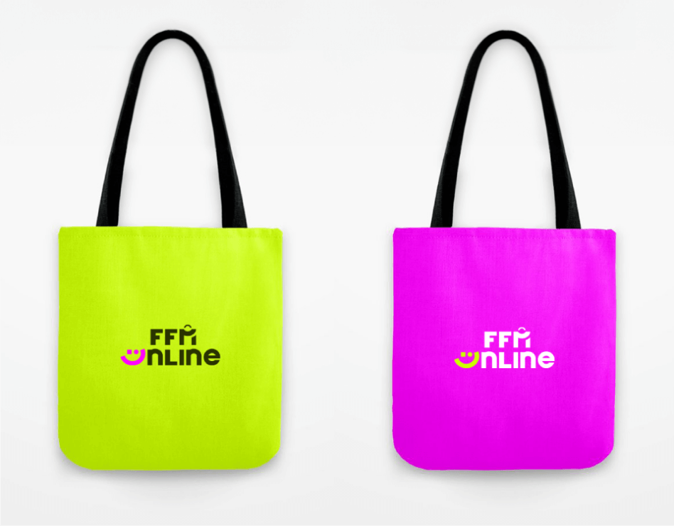
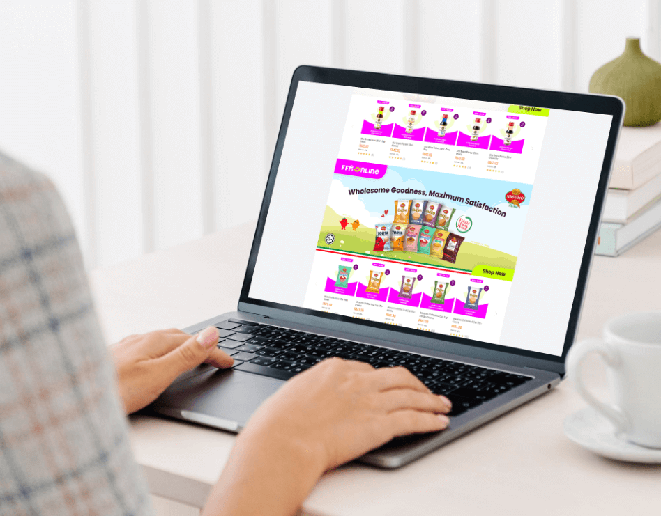
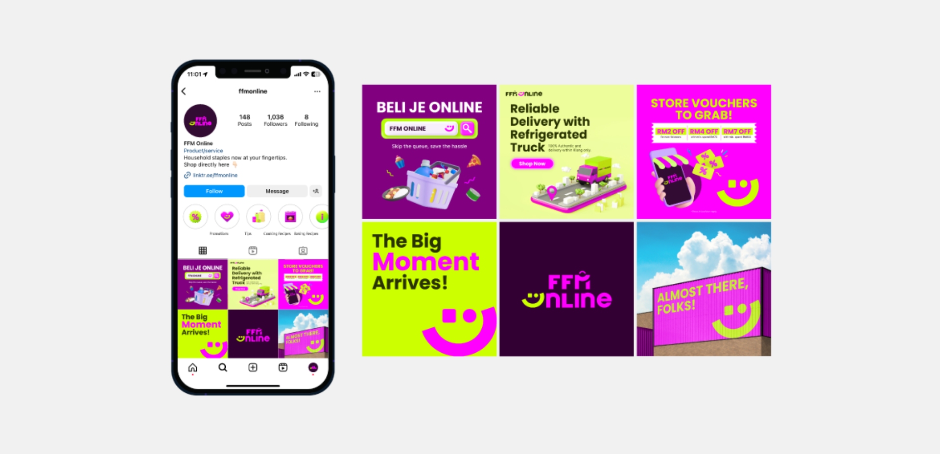
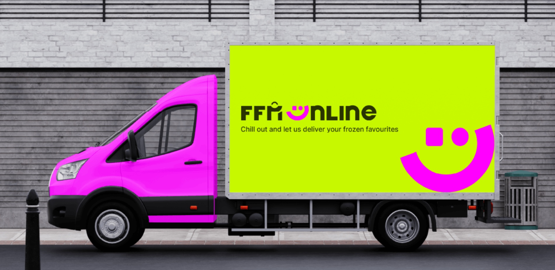
APPLICATIONS
As the digital counterpart of FFM Group, FFM Online needed a comprehensive set of digital assets to support its online presence. Our brand applications covered everything from marketplace profile designs and digital icons to social media profiles and digital asset templates. Each element was carefully crafted to ensure that FFM Online’s brand identity is cohesive, modern, and visually engaging across all digital platforms.