Every parent knows the feeling. You want the best for your baby, but finding products you can truly trust is harder than it should be. Pilloo was built around that exact truth.
Inspired by the word “pillow,” Pilloo is a baby diaper brand that embodies comfort, softness, and gentle protection. Just as a pillow offers rest and reassurance, Pilloo is designed to be a cushion that both baby and mother can lean on. The brand is built on a simple but powerful promise: every baby deserves to grow in safety and ease, and every parent deserves confidence in the choices they make.
Grounded in sincerity, transparency, and a deep respect for the sensitivity of a baby’s skin, Pilloo bridges the gap between heartfelt care and science-backed innovation.

Brand Name & Logo Concept
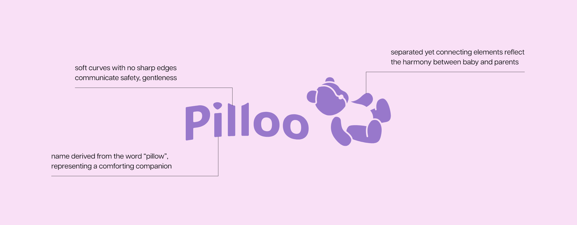
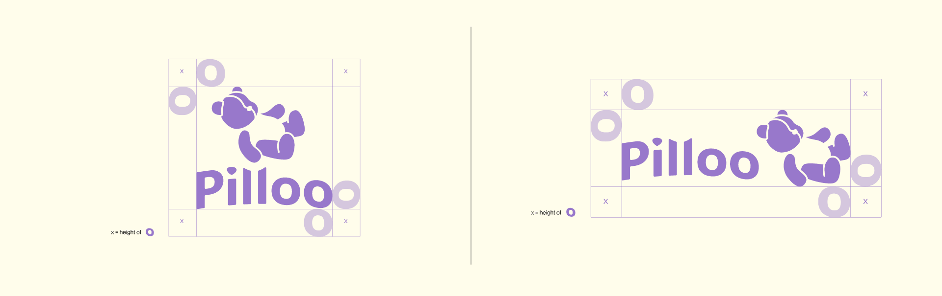
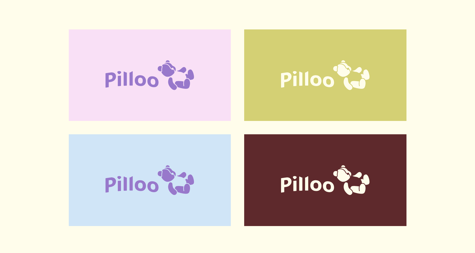
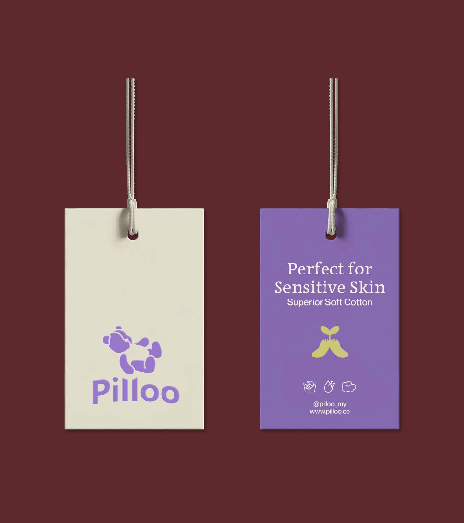
The Pilloo logomark was designed to be instantly warm, friendly, and full of personality. At its heart is a playful brand icon depicting a baby bear in a resting pose, a visual embodiment of peaceful comfort and gentle care. The icon is soft in form, rounded at every edge, and carries a sense of movement that reflects how active little ones really are.
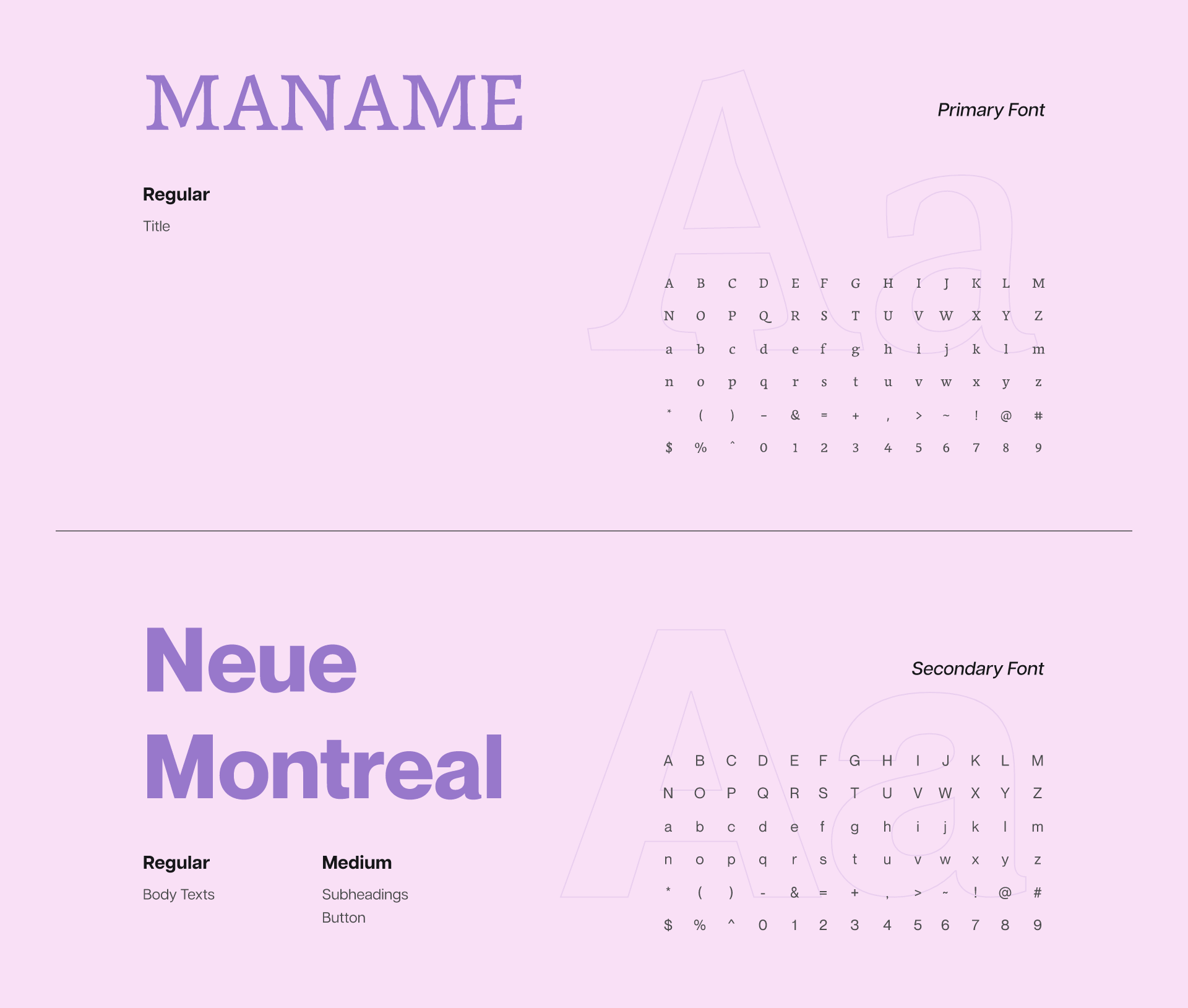
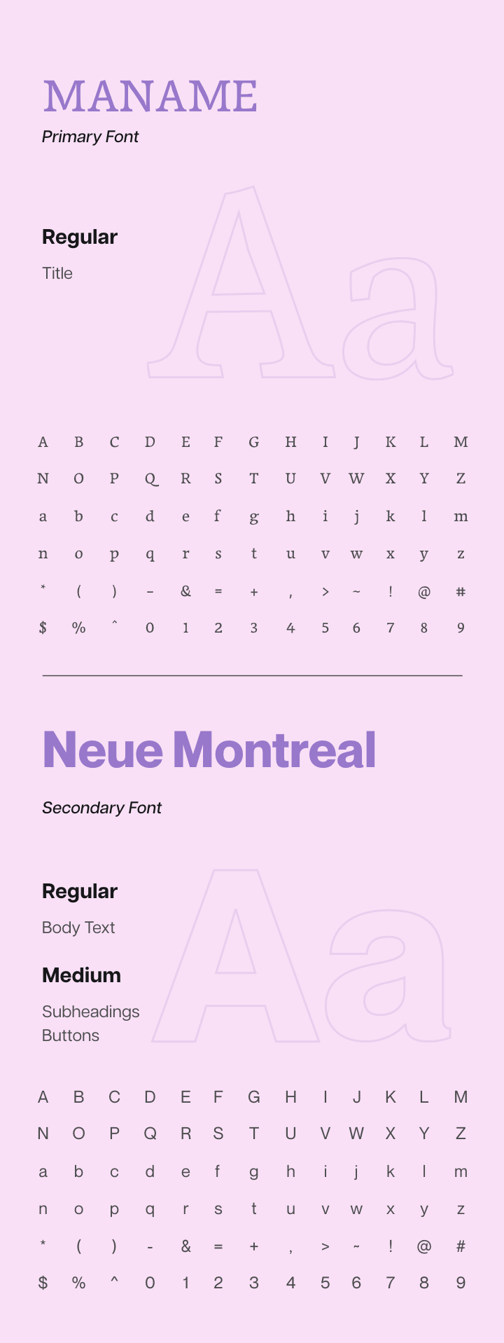
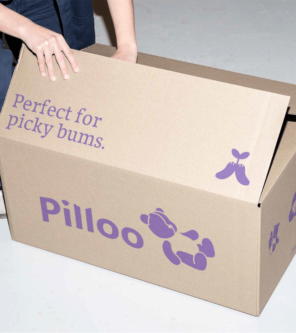
Paired with a bold, chunky wordmark set in a rounded typeface, the logo strikes the right balance between approachable and trustworthy. It’s a brand mark that parents can smile at, and babies would reach for. The full logo system includes a vertical lockup, horizontal logomark, standalone wordmark, and brand icon, giving the team flexibility across every platform and touchpoint.


Brand Colours
Pilloo’s color palette was built to feel like a nursery done right.
Soft, considered, and full of quiet warmth.
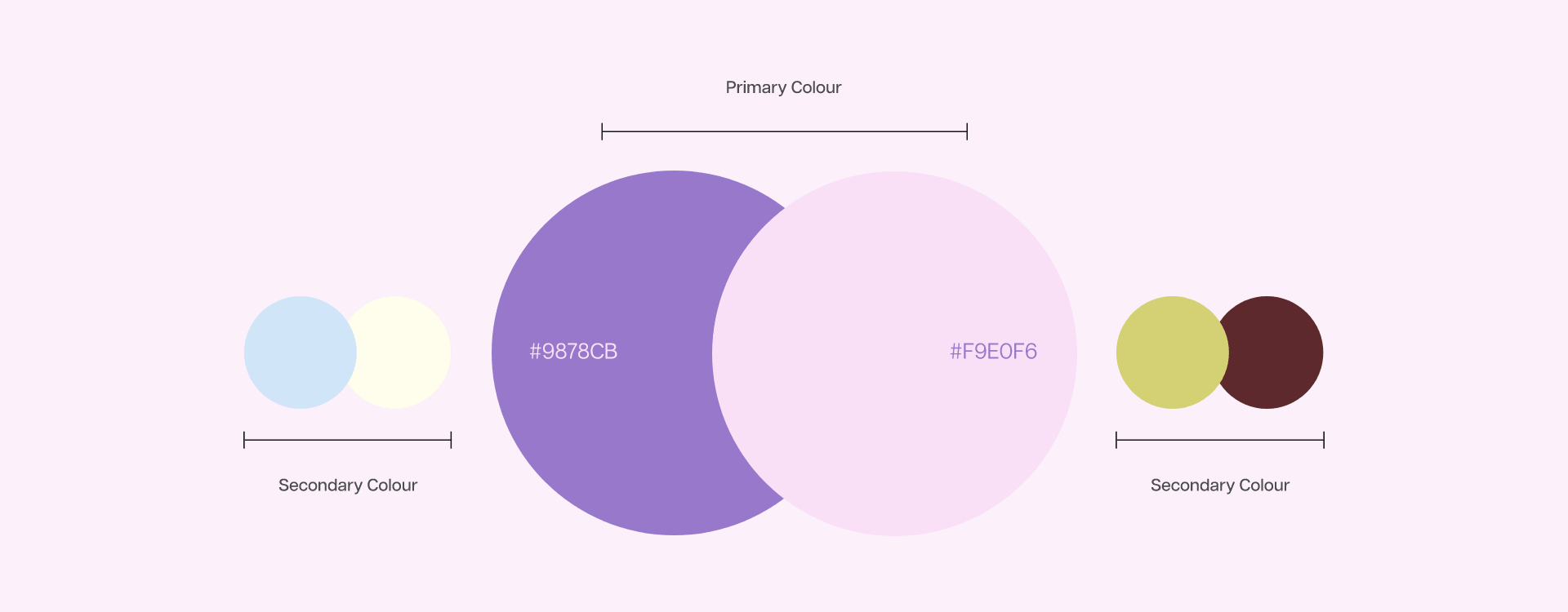
The hero color is Lavender Dream, a muted purple that anchors the brand with a sense of calm and gentle confidence. Supporting it are Cloud Blush, a barely-there pink, and Dreamy Sky, a soft powdery blue that together create a palette that feels inclusive and light. Warm Milk adds a creamy, grounded base across layouts, while Sleepy Sage and Cocoa Cuddle bring earthy depth for moments that call for more contrast and character.
No single color shouts. Together, they whisper everything the brand stands for:
safe, soft, and made with love.


Applications
Pilloo needed a brand that could live across both the digital and physical world, while always feeling like it belonged in a parent’s home rather than on a retail shelf.
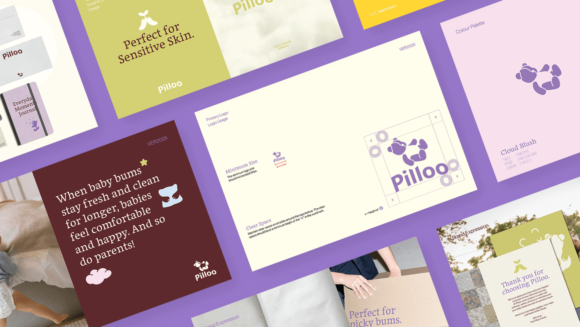
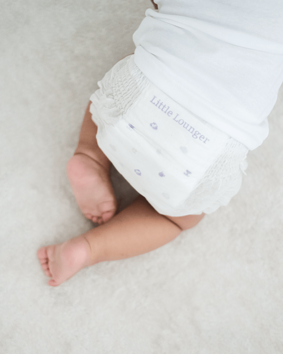
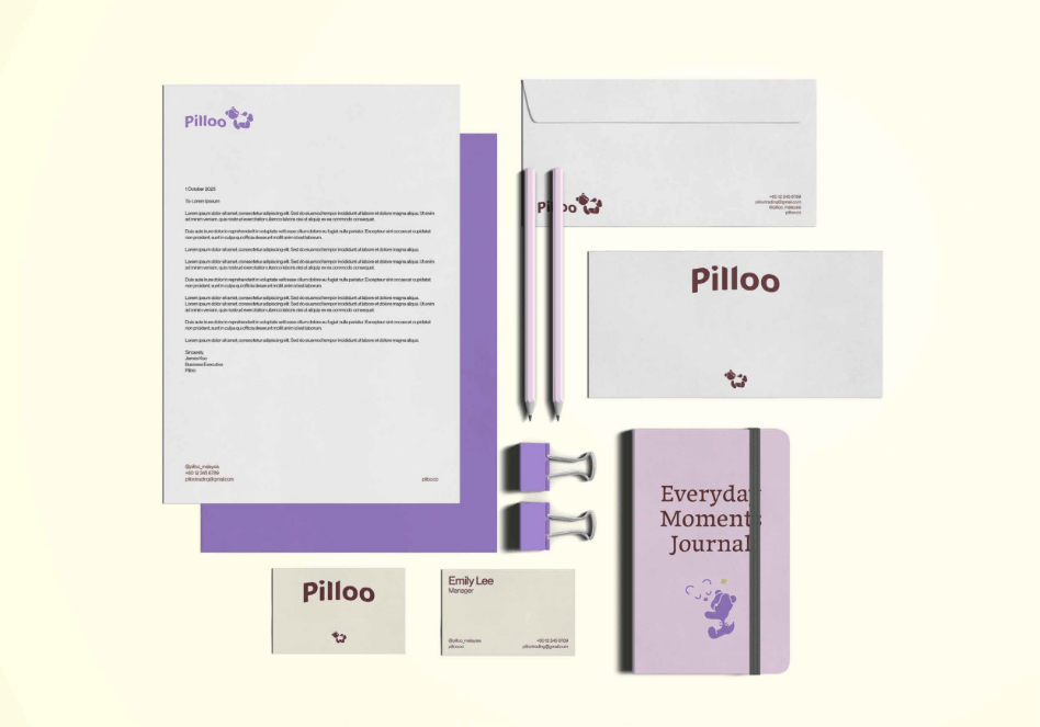
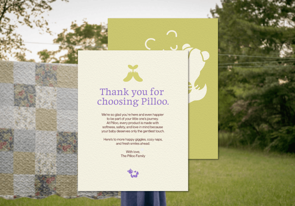
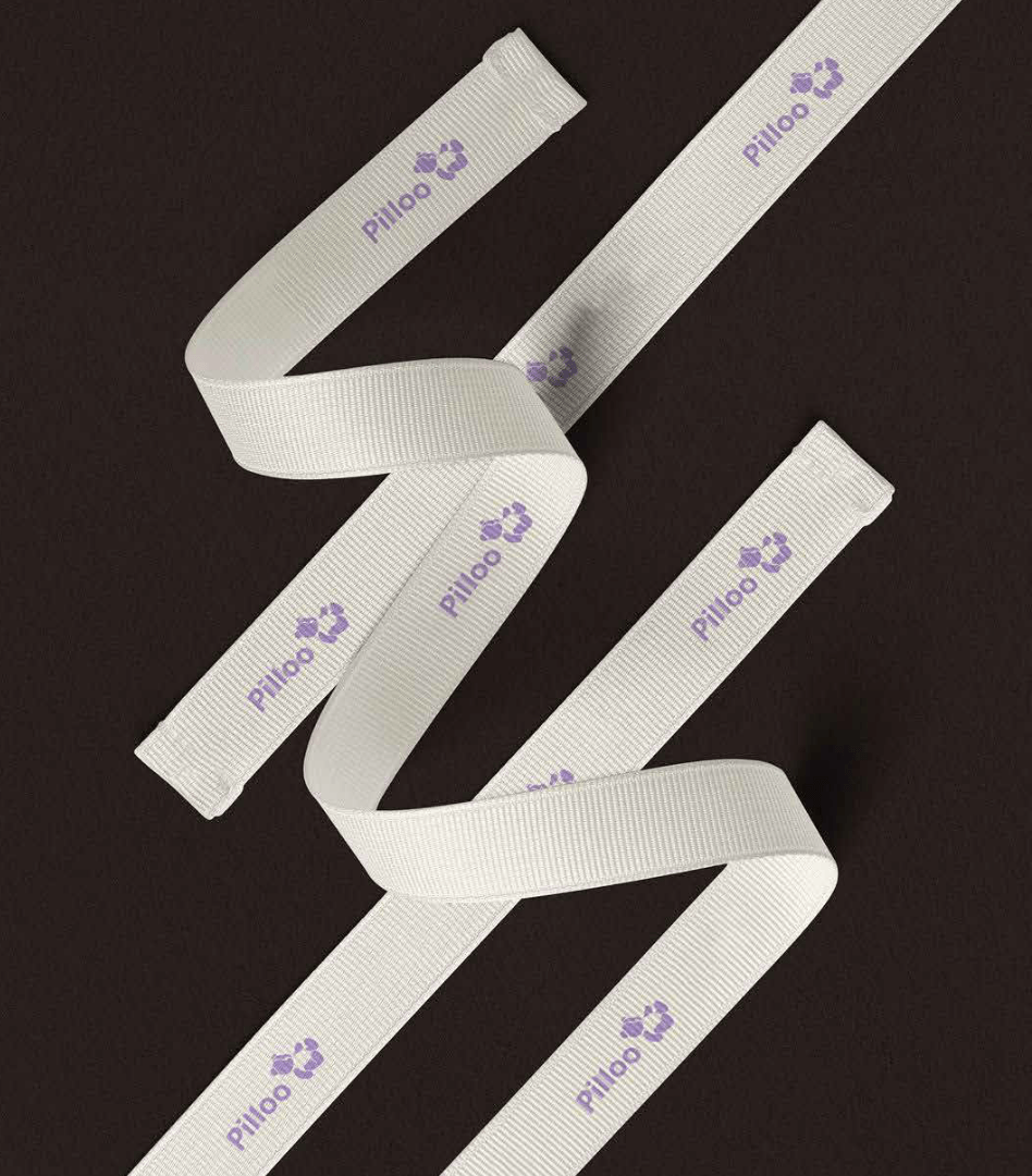
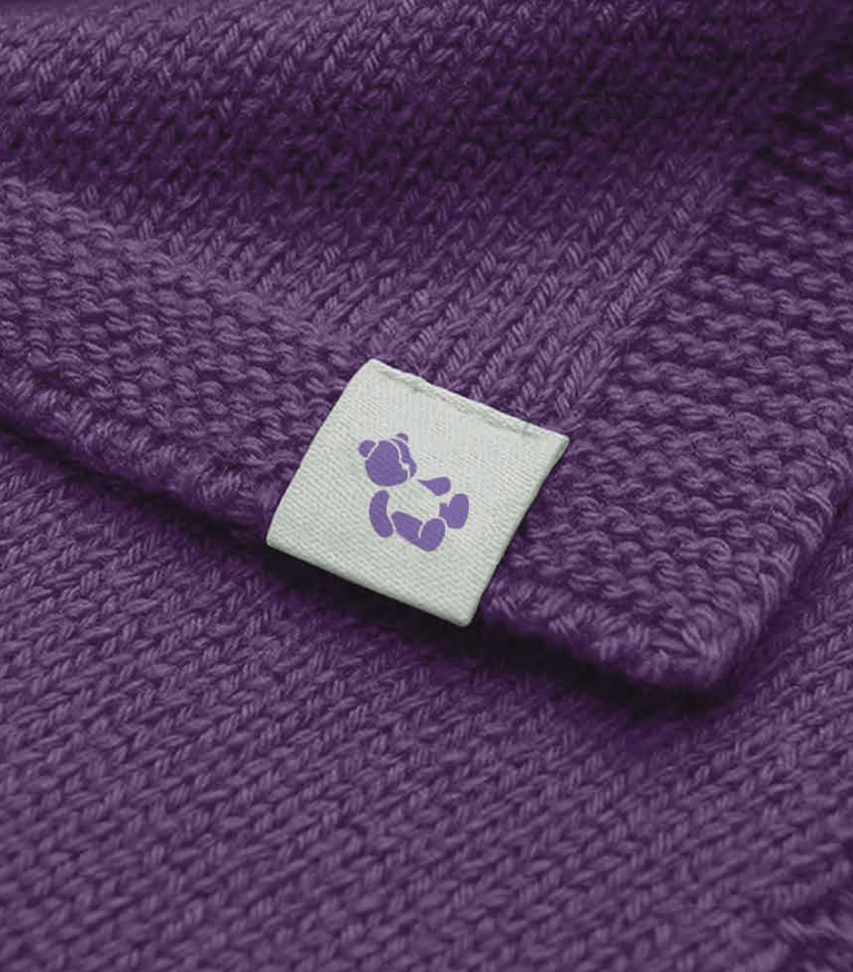
We developed a comprehensive suite of brand applications spanning stationery, packaging, product labels, garment tags, woven ribbons, and social media templates. Each touchpoint was approached with the same level of care: warm, clean, and built to earn trust at first glance. The graphic element system, featuring illustrated icons representing natural materials, 360-degree leakproof protection, and safe spaces, gives the brand a visual language that communicates product benefits without a single word of jargon.
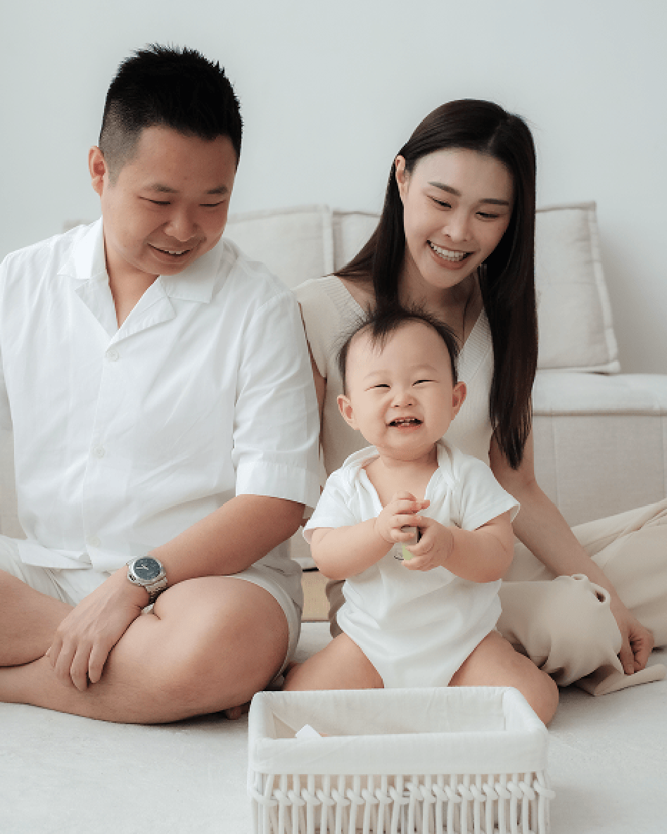
For social media, the Pilloo feed was designed to feel like a warm scroll through real parenthood moments, soft lighting, gentle textures, and natural tones, never cluttered or overly styled. The result is a brand that a mother picks up once, and comes back to every time.