Slide 1
TeamPME

Financial Advisory

Financial Advisory

Financial Advisory

Client Introduction


About TeamPME

TeamPME Corporation Sdn Bhd is a legendary team transacting insurance businesses representing Prudential Assurance Malaysia Berhad in terms of Life and General insurance, BSN Takaful as well as Eastspring Investments. It was founded and incorporated in year 1998. TeamPME aims to be the No 1 Agency who provides Financial Freedom and Peace of Mind to all Malaysians.

To achieve their vision, TeamPME has produced more than 21 MDRT agents, 99 Star Club Qualifiers and 112 wealth planners and they want to attract more young bloods who share the same vibe. That’s when they realized they needed a rebranding. They needed a new voice that can speak to the rising generations.
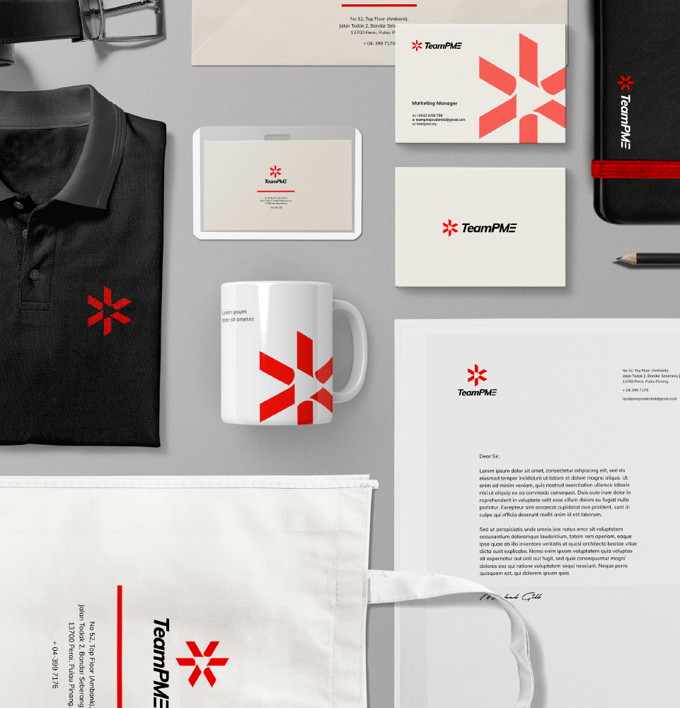

WHAT WE DO

Rebranding

PREVIOUS LOGO
NEW LOGO

TeamPME has been earning trust from protecting the health and wealth of their clients and loved ones for more than 20 years today. Therefore, a rebranding for TeamPME is not about starting scratch. It is, however, to pair yesterday’s experience with the technology of tomorrow to provide greater value in the best service, protection, loyalty and trust.


Logo and Placement


The logo is the root of their visual identity as it radiates the value TeamPME is providing for its services, protection, loyalty and trust. The boldness of the primary colour portrayed the team’s innovative spirit while the curves in the logo mark signify they are always moving forward as a team.

Meanwhile, the brandmark PME Forward is a composition made out of the essential brand visual elements of the logo. On certain angles, it can be seen to have a forward button. It symbolises TeamPME’s progressive attitude towards growth whereas the 3 other forward arrows surrounding it represent teamwork towards a greater success together as a team.
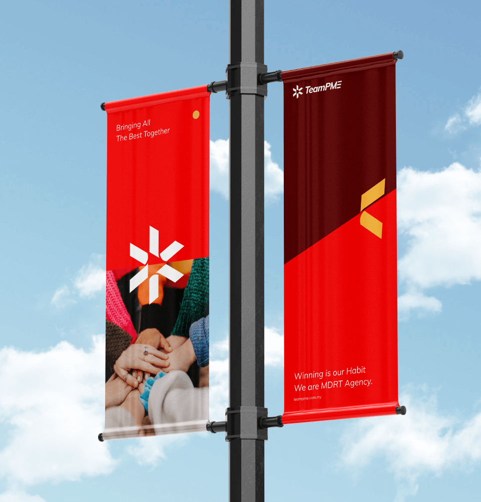
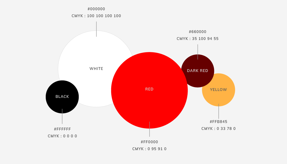
HORIZONTAL LOGO
VERTICAL LOGO

Typography

TeamPME’s typographic system consists of two typeface families: Muli and Helvetica Neue.

The primary font is Muli, it is often used on product titles and visual headings. Muli font is a versatile and clean Sans Serif font. The overall typographic voice of Muli perfectly conveys the mood of a down to earth, meanwhile, professional and reliable tone.

Meanwhile, Helvetica Neue is chosen as the secondary font for TeamPME. It is a modern, clean and minimal San Serif font that best fit TeamPME’s branding identity.

Overall, the typographic style establishes a brand voice that reflects the reliability and professionalism of TeamPME.

Muli Font

Primary Font

FONT FAMILY
MULI REGULAR
MULI REGULAR ITALIC
MULI BOLD
MULI BOLD ITALIC
MULI SEMIBOLD
MULI SEMIBOLD ITALIC
MULI EXTRABOLD
MULI EXTRABOLD ITALIC

Helvetica Neue Font

Sub Font

FONT FAMILY
HELVETICA NEUE REGULAR
HELVETICA NEUE REGULAR ITALIC
HELVETICA NEUE BOLD
HELVETICA NEUE BOLD ITALIC
HELVETICA NEUE SEMIBOLD
HELVETICA NEUE MEDIUM ITALIC

Font Hierarchy


Colour Palette

The primary colours for TeamPME’s brand are white and red. While the sub colours are dark red, yellow, grey and black.

The red hues associated with passion, desire and love; dark red symbolises leadership and courage. Yellow is the colour of sunshine, hope and happiness which directly reflects on TeamPME’s values.

The white and grey hues on the brand visual identity play the role of giving the essential balance to the logo. These 2 colour hues also represent minimalism and innovativeness.
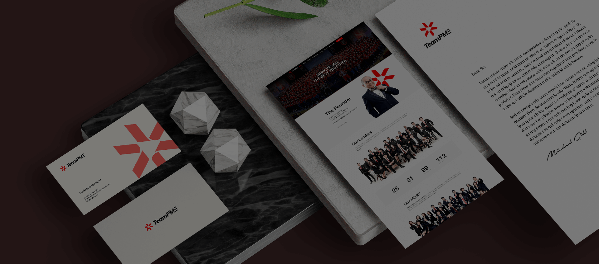

Jumix Creates Your Brand


Need a brand name? Need experts help to create a brand for your business?
From branding to website design, we’ve got you covered.
Get in touch with our team today to get started.


WANT MORE LEADS AND SALES TO YOUR WEBSITE?
Join 20,000+ others who get FREE guides, eBooks and exclusive offers!
We hate spam than you do. You info is safe with us and you can unsubscribe at any time.