



Malaysian clinics that grow without increasing ad spend share one thing: a website built around patient psychology, not just service listings. Patients use clinic websites to filter trust, estimate costs, reduce anxiety, and decide whether to make contact, all within 15 seconds. A poorly designed medical website loses patients silently, before a single enquiry is made.
- Quick Takeaways
- The leaking bucket problem
- What patients actually do on a clinic website
- The psychology of anxiety-based browsing
- The 15-second test most clinic websites fail
- Why Malaysian patients choose WhatsApp over booking forms
- Design is a professionalism signal, not just aesthetics
- The copy problem: medical language vs patient language
- Micro-reassurances and local search intent
- The silent drop-off: patients who leave without you knowing
- Frequently Asked Questions
- Conclusion
Quick Takeaways
- Patients compare clinics by confidence, convenience, and clarity. Medical quality comes later.
- Most clinic websites make patients work too hard to find basic answers
- Malaysian patients prefer WhatsApp over contact forms. Most clinic websites ignore this.
- A bad website signals bad operations, even when medically untrue
- The biggest patient leakage happens before contact, not after. Most clinics never see it.
The leaking bucket problem
You’re spending on ads. Patients are clicking. Enquiries are flat.
Most clinic owners respond by spending more on ads. Better targeting. Higher budgets. A new campaign.
The numbers move slightly, then flatten again.
The problem is where the ads send people, not the ads.

A clinic website that doesn’t earn patient trust is a bucket with a hole in it. You can pour more traffic in. The result stays the same.
If it were my money, I’d treat every ringgit spent on ads that lands on a weak website as a ringgit running at a fraction of its potential.
The clinics growing in Malaysia without increasing their ad spend have fixed the foundation. Their website does the work the ads can’t: it answers patient questions before they’re asked, reduces anxiety before it builds, and makes the next step obvious.
Their ad spend is the same. Their website converts better.
This article breaks down exactly how, and what most Malaysian clinic websites are getting wrong.
What patients actually do on a clinic website
Most clinic owners think patients visit their website to read about services. That’s true but incomplete.
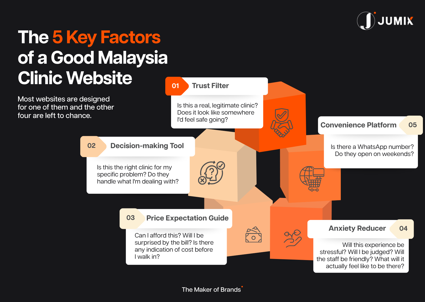
A clinic website is doing five jobs simultaneously for every patient who lands on it. Most websites are designed for one of them.
The other four are left to chance.
1. Trust filter. Is this a real, legitimate clinic? Does it look like somewhere I’d feel safe going?
2. Decision-making tool. Is this the right clinic for my specific problem? Do they handle what I’m dealing with?
3. Price expectation guide. Can I afford this? Will I be surprised by the bill? Is there any indication of cost before I walk in?
4. Anxiety reducer. Will this experience be stressful? Will I be judged? Will the staff be friendly? What will it actually feel like to be there?
5. Convenience platform. Can I contact them right now, in the way I prefer? Is there a WhatsApp number? Do they open on weekends?
Patients run through all five of these in under a minute. If the website fails any one of them, most patients leave. Quietly. Without enquiring. Without telling you why.
The clinics that win build every page around all five jobs. The ones that struggle design for job one and assume the rest will handle itself.
The psychology of anxiety-based browsing
Here’s what most clinic owners underestimate about how patients browse. The person visiting your website is anxious, not a calm, informed consumer comparing options on a spreadsheet. They might be in pain. They could be embarrassed about their condition, worried about cost, or searching at 11pm because they’ve been putting this off for weeks.
That emotional state changes everything about how they process information on your website.
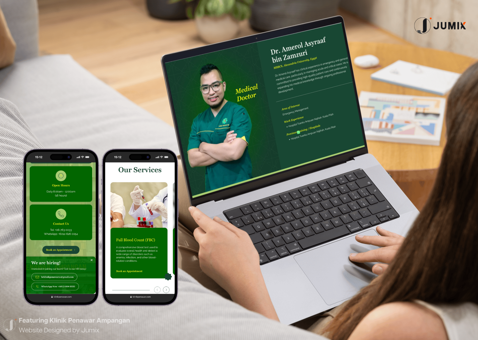
A patient searching for a skin clinic scans for signals that say it’s safe to make contact here, not credentials read with an open mind. Warm photos of real staff over generic stock images.
A doctor’s face over a corporate logo. Clear pricing over hidden fees. A WhatsApp button over a complex multi-step form.
Before they ever book, patients are mentally pre-experiencing the visit. They’re asking themselves: will the clinic feel stressful? Will staff be friendly? Will I be judged for my condition? Will the process be smooth?
A website that answers those unspoken questions through its design and tone converts. One that doesn’t loses the patient to a competitor that felt safer. Even when the two clinics are medically equivalent. 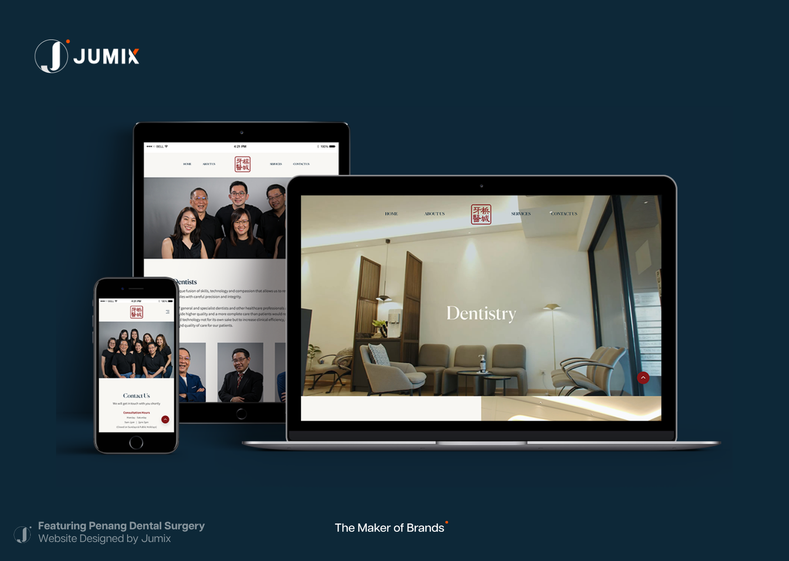
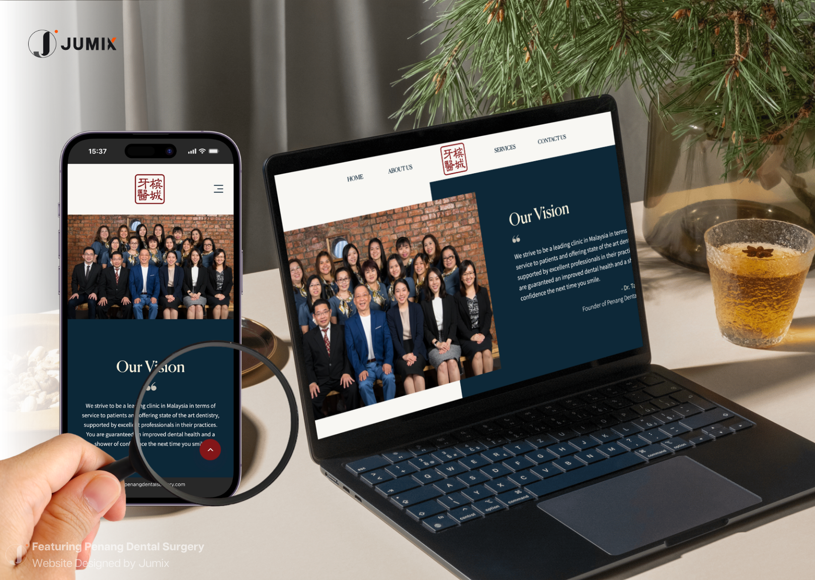
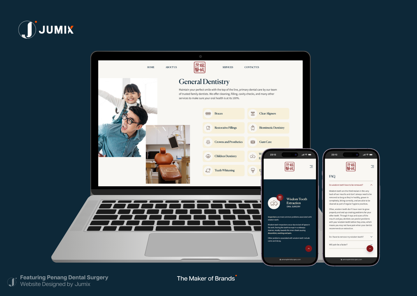
Penang Dental Surgery understood this when Jumix built their digital presence. A dental practice established since 1984 could have led with clinical authority and a list of procedures. Instead, the website opens with warmth: “a unique fusion of skills, technology and compassion.” WhatsApp is the most prominent contact method. Services are listed in plain language. Every design decision was made to calm a patient’s nerves before they walk through the door.
The 15-second test most clinic websites fail
When a patient lands on your homepage, they’re asking three questions. If the website can’t answer all three within 15 seconds, most patients leave.
What do you specialize in? Are you expensive? Can I contact you right now?
Most clinic websites bury all three. Services are hidden inside dropdown menus.
Pricing is absent or deliberately vague. The contact button lives in the footer, six scrolls down the page.
A patient who has to work to find basic information makes a quick judgment: this clinic is disorganized. And they look elsewhere.
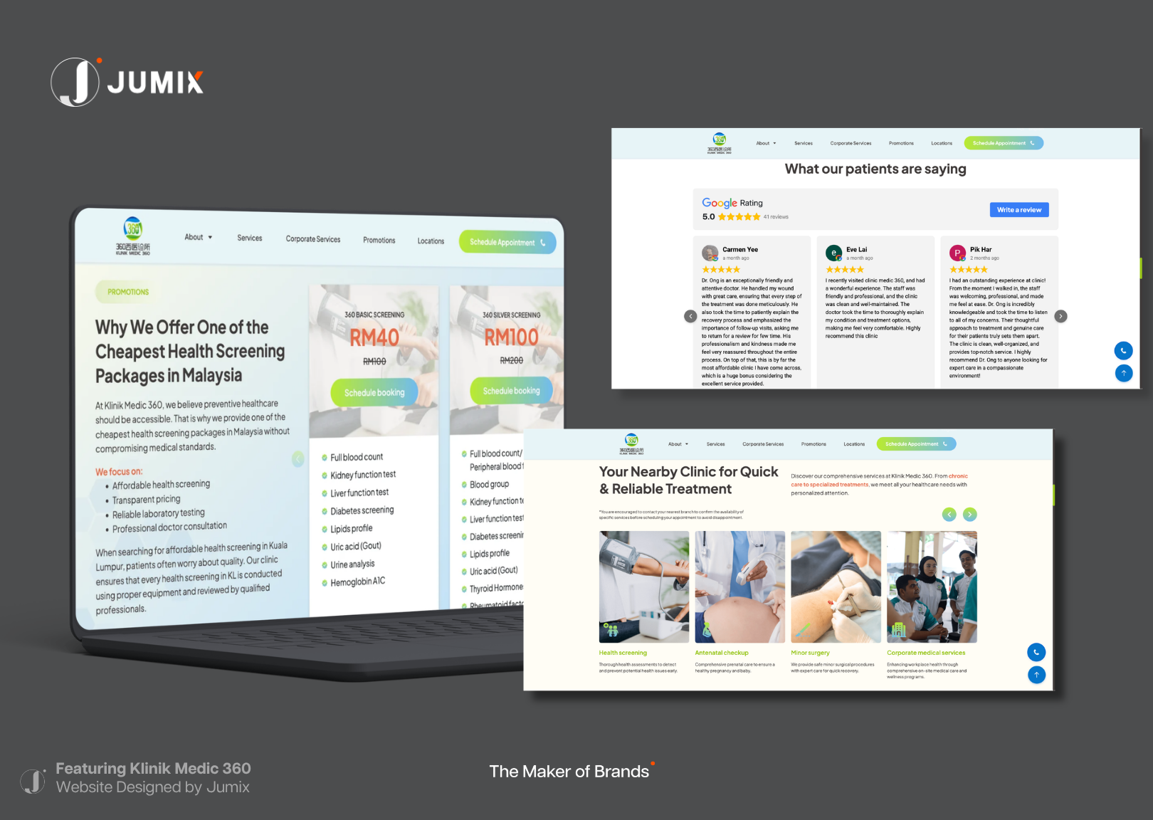
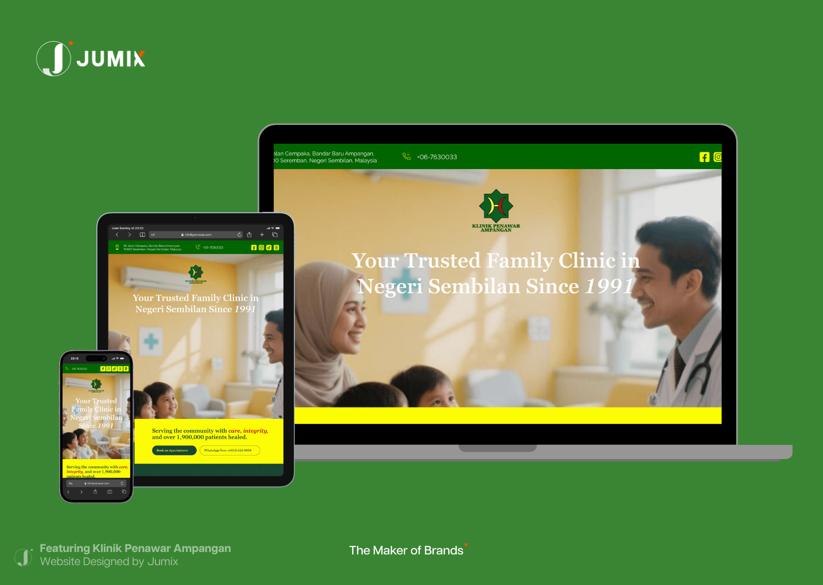
Klinik Medic 360 built their website around the opposite philosophy. Their homepage answers all three questions without a single scroll. The health screening package starts from RM40: that number is in the headline, shown against the original price, crossed out. The appointment button is above the fold. Services are listed in plain view, organized by what patients actually look for.
For a multi-branch clinic group serving working adults and university students across KL and Selangor, removing price anxiety was the single most important conversion decision they could make.
The RM40 figure does more work than any ad campaign. It eliminates the patient’s biggest hesitation before they even consider clicking away.
That’s the 15-second test, executed well. Most clinic websites fail it. The ones that pass it consistently outperform competitors on enquiry volume without spending an extra cent on traffic.
Why Malaysian patients choose WhatsApp over booking forms
Most web design advice comes from Western markets, where contact forms and appointment funnels are standard. Malaysian patient behavior works differently.
The typical Malaysian patient journey looks like this: they find the clinic, check the website, and want to ask one quick question before committing to an appointment.
They want to ask, right now, on WhatsApp, not fill in a form and wait 24 hours. Casually. Without feeling like they’ve committed to anything.
Clinics that route all inquiries through a contact form create friction at the most critical moment in the patient decision cycle. The patient had intent. The form killed it.
The fix is direct: make WhatsApp the primary contact method. Put the button where patients can see it without scrolling.
Pre-fill the message with a prompt like “Hi, I’d like to enquire about [service].” Remove every step between “I’m interested” and “I’m talking to a human.”
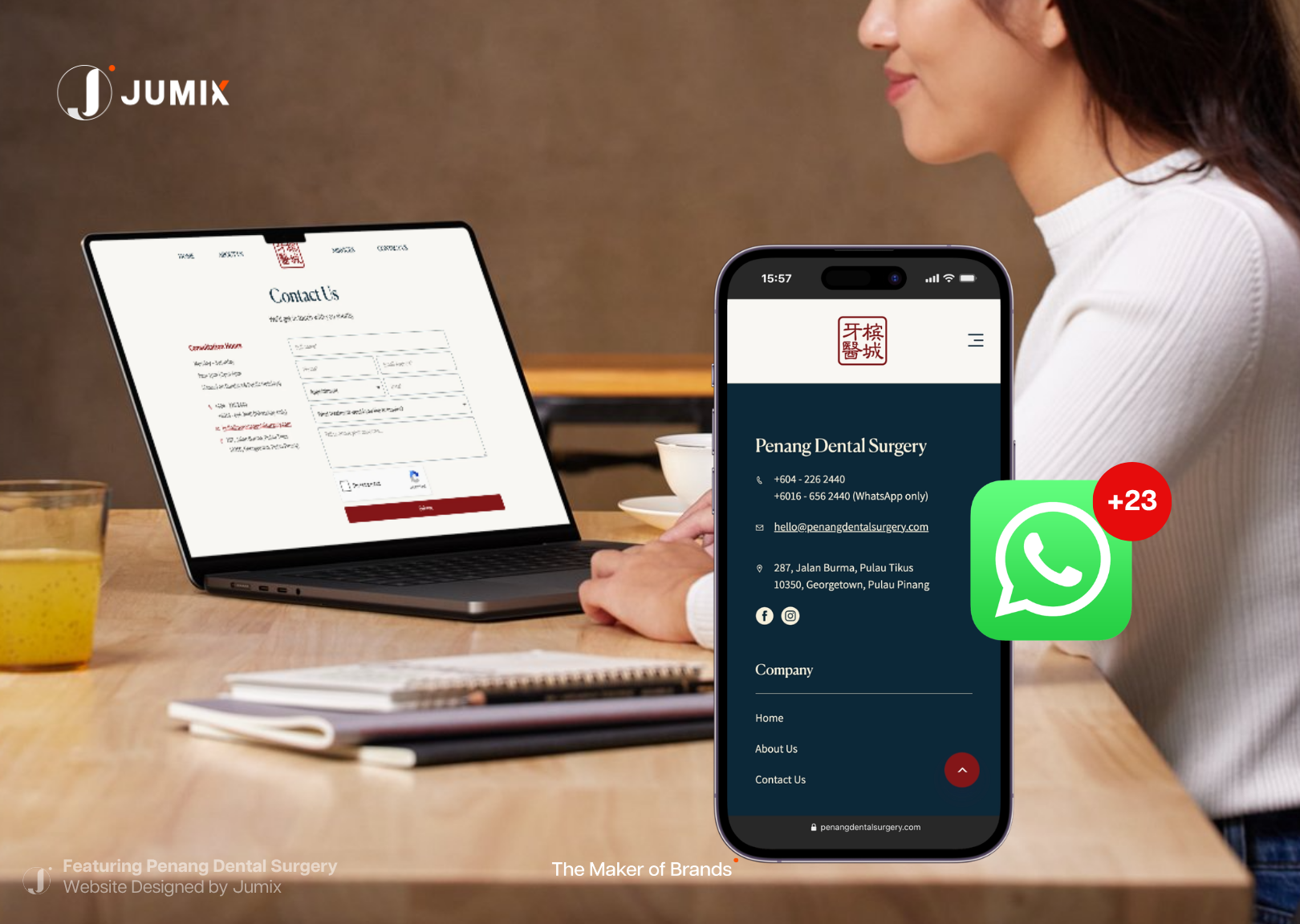
Penang Dental Surgery displays a dedicated WhatsApp-only number separately from their main clinic line. That distinction alone signals to patients: we know how you prefer to communicate, and we’ve made it easy. The result is more initial contact, higher conversion from contact to appointment, and a warmer patient relationship before the first visit.
An online booking system has its place, especially for high-volume clinics managing multiple doctors. But it should sit alongside WhatsApp, not replace it. Patients use WhatsApp as a low-commitment way to test whether the clinic is responsive and approachable.
Pass that test, and the booking follows naturally.
Design is a professionalism signal, not just aesthetics
Patients make assumptions about clinical quality based on website quality. It’s consistent, even though it isn’t rational.
An outdated website signals outdated equipment to a patient who has never visited your clinic.
A broken mobile layout suggests disorganized operations.
Blurry photos of the clinic interior suggest a team that doesn’t care about presentation.
Patients extend that judgment directly to care quality and staff professionalism.
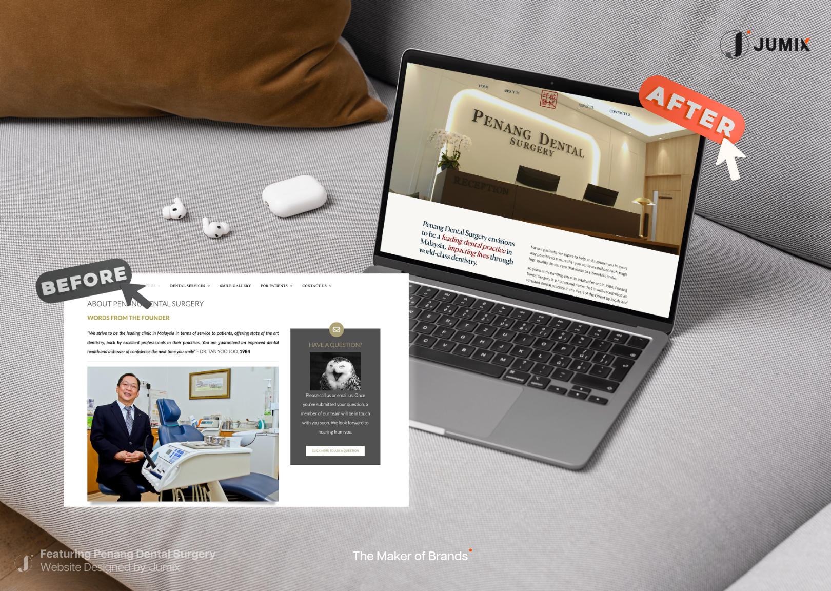
People quickly evaluate a site’s credibility from its visual design alone. (Source: Stanford Web Credibility Research, 3 years of research, 4,500+ participants) In a medical context, that credibility judgment maps to safety perception. The subconscious question every patient asks is: if this clinic can’t maintain a professional website, can I trust them with my health?
This problem cuts both ways. A poorly designed website makes a good clinic look unreliable. But the wrong design creates the wrong positioning entirely.
A premium aesthetic clinic designed to look budget attracts price-sensitive patients who complain about cost. A specialist clinic with an overly corporate, intimidating website keeps away exactly the patients who need specialist care most.
A family clinic that looks too aesthetic loses the trust of parents looking for a warm, approachable GP.
Design positioning and medical positioning have to align. When they don’t, the website attracts the wrong patients, generates the wrong enquiries, and wastes the time of both clinic and patient.
The copy problem: medical language vs patient language
Most clinic websites are written for doctors, not patients. The language is clinically precise and completely disconnected from how patients actually think and search.
Patients don’t search for “orthodontic malocclusion correction protocol.”
They search for “braces pain,” “how long does swelling last after tooth removal,” “can I eat normally after this,” and “how much downtime.”
They arrive at your website carrying specific, anxious questions. If the website answers those questions in plain language, patients feel understood. If it greets them with medical terminology and procedure lists, they feel lost. They find a clinic that speaks their language instead.
The shift is simple in principle and difficult to execute without the right team. Every service description needs rewriting in patient language.
“We perform wisdom tooth surgical extraction under local anaesthesia with appropriate post-operative care” becomes: “Wisdom tooth removal, done comfortably. Most patients are back to normal within 2 to 3 days.”
Every service page should answer the questions patients are too embarrassed to ask in person:
- “Will it hurt?”
- “How long will I be there?”
- “What can I eat afterward?”
- “How much does it cost?”
- “When can I go back to work?”
Clinics that answer these questions on their website convert at higher rates. The reason is simple: they’re easier to choose.
The patient feels informed and prepared before they even book. That’s a dramatically better patient experience starting from the first click.
Micro-reassurances and local search intent
Small details on a clinic website do disproportionate work in patient decision-making.
These are micro-reassurances: specific pieces of information that eliminate a specific hesitation before it becomes a reason to leave.
A few examples that consistently convert hesitant patients in Malaysia:
- “Parking available behind clinic”: eliminates a practical anxiety before it forms
- “Female doctor available on request”: signals safety for female patients dealing with sensitive conditions
- “Child-friendly environment”: removes a barrier for parents who can’t easily arrange childcare
- “Open on Sundays”: captures the significant segment of working adults who can’t visit on weekdays
- “Walk-ins welcome”: removes the commitment barrier for patients anxious about booking ahead
Each micro-reassurance is worth more than a paragraph of credentials. It answers the real question the patient is asking: will going to this clinic be a stressful experience?
This connects directly to how patients search today. They’ve moved past generic terms.
Real Malaysian searches look like: “skin clinic Penang open Sunday,” “kids dentist near me Petaling Jaya,” “female doctor KL affordable health screening,” “dental clinic Georgetown WhatsApp.”
These searches already contain the micro-reassurances patients need. Clinics that include those specific phrases in their website copy rank for them and convert those patients when they arrive.
Local SEO and patient psychology overlap exactly here. The clinics that show up for these specific searches understood what patients actually worry about. They answered those worries on the page.
The silent drop-off: patients who leave without you knowing
Clinic owners track what they can measure: enquiries, bookings, walk-ins.
But the biggest leakage in the patient funnel happens before any of those are counted.
A patient visits the website. They can’t find the price. They’re not sure the clinic handles their specific condition.
The mobile layout is broken and they have to pinch-zoom to read. The WhatsApp button is buried.
They close the tab. No enquiry. You never knew they were there.
This is the silent drop-off. For most clinics, it’s losing more patients than all other problems combined. It’s invisible.
The assumption is: if patients aren’t complaining, the website is working. But patients don’t complain when they leave. They just book somewhere else.
The only way to see the silent drop-off is through analytics: bounce rate, time on page, scroll depth, exit pages, heatmaps.
Most clinic websites have never been audited for any of this.
Clinics that grow without increasing ad spend have usually done exactly this. They treated the website as a patient acquisition tool, measured where patients were dropping off, and fixed the friction one step at a time.
- A button moved above the fold.
- Prices added to the homepage.
- WhatsApp link made visible.
- A service description rewritten in plain language.
None of these changes require more ad spend. All of them compound.
A website that converts 5% of visitors instead of 2% delivers 150% more patients from the same traffic. Without a single extra ringgit on ads.
A conversion-focused website is the highest-ROI marketing investment a Malaysian clinic can make.
Frequently Asked Questions
How do I know if my clinic website is losing patients?
Check your Google Analytics for bounce rate and average session duration. If more than 70% of visitors leave within 30 seconds, the website isn’t answering patient questions fast enough. Also check mobile performance: load your own clinic website on your phone right now and count how many taps it takes to find your WhatsApp number or pricing. If it’s more than 3, you’re losing patients at that step.
Does a clinic website really affect patient numbers?
Yes, directly. In Malaysia, most patients search for a clinic online before visiting or calling. The website is the first touchpoint. A clinic that ranks well on Google but has a weak website consistently loses patients to competitors with lower search rankings but better-converting pages. The ad click gets patients to your website. The website gets them through the door.
What’s the most important thing to fix on a clinic website first?
Answer these three questions on your homepage, visible without scrolling: what do you specialize in, what does it cost (or at least a pricing range), and how do patients contact you right now. If your homepage doesn’t answer all three immediately, that’s the first fix. Design, copy, and SEO all build on top of that foundation.
Is WhatsApp better than an online booking system for Malaysian clinics?
For most Malaysian clinics, WhatsApp should be the primary contact method with a booking system as a secondary option. WhatsApp removes the commitment barrier. Patients ask a quick question, you respond, they book. A booking form requires commitment before the patient feels ready. For high-volume practices managing multiple doctors, a booking system makes sense for schedule management. But it should sit alongside WhatsApp, not replace it.
Your website is working right now. Is it winning patients or losing them?

It’s running 24 hours a day. Every patient who searches for a clinic in your area, at any hour, lands on it.
It either earns their trust in 15 seconds or loses them permanently to a competitor whose website did.
The clinics growing without bigger ad budgets aren’t doing anything mysterious. They’ve built websites that understand how patients actually think, search, and decide.
Clear pricing. Warm design. WhatsApp front and center. Services in patient language.
Micro-reassurances that answer the questions patients are afraid to ask out loud.
None of that requires more ad spend. It requires a website built for patients, not for clinic owners.
If your clinic’s website isn’t generating consistent enquiries, the traffic isn’t the problem. Jumix’s web design service is built to fix exactly this: healthcare and clinic websites designed around patient psychology, conversion, and the specific way Malaysian patients decide.
Get in touch and we’ll show you what your current website is costing you.




Comments are closed for this article!