


Have you ever asked yourself why tablet and mobile internet usage surpassed desktop internet usage globally in October 2016 for the first time in the history? This because smartphones and other handheld gadgets are rapidly becoming the favored method of accessing the Internet.
With the world population of over 7 billion, it’s predictable that the number of cell phone and tablet user will exceed over 5 billion by 2019. This is because more searches occur on the mobile phone than on desktop or laptop.
If you still don’t have a mobile friendly website, then you need to have one as soon as possible because your clients are progressively shifting to mobile.
If you are trying to comply with the same, then the following are reasons why you need mobile friendly website;
1. Improve user experience
Once your website is accessed from a tablet or mobile, it advances from design to high vertical configuration, initiating a different presentation of pictures and content.
Responsive website design can ease the control of the web page to accurately fit the screen of the device being used. It contracts the content sizes and pictures rather than maintaining a constant structure.
Consequently, this programmed adjustment can enhance the user experience by giving a less demanding approach for perusing the website.
2. A mobile friendly design makes your site more available to the clients
Mobile users can gain access to the website at every time they wish, regardless of their location.
The underlying reason why they navigate the website from their cell phone is that the laptop or desktop PC is not easily accessible.
The websites which are not mobile friendly usually chase the visitors to abandon and look for the more efficient site to explore.
Thus, none mobile friendly website can also create responsive designs, to be accessible at any moment and with any handheld gadgets such as tablets and cell phones.
3. An upgraded mobile site involves Google ranking
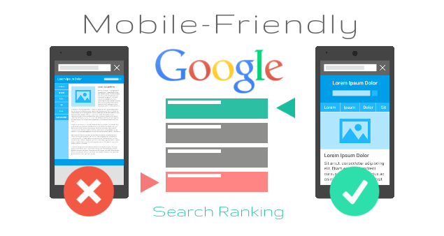
According to recent research, approximately 96% of Internet users are using Google to research for something regardless of the location. Thus, every website buckles down on its search engine optimization to appear in the first several results of a Google search. An essential stride in improving a website is to design a responsive website layout because Google recognizes whether the website is mobile friendly and then prioritize when visualizing search results.
4. Responsive website architecture can become more cost-effective
Before the display of responsive web design, website owners should use this technique to site design aimed at permitting desktop web pages to be observed in response to the dimension of the web browser or screen one is observing with.
This couple of assignments as the source codes and substance updates are performed separately for every form.
The responsive website composition frequently changes by all sizes of the screen for a single source code for your web page, and a single object administration framework.
5. A mobile friendly website boosts sales
While web-based buying is developing amazingly, an ever-increasing number of clients are using their cell phone to purchase commodities on the web.
In the year 2013, more 10% of the region’s online purchases were done through mobile phone, and this rate multiplied by two in the two years that followed to attain 20% in the year 2015.
Therefore, the trend has drastically increased to achieve the over 60%. Currently, this has become the advanced strategy for all online business to extend to the mobile phone with a sensitive design.
This trend will, as defined before, improve the user experience, building open doors for developing an online deal.
6. It improves your reputation
The user will like a website that has a great user experience and the dislike the one with the bad user experience.
Reputation is everything that your client requires from the mobile friendly site, and the most online dealer can’t afford to provide the prospect with a bad user experience.
7. Your business will appear as relevant and modern
You might offer some unique, valuable, and beneficial products on web-based business, but if your website has non-existent or poor mobile experience, then you can rest assured that your business will encourage the visitors to look for help elsewhere.
In contrast, mobile friendly websites can be regarded as legit, innovative and modern.
Google often give priority to mobile friendly websites as compared to those sites that are no longer mobile friendly in portable gadgets search results.
8. It increases your credibility

It assists you to build trustworthiness with your influencers, prospects, customers in the industry.
Whether you are marketing the business through the business-to-consumer, or business-to-business approach, using the mobile friendly website, then anybody who attempts to visit your blog on a mobile phone will acquire a suitable experience.
Moreover, this technique will prompt the client to consider you as a trustworthy resource for reliable information.
In summary, responsive web design functionality increases a mobile webpage’s user experience and execution crosswise over various screens and gadgets. Also, as noticed and expected, the mobile web approach is on the ascension, so upgrade your mobile friendly website and gain the upper hand over the opponent.


Comments are closed for this article!