
Key Facts
- 99.5% of Malaysians access the internet using mobile devices (Department of Statistics Malaysia).
- 53% of mobile users leave if a site loads in >3 seconds (Google).
- Mobile-first sites show higher trust, lower bounce rates, and higher conversions than desktop-first sites.
- Malaysian web traffic is driven largely by TikTok, Shopee, Instagram, Facebook, all mobile-dominant channels.
- Google fully evaluates and ranks websites based on their mobile version (mobile-first indexing).
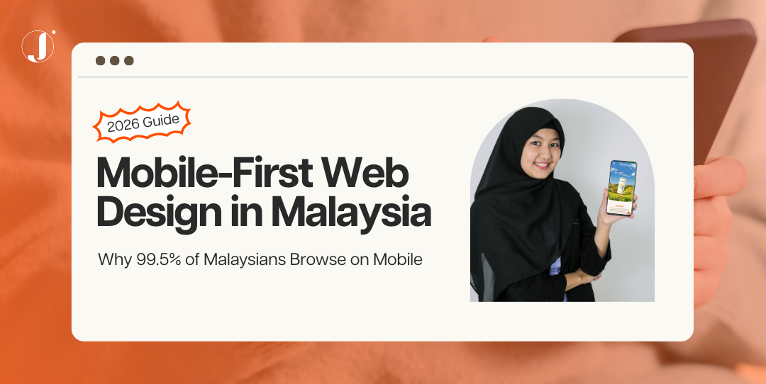
In Malaysia today, if your website isn’t built with mobile first web design Malaysia principles, you’re literally burning opportunities every single day.
I’ve audited enough business websites to notice a pattern:
When conversions drop, when customers “abandon cart”, when nobody fills up your form…
9 out of 10 times, the problem starts with the mobile experience.
And that makes perfect sense, because 99.5% of Malaysians browse on mobile (Department of Statistics Malaysia).
Not 50%.
Not 70%.
Is 99.5%.
If your website is designed desktop-first, it’s like opening a shop but keeping the front door locked.
So today, let’s walk through the REAL reason mobile-first matters, what happens when SMEs ignore it, and how to fix it properly.
Malaysia’s Mobile Usage Data: Understanding Your Audience
Before anything else, let’s ground ourselves with real Malaysian data.
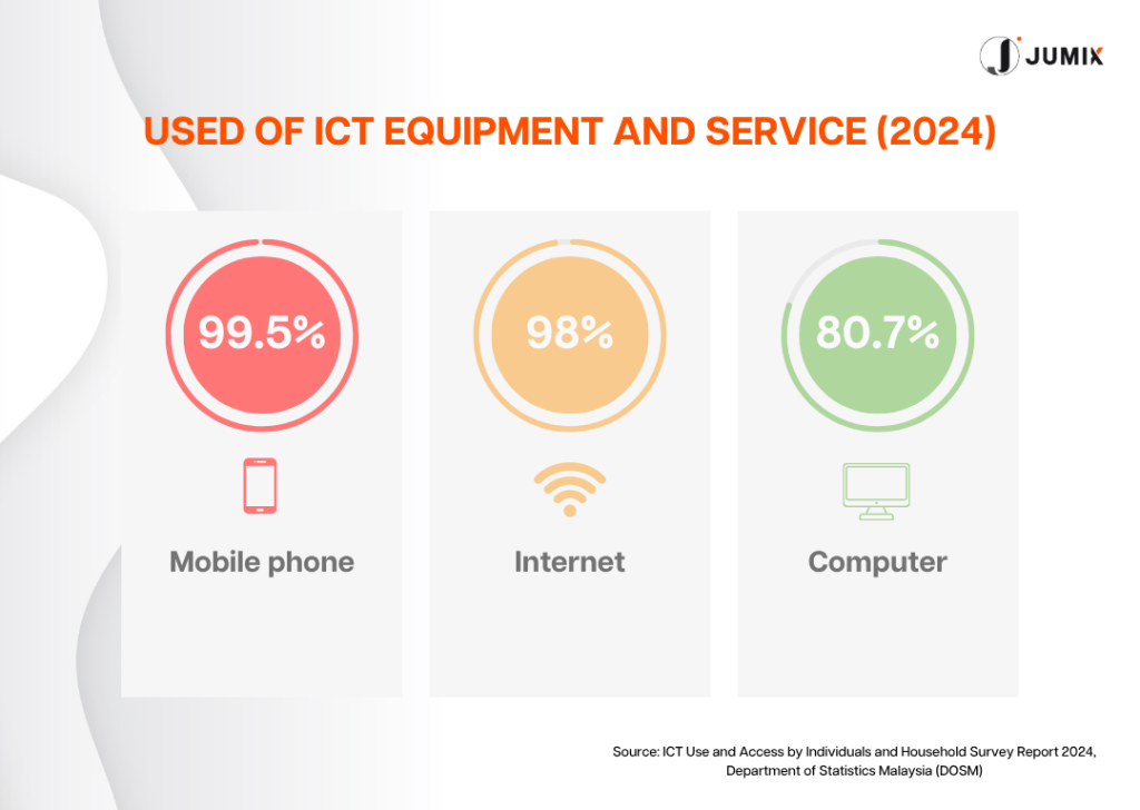
99.5% Mobile Access, Your Actual Audience
Across Kuala Lumpur, Penang, Johor Bahru, everywhere, Malaysians use their phones for almost everything.
Students in KL scrolling TikTok.
Parents in Ipoh checking Shopee.
Business owners in George Town replying to WhatsApp while browsing products.
That means when you embrace mobile first web design Malaysia, you’re designing for your real audience, the 99.5% who are living on their phones.
Social Media Behaviour Drives All Web Traffic
Malaysia is a mobile-driven market (Think with Google).
People browse, shop, research, compare, and pay using their phones.
This makes mobile-first design the foundation of revenue, not a trend.
How Malaysians Actually Browse
- TikTok → product discovery
- Shopee → price comparison
- WhatsApp → communication
- Instagram → brand research
- Mobile browser → final decision
If your mobile site loads slowly, looks cramped, or feels unreliable, users return to Shopee or find another seller within seconds.
This is why mobile-first isn’t a “trend”.
It’s survival.

Why Mobile-First Matters for Malaysian SMEs (And Why It’s Not Optional)
SMEs in Malaysia don’t have time to waste.
You need conversions, sales, bookings, and leads.
And mobile-first directly determines whether people buy or leave.
The Conversion Gap
Global research supports the link between mobile usability and conversions:
- Google found that 53% of mobile users abandon sites that take longer than 3 seconds to load.
- Shopify reports that fast, user-friendly mobile stores drive higher add-to-cart rates and completed purchases.

How Malaysian Shopping Habits Have Changed
Let me paint you a picture.
It’s 8 PM on a Wednesday.
A Malaysian customer is on their couch, scrolling through Shopee on their phone.
They see a product they like, maybe it’s skincare, fashion, electronics, whatever.
They click the link to the seller’s website.
Now here’s the moment of truth:
- If your website loads under 2 seconds → They buy.
- If your button is clear and easy to tap → They trust you.
- If scrolling feels smooth → They continue.
If it feels clunky or slow?
They go back to Shopee or check a competitor.
Your sale disappears instantly.
This is the reality of modern Malaysian commerce.
Mobile-first web design Malaysia is how you win these micro-moments.
Core Principles of Mobile-First Design: What Actually Works
When we talk about mobile first web design Malaysia, it’s not about shrinking your desktop website.
It’s about rethinking the entire user journey.
1. Layout Designed for Small Screens
- Single-column structure
- 48×48px tap targets
- Large, legible font sizes
- Generous spacing
- Important content first (above the fold)
- Sticky CTA for conversions
Mobile-first layout isn’t about shrinking desktop design.
It’s about rethinking what information matters most.
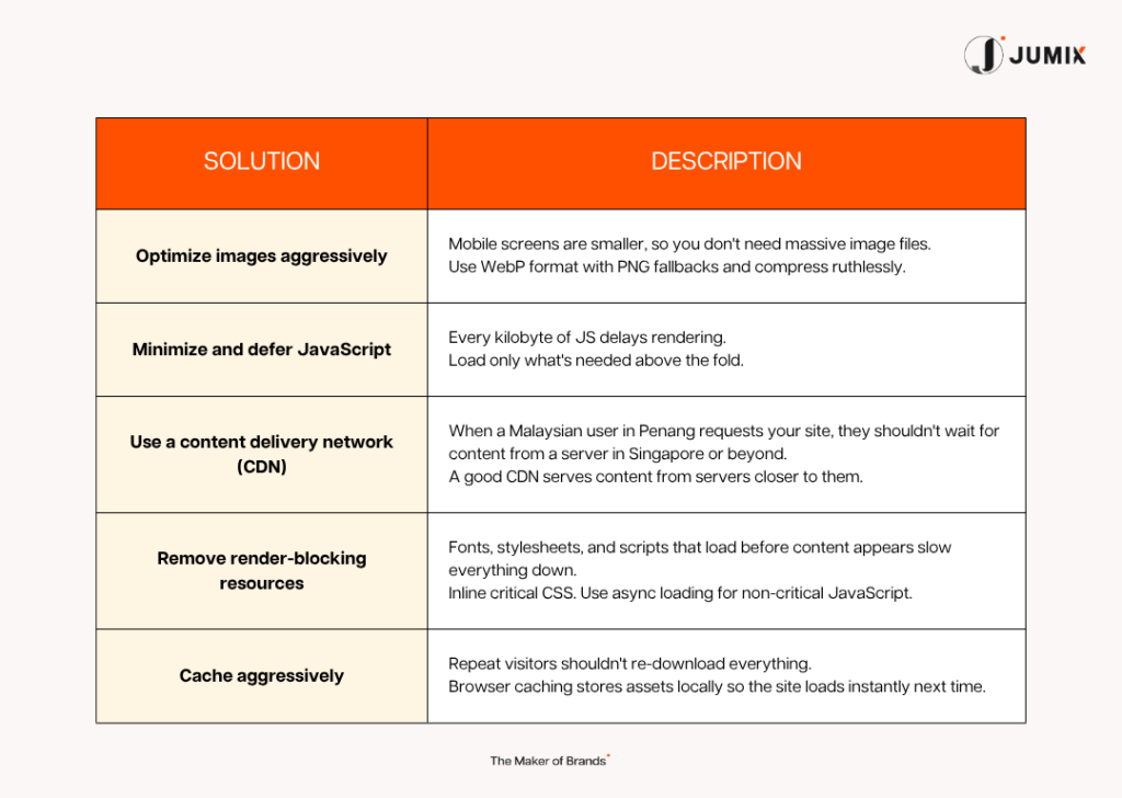
2. Speed as the Primary Ranking + Conversion Factor
Your site should aim for:
- LCP < 2.5s
- FID < 100ms
- CLS < 0.1
Methods:
- WebP images
- Compressed JS/CSS
- CDN
- Lazy-load media
- Critical CSS
- Cached assets
If your site takes 5 seconds to load, you’ve already lost 50% of visitors.
In 7 seconds, you’ve lost 80%.
Speed = trust.
Speed = conversions.
Speed = better Google rankings.
3. UX Flow Built Around Malaysian Behaviour
- Short forms
- Simple menus
- Minimal scrolling friction
- Clear CTAs (“Buy Now”, “Get Quote”, “Book Online”)
- Quick path from interest → purchase
Mobile-first web design Malaysia means understanding how Malaysians interact with their phones.
The quicker someone can make a decision, the more conversions you get.
Design Best Practices: Read about 7 UI/UX rules your users hate and learn 7 must-have features of modern web design in Malaysia.
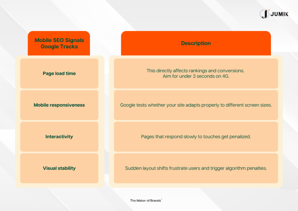
How Google Evaluates Mobile Pages (And Why This Affects Your Rankings)
Google ranks your website using mobile-first criteria (Google).
Poor mobile performance = lower visibility.
Google’s key signals:
- Load speed
- Layout stability
- Touch responsiveness
- Readability
- Interactivity
- Core Web Vitals
- Content usefulness
Monitor via:
Google has gone fully mobile-first.
Their crawler now treats the mobile version of your site as your “real” website.
If your Core Web Vitals are poor → your ranking drops.
Google prioritises:
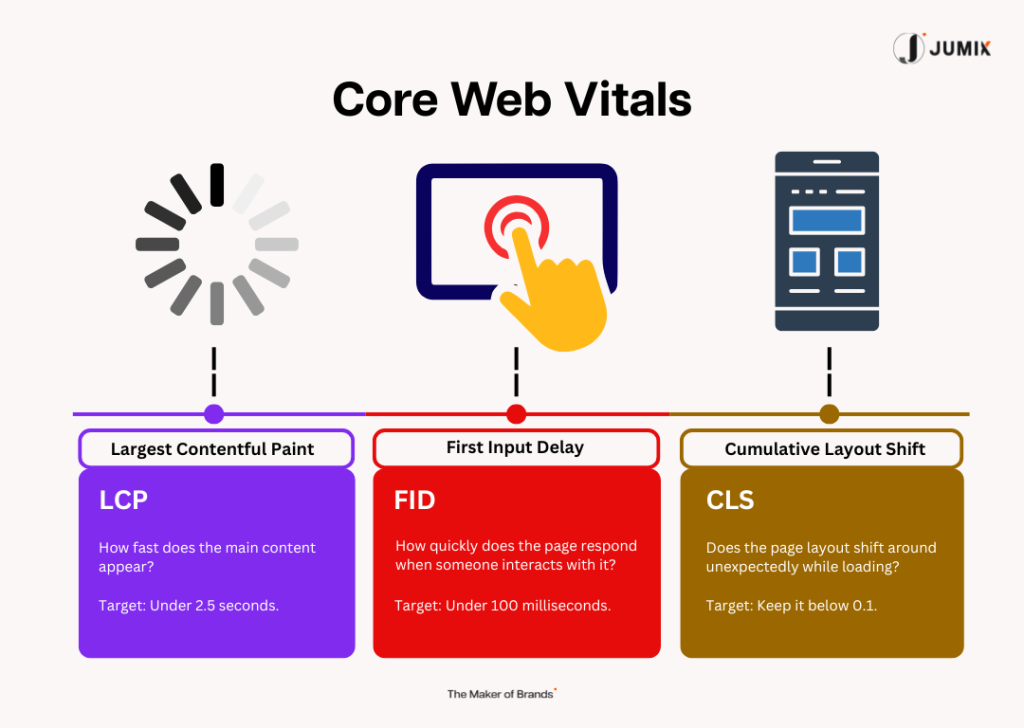
Core Web Vitals
- Largest Contentful Paint (LCP) < 2.5s
- First Input Delay (FID) < 100ms
- Cumulative Layout Shift (CLS) < 0.1
We measure these for every mobile first web design Malaysia site we launch.
If you see errors or warnings, fix them immediately.
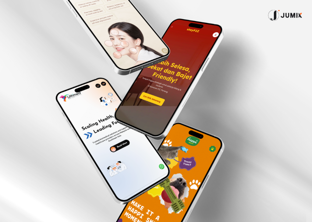
Examples of Mobile-First Malaysian Websites That Actually Work
Here are real examples of how mobile-first transformed businesses.
E-Commerce: E-Shirudo (Personal Protective Equipment)
Old site: Desktop-first, slow, confusing on mobile, conversions stuck at 0.8%.
We rebuilt it using mobile-first web design Malaysia principles:
- Use high-quality, optimized images
- Add-to-cart button always accessible
- Checkout simplified from 7 steps → 3 steps
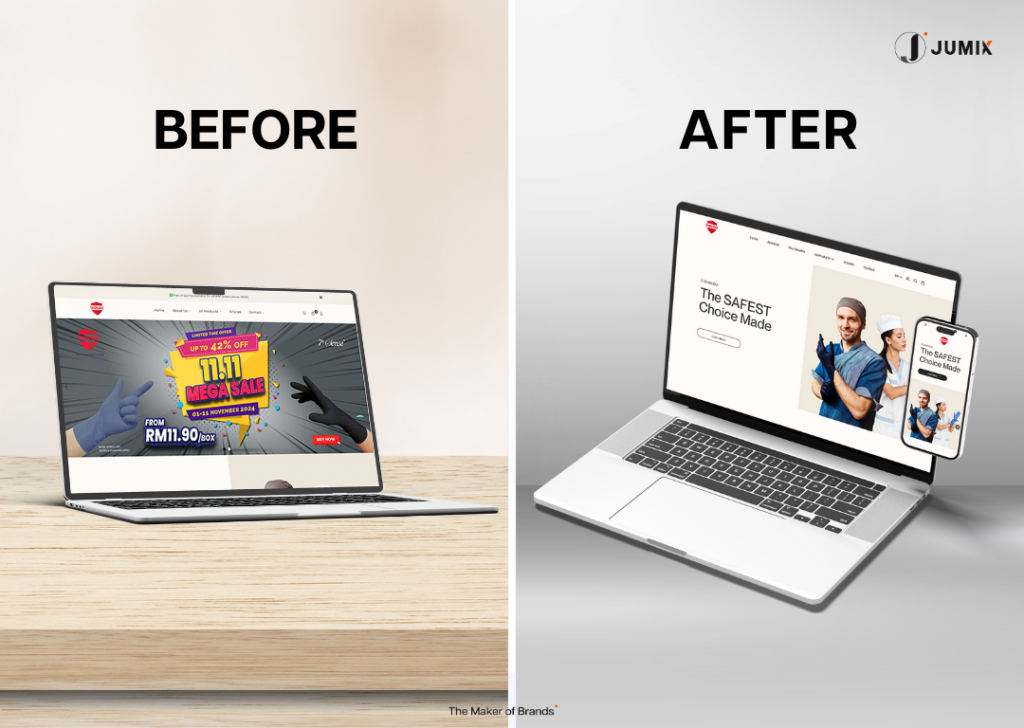
Result:
- Conversion rate increased to 2.1% in 3 months
- Same traffic, 2.6× more customers
- Revenue achieved RM342,000
This shows how mobile-first design can turn a mobile-unfriendly website into a conversion and revenue powerhouse.
The Truth About Mobile-First Design in Malaysia: Key Takeaways
If you’re reading this, you already know the truth:
👉 Malaysians shop on mobile
👉 Google ranks mobile
👉 Mobile-first converts better
👉 Mobile-first builds trust
👉 Mobile-first IS the business strategy
This isn’t optional anymore.
At Jumix, we offer a FREE Mobile Audit for Malaysian businesses.
We’ll show you:
- What’s slowing your site
- What’s killing your conversions
- Your Core Web Vitals score
- How Google sees your mobile pages
- Quick wins you can fix immediately
No obligation.
No “sales trap”.
Just real data and real solutions.
Your customers are on mobile.
Your competitors are improving their mobile experience.
The only question is:
How fast will you move?
Book your free mobile audit today.
FAQ
Does mobile-first design affect desktop performance?
No. Mobile-first simplifies your layout and prioritizes essential content. Desktop versions become cleaner and easier to navigate.
How fast can I see results?
- Conversions: 1 to 4 weeks
- SEO gains: 4 to 8 weeks after Google re-crawls
What’s the difference between responsive design and mobile-first design?
- Responsive = adapts desktop design to smaller screens
- Mobile-first = starts with mobile, then scales up → results in higher usability and conversion rates
Learn more about how to make websites responsive.
How much does a mobile-first redesign cost?
The cost varies depending on the agency. It should typically costs around RM5,000+.


Comments are closed for this article!