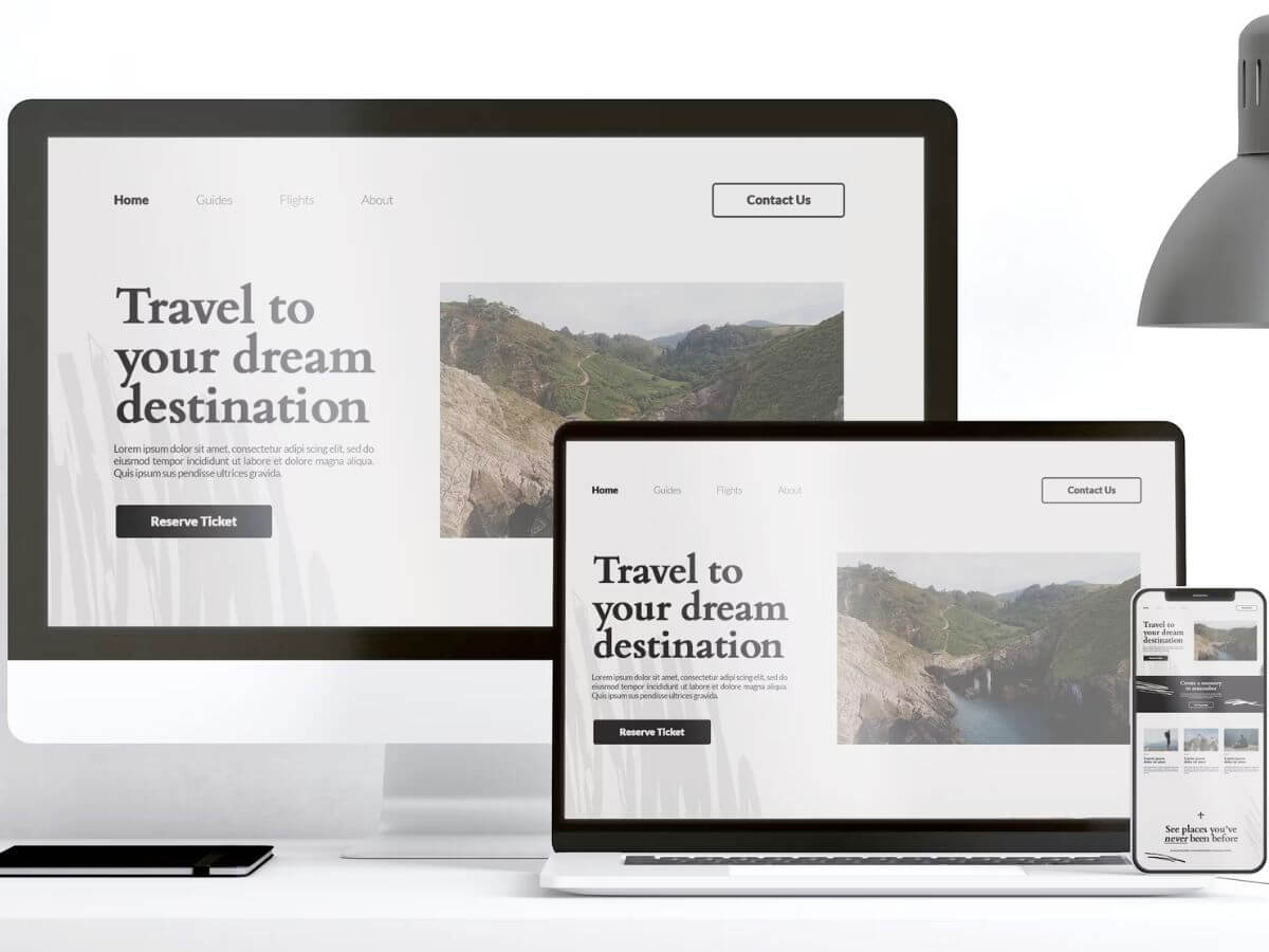
A responsive website needs to adjust its layout, images, and other design elements depending on the device used to access it. Screen sizes vary from small mobile screens up to large desktop monitors. You want your site to look terrific on every one of them.
Read more: Why You Need Mobile Friendly Website.
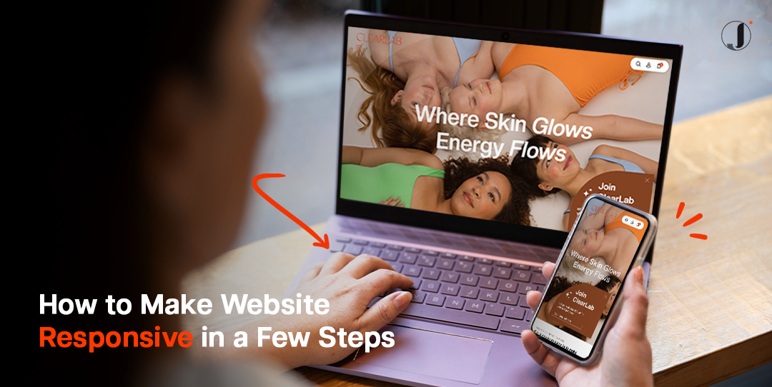
How to Make Website Responsive
So, how to make website responsive? The answer is using CSS (Cascading Style Sheets), a powerful tool that lets developers control the visual appearance of a webpage. To resize a web page to fit different screen sizes, you’d use CSS properties such as ‘width’, ‘max-width’, ‘min-width’ and viewport meta tag units like ‘vw’ (viewport width) and ‘vh’ (viewport height). Implementing these will ensure your content not only fits but looks good on any screen size.
For example, using relative rather than absolute values for these properties will allow a browser to calculate the appropriate size based on the available display area, such as:
img, picture, video {
max-width: 100%;
height:auto;
}
This kind of flexibility ensures your page won’t exceed its welcome by overpowering the screen space or shrinking into obscurity on larger screens.
But what if you need more granulated control over how your site behaves across devices? This is where media queries come in handy. Media queries are part of CSS3; they apply CSS rules only when certain conditions are met. You state these conditions aiming at specific resolutions, landscape or portrait modes, or even considering whether some features are available or not.
They work like an “if-then” programming loop: “If” the device’s screen size meets specific parameters defined in the media query, “then” certain styles are applied. Media queries can be inserted directly into your main style sheet or linked as separate files that target different devices.
For instance, let’s say you want to adjust your site’s layout for devices with a screen width of 768px or less. You can write a media query like this:
@media screen and (max-width: 768px) {
/* CSS rules that should apply to devices with max width of 768px */
}
This changes the layout for smaller devices. With properly configured CSS media queries, you can create different layouts for phones, tablets, laptops, and desktops—all within one website.
Testing the Responsiveness of a Website
First, let’s talk about manual checking. This involves physically accessing your website from different devices – a PC, tablet, and mobile device. Observe if the site adjusts properly based on screen size, resolution, and orientation. Easy navigation, legible text size, clickable buttons – all these need to be functional across all platforms for an optimal user experience.
While manual checking is useful for catching obvious errors or inconsistencies, sometimes issues might slip through unnoticed. That’s where browser web developer tools come in handy.
Most modern browsers (like Chrome and Firefox) include built-in developer tools that allow you to simulate different screen sizes and resolutions right on your desktop. For example, Google’s Chrome offers an excellent ‘Device Mode’ that mimics various mobile devices’ viewports to see how responsive designs perform under those conditions.
To access this feature in Chrome and Firefox, simply open up DevTools via hamburger menu icon > More Tools > Web Developer Tools > Toggle device toolbar (icon that looks like phone/tablet). Select the device you want to simulate from the dropdown menu at the top of the screen, and voilà! You’re able to test your website’s responsiveness without juggling multiple gadgets around.
Remember also that responsiveness isn’t just about adjusting visuals for different screens; it should also take into account network speed variations across devices. Hence, testing on slower connections can give valuable insights too!
Automatically Way to Make Responsive Web Design
Primarily, CSS Frameworks can come to your rescue here. Think of them as pre-designed codes that have built-in responsiveness. One such popular and widely adopted CSS framework is Bootstrap. Bootstrap has predefined classes that address responsiveness, allowing you to focus on the aesthetics and functionality of your website rather than fretting over manual adjustments for different screen dimensions. However, bear in mind that using a CSS framework like Bootstrap effectively requires integrating it from the outset while initially building your site.
But what if you’re on WordPress? The good news is you too can automate responsiveness using responsive WordPress themes. Selecting a responsive theme when building your website significantly reduces manual coding efforts needed otherwise for achieving scalability across devices. These themes are designed in a way that they default visually adapt to the screen size on which they’re displayed. The only catch; customising these themes might not always yield 100% success in maintaining their inherent responsive design properties.
Cost to Build a Responsive Website
Making a responsive website involves using flexible CSS properties and utilising media queries. This ensures an optimal user experience across various screen sizes. By resizing web pages and applying specific rules through media queries, your website becomes truly responsive — adaptable in a rapidly evolving digital environment.
Building an adaptable interface that ushers users into an optimised digital experience on multiple platforms isn’t straightforward nor cheap. The cost is consequential and derived from several factors such as design complexity or extensions needed.
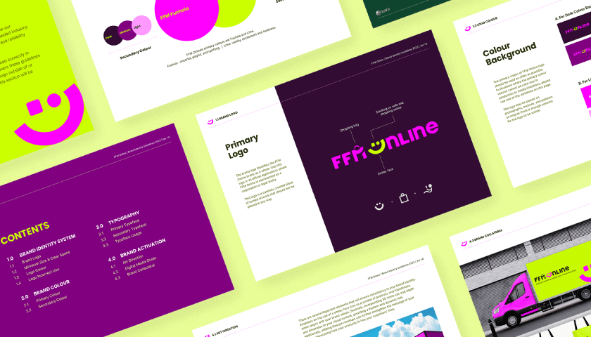
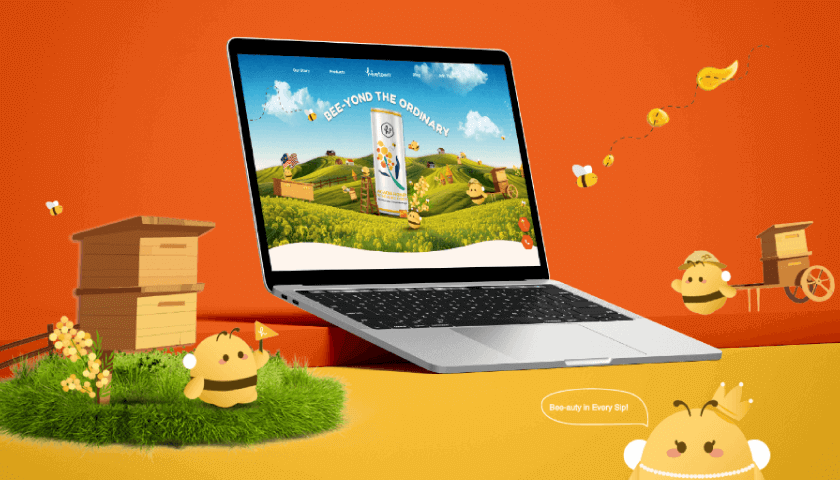
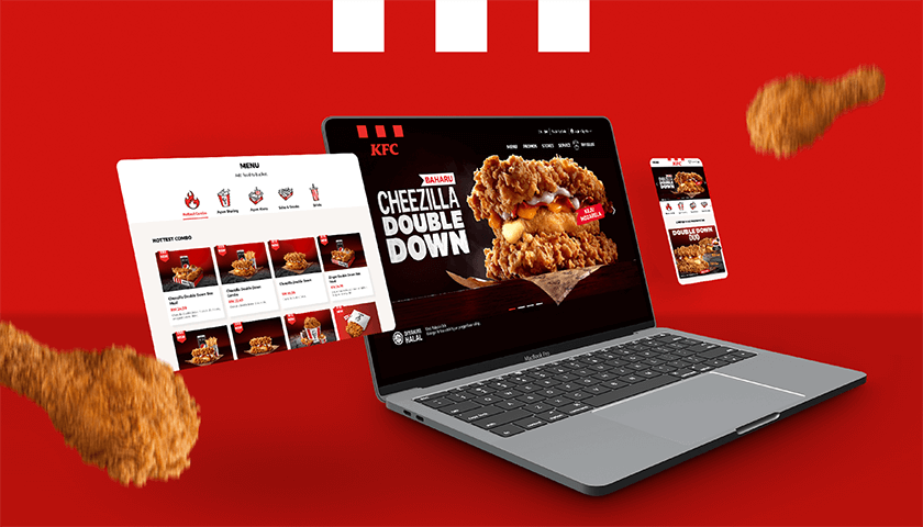
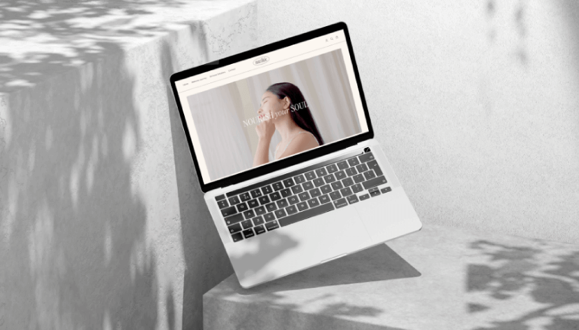
Jumix Design proves time after time that we are more than just a web design company in Malaysia. We go beyond providing astounding, responsive websites – we also offer timeless partnerships geared towards maintaining your impressive online presence long after the site goes live.
Engage with Jumix Design today and discover the real cost-effectiveness in building not only a responsive website, but more importantly, a thriving business.
Read more: How Does Website Design Affect Sales.


Comments are closed for this article!