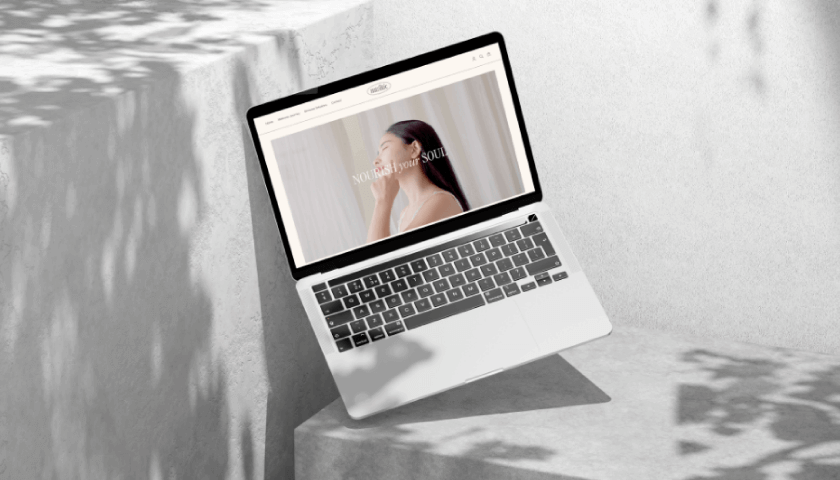
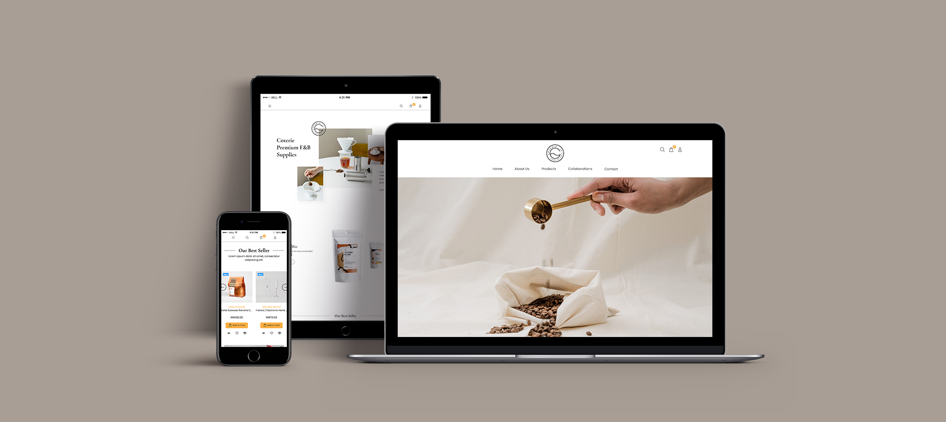
Just like Coterie’s brand image, we use a layout that is uncluttered, allowing for easy navigation and a focus on essential elements. The color palette, predominantly white with subtle accents, creates a sense of coffee experience in simplicity and sophistication. Crisp typography ensures clarity and readability, maintaining a polished aesthetic. The judicious use of negative space creates a balanced and harmonious visual experience. This design approach not only showcases their range of coffee beans, but also makes users appreciate the elegance and quality synonymous with Coterie’s coffee-related products.