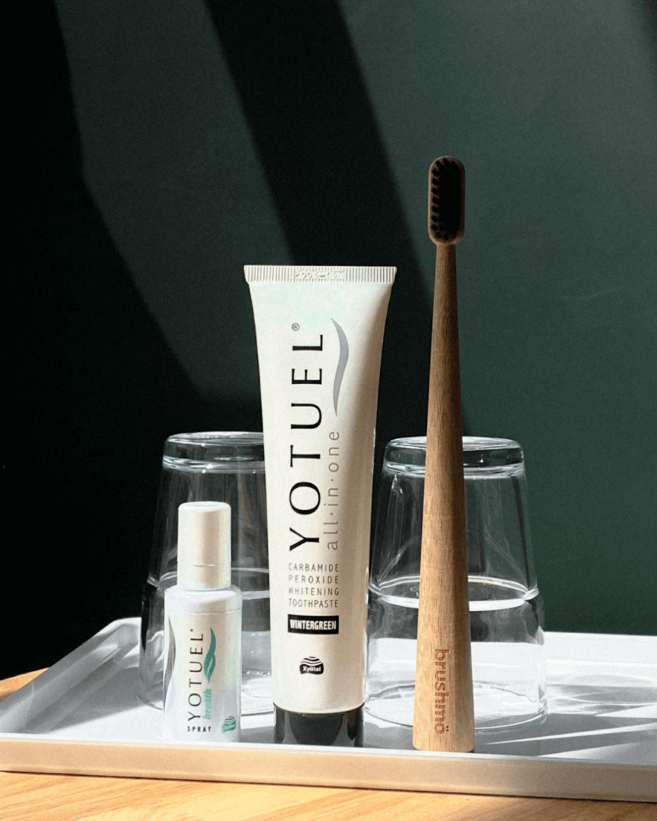
Day9, an authorised supplier for professional premium-quality personal care products for the major SEA counterparts, seeks to create a platform to connect with consumers looking for affordable and professional solutions to their beauty care regime.
Focusing on dental care to kickstart the brand, the client came to us in need of a new branding image. They needed a new brand identity to reflect their business nature and a new voice to speak for them, basically, they wanted to start fresh.
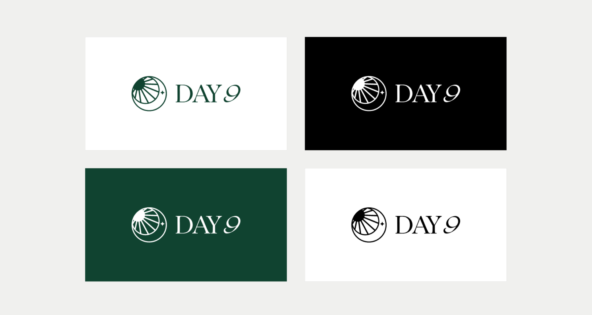
BRAND NAME & LOGO CONCEPT
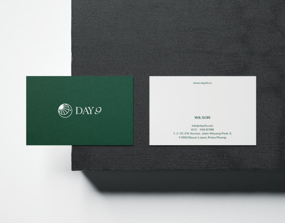
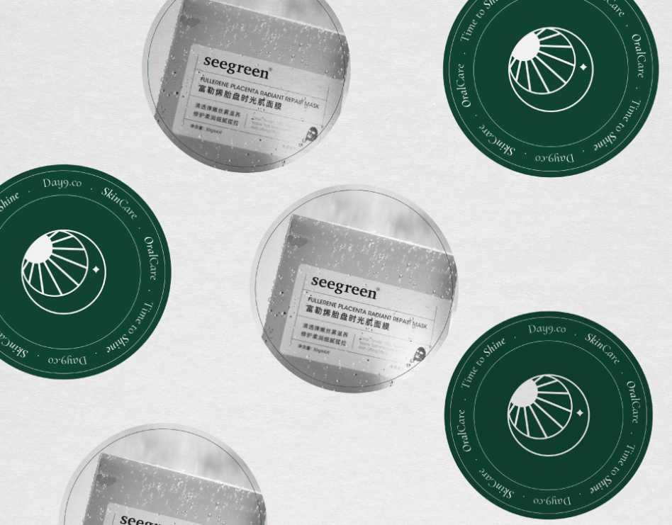
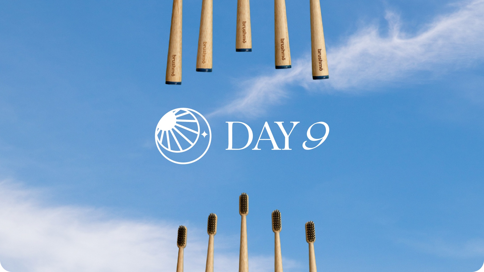
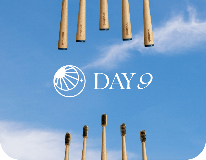
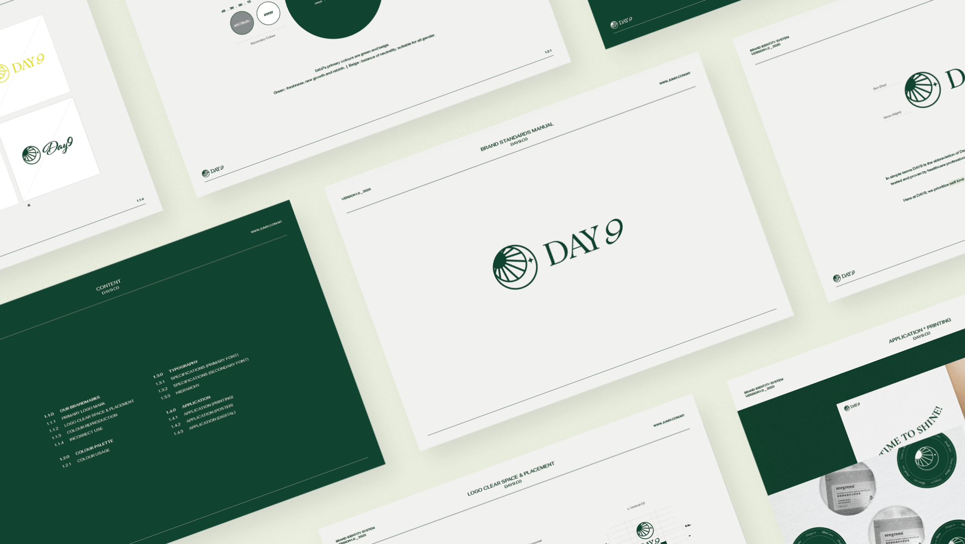
The creation of DAY9’s brand began with a blank canvas. Following our initial discussion with the founder, the name “DAY9” quickly emerged as the perfect fit. The idea behind DAY9 is to inspire consumers to radiate confidence around the clock, starting with a beautiful smile that lasts both day and night. This led to the conceptualization of the logo, which elegantly combines a sun and a moon. The logo not only serves as an aesthetically pleasing mark but also embodies the brand’s commitment to building a strong social community centered around self-love and confidence. Recognizing the significant role social media would play in this mission, we ensured the logo was versatile and impactful across various platforms.
BRAND COLOURS
The color palette for DAY9 is centered around green and beige. The specific shade of green was chosen to symbolize freshness, new growth, and renewal—perfectly aligning with the brand’s mission of rejuvenation. Beige was introduced to add balance and neutrality, emphasizing inclusivity and the belief that beauty is for everyone.


APPLICATIONS
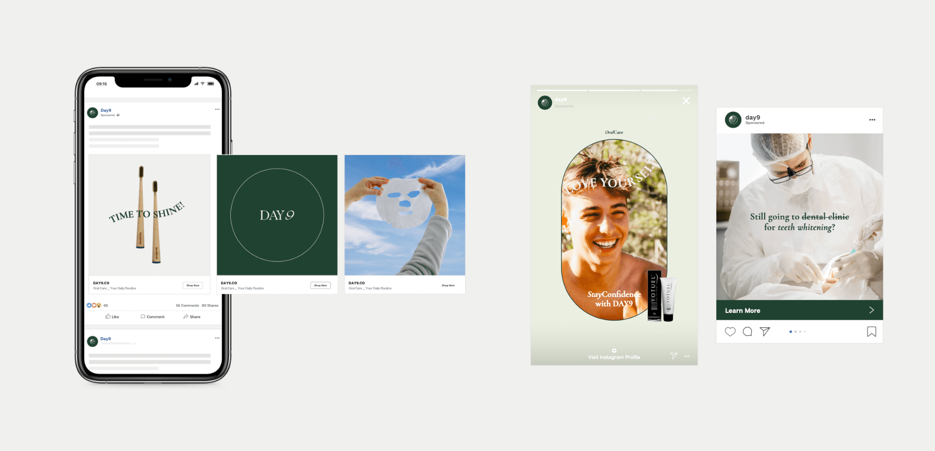
With the brand identity firmly established, the next step was to build a website that clearly communicates DAY9’s purpose and values. Both DAY9 and our team agreed that to foster a strong community and connection with consumers, a robust social media presence and an eCommerce platform were essential.
In the beauty and lifestyle industry, consumers often require extensive information before committing to a product. To meet this need, we developed an eCommerce website that not only showcases DAY9’s product offerings but also serves as an informative resource for potential customers. We allowed social media to play its part in drawing the target audience in, directing them to DAY9’s well-crafted website. The homepage was designed for easy navigation, allowing users to browse through featured products with ease, whether they arrived via social media or directly.
Thanks to a user-friendly eCommerce backend system, DAY9 can manage store updates effortlessly from any device, ensuring the brand remains agile and responsive to consumer needs.