

Juiko, a well-established brand known for selling imported premium fruits in the offline market for the past seven years, sought to elevate their brand presence and expand into the online market. Juiko’s mission is to position their products as symbols of gratitude, gifts, and care, with a commitment to quality and customer satisfaction. Recognizing the potential of the online marketplace, they approached us for a comprehensive business marketing strategy that included creating a new brand identity and an eCommerce platform.
BRAND NAME & LOGO CONCEPT
The creation of Juiko’s brand identity started with the name itself. After understanding their business vision and the essence of their products, we recommended a simple, meaningful, and accessible name. “Juiko” is inspired by the Hokkien dialect, where it translates to “fruits,” creating a brand identity that feels local and relatable to their target audience.
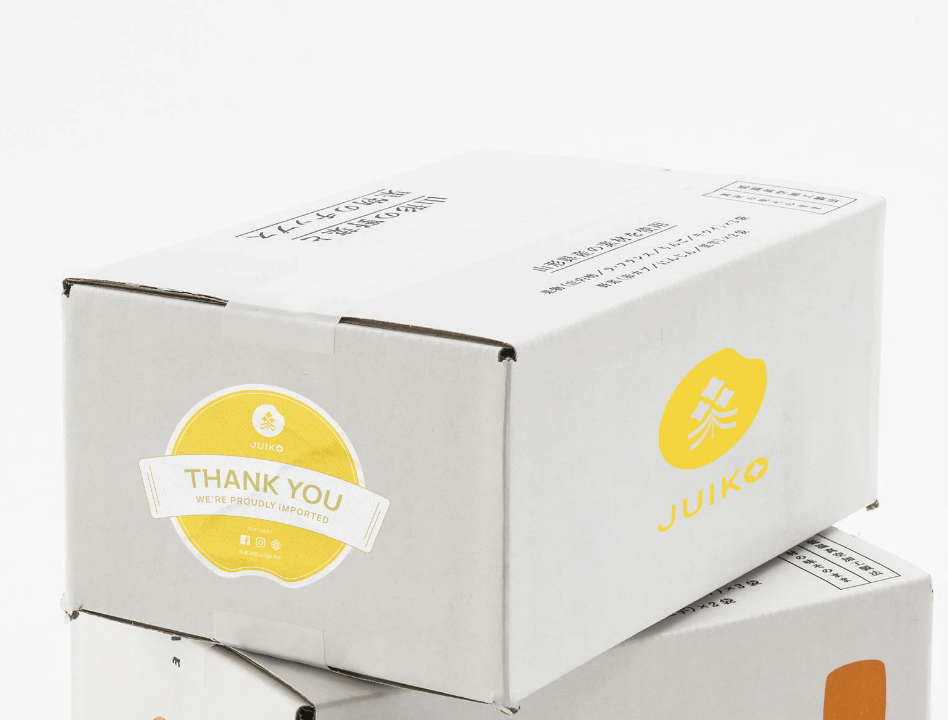
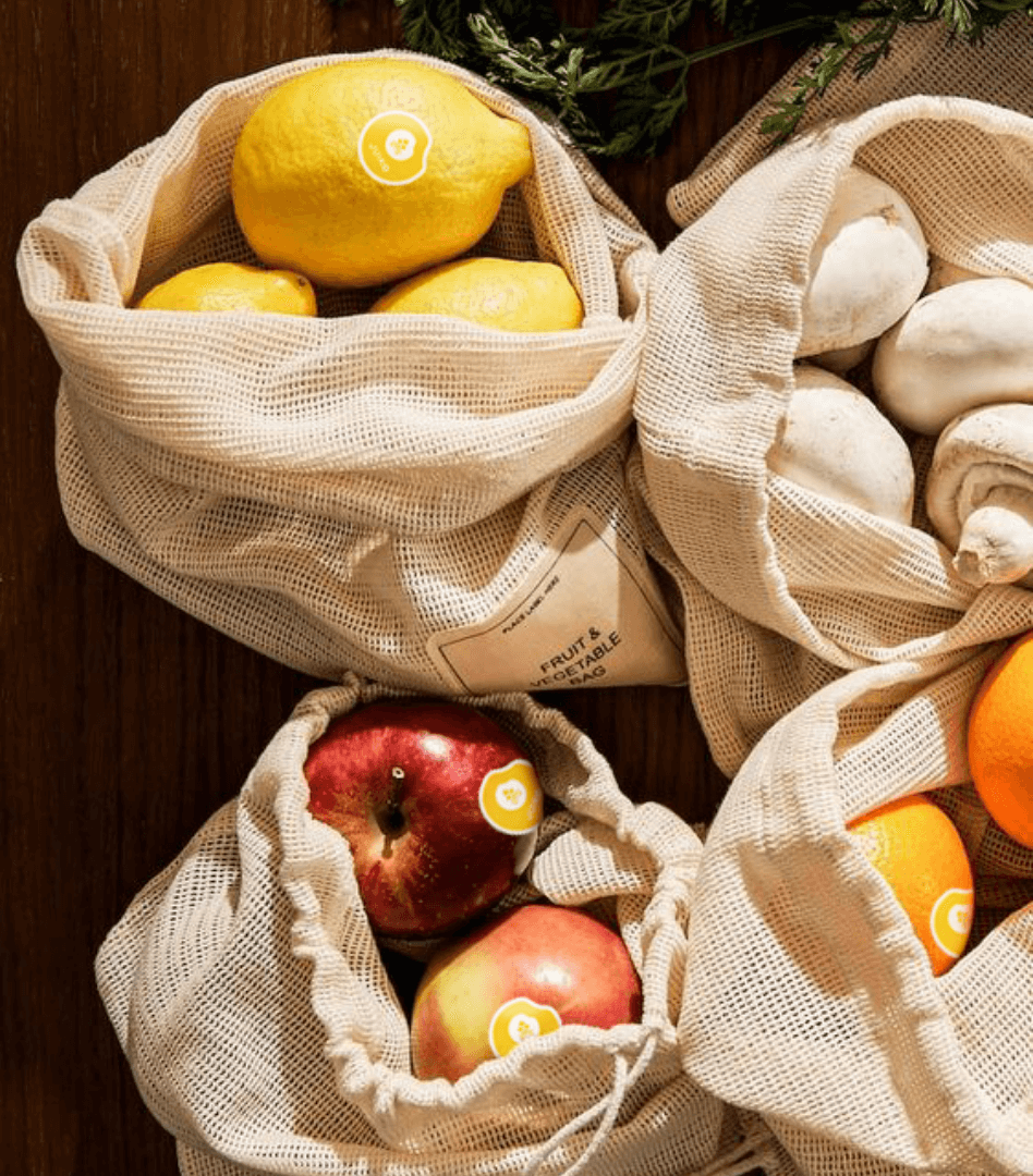
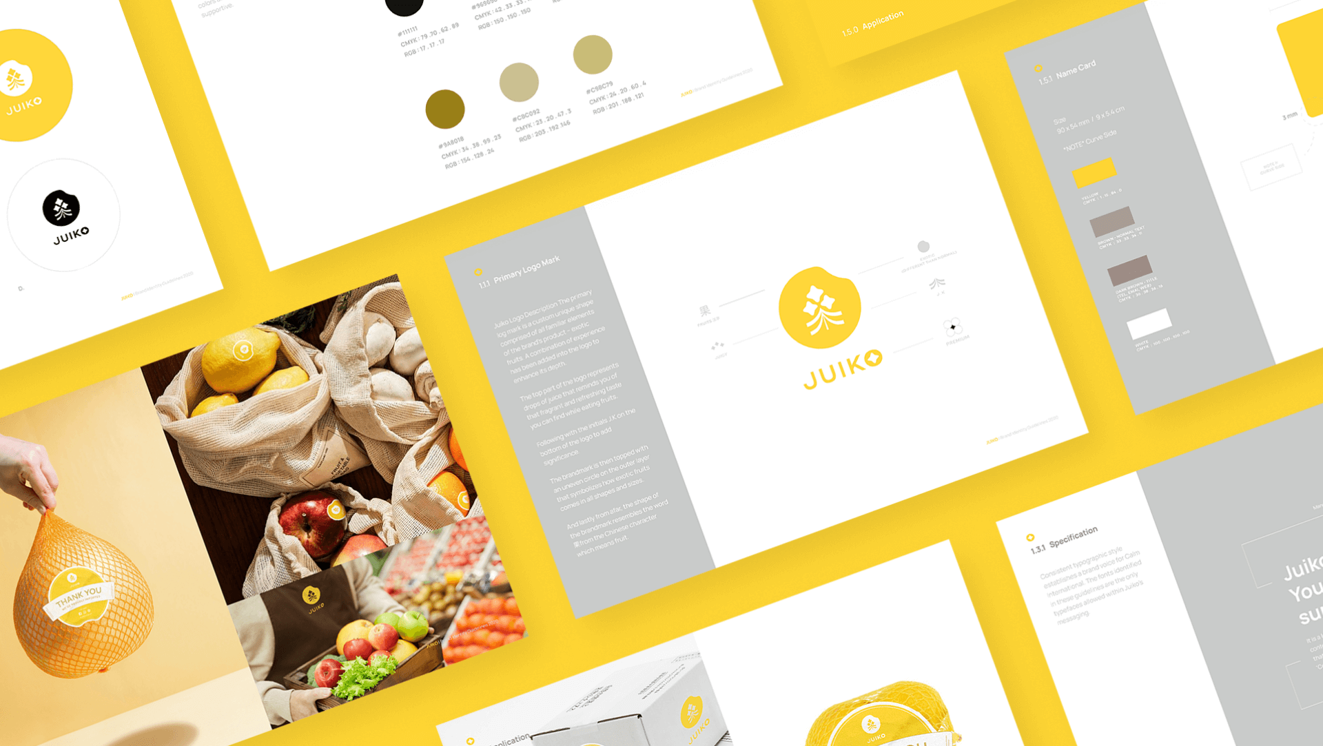
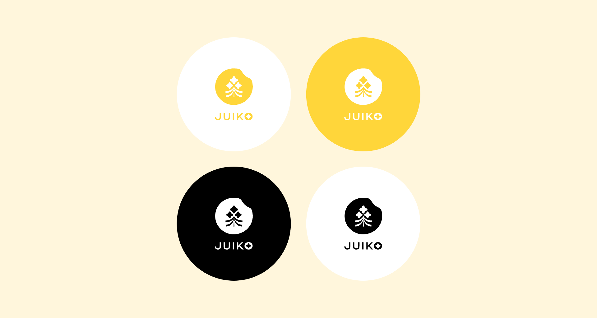
The primary logo mark for Juiko is a custom design that blends elements familiar to their products—exotic fruits. The shape of the logo is inspired by the Chinese character ‘果’ (meaning “fruit”), with the top part designed to represent drops of juice, evoking the refreshing taste of premium fruits. The initials “J” and “K” are subtly integrated at the bottom of the logo to add significance. The logo’s icon also symbolizes a gold coin, a nod to prosperity, and serves as a detailed greeting to Juiko’s customers, reinforcing a brand image that is both meaningful and visually clear.


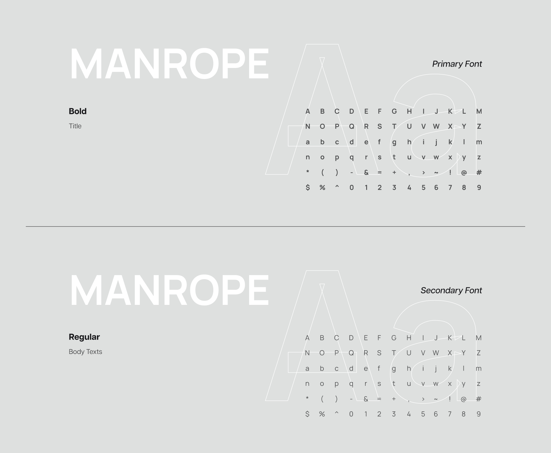

BRAND COLOURS & ELEMENTS
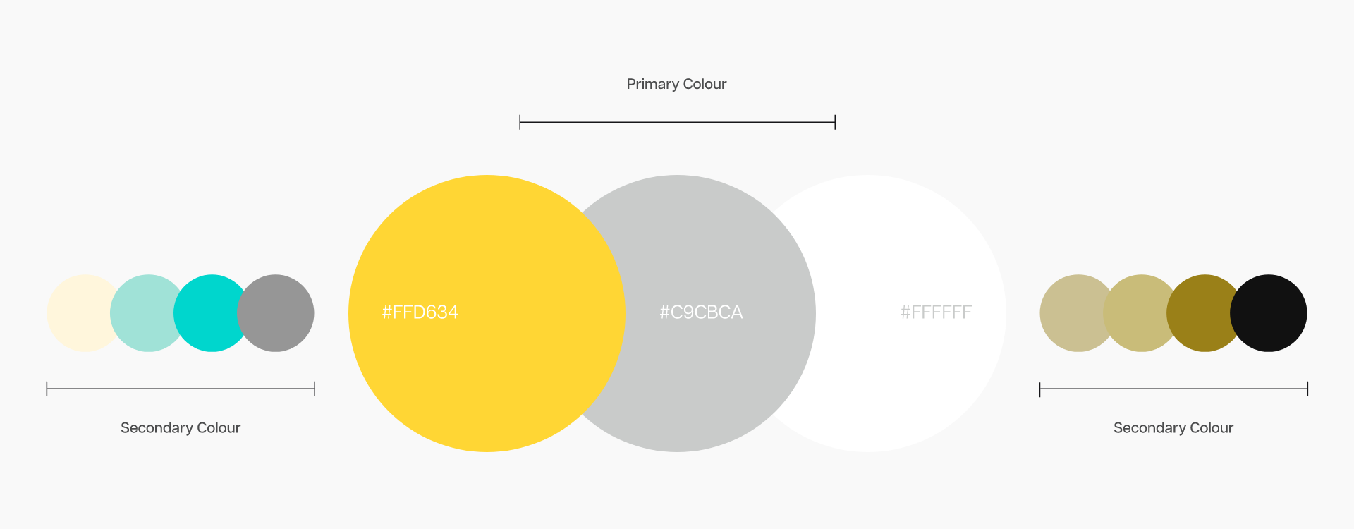
Juiko’s primary colors are yellow and white, carefully chosen to reflect the brand’s essence. Yellow is a color that naturally captures attention and conveys happiness, freshness, and positivity—qualities that align perfectly with the brand’s premium fruit offerings. White represents safety and simplicity, while gray adds a neutral, calming balance to the overall brand identity.


APPLICATIONS
Juiko’s product applications were designed with a down-to-earth, simple, and clean approach, reinforcing a local-friendly brand identity that resonates with their customers. With an established offline presence, Juiko needed an eCommerce platform to further their reach. The new eCommerce site allows Juiko to gather valuable customer behavior insights, enabling them to understand shopping habits and optimize their marketing strategies accordingly.
By implementing our marketing tools on the website, Juiko can identify where customers engage and where they might encounter obstacles in the purchasing process. This data-driven approach allows for precise marketing strategies that support revenue growth.
In addition to the eCommerce platform, social media plays a crucial role in Juiko’s marketing strategy. We created social media profiles to help Juiko connect with their customers, increase brand awareness, and drive traffic to their website, ultimately boosting leads and sales.
