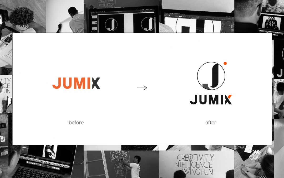
Jumix was founded by Sanz Teoh way back in 2014 – the year of Selfies, ice bucket challenge and Iphone 6!
Running a single-person startup wasn’t as easy as it seems. However, it took Sanz a few years to grow the company.
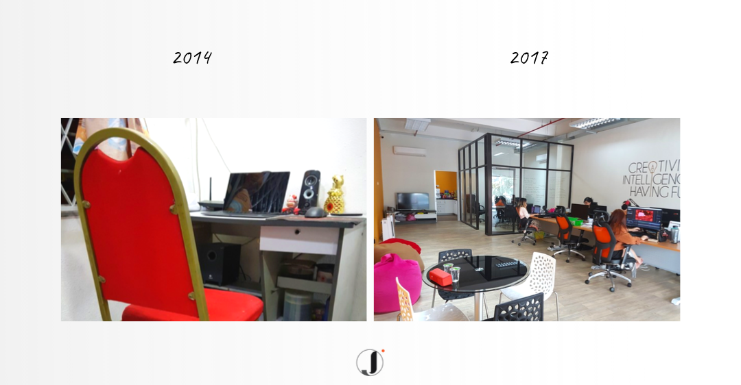
Just 2 years ago, Jumix grown into a great team of people and finally got a proper office. Hooray!
Before, the team in Jumix was always cautious of what works and what wouldn’t work in our business environment, causing us to create within the box.
We are a little too afraid to take a leap of faith.
Resulting us to neglect a big piece of expressing our true self.
Hence, in our brand-new representation of ourselves, we’ve created something totally new from before.
Incorporating a combination of our unique expressive selves into a minimal yet future oriented visual identity.
Take a look:
Companies evolve, and their branding should evolve with them too.
Jumix was no longer the new kid in town by the time we rebrand. We have helped hundreds of businesses deliver better user experiences to millions of end-users.
It was time for a fresh new look.
Ready?
Our Core Identity
‘What is Jumix?’
Before going into colours, styles and other stuff, we needed to know – who we were and what we want.
So what is our core identity? Which includes our brand attributes and values.
What is Jumix’s beating heart?
During Jumix’s rebrand, we wanted to ensure the core identity was the one thing that truly defined us, as individuals and as a whole.
Now, we are focused on achieving sustainable long-term success and creating a positive brand voice not only for us but for all our clients because success starts from people who believe in us.
Our Values
We are undeniably proud of the company culture we have at Jumix.
While we continue to invest in our core strengths as a team, we are also letting ourselves go as ambitious individuals.
As passionate millennials we support uniqueness.
With these values combined we manifest on bringing Jumix to greater heights, somewhere we can truly stand out and exhibit all that we have to create and add value for our clients.
Brand Attributes
Our values are the mottos that we endeavour to live by each day, while our brand attributes are the personality traits that we had like to be known for.
Our spirit fosters the sense of pride we have for who we are and where we are hustling towards.
It is what keeps us going and is essentially how we aspire to convey our brand throughout all channels.
We determined that Jumix is:
User-centric
This idea encourages us to strive beyond just profiting to ‘handcrafting’ every intricate detail our client needs.
Creative
We bring the right people and strategies to creatively solve our client challenges confidently.
Confident
We are smart and always motivated.
We innovate in meaningful ways that not only make our clients more successful but to constantly provide a better experience for their customers.
We call ourselves – The Maker of Brands.
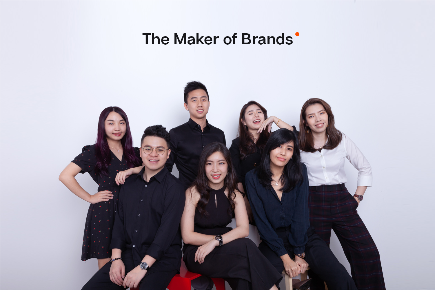
The maker
- Think global, unstoppable and outstanding
- Individualistic
- Maker of art, strategies and development
- Us
Of brands
- You
Style Attributes
We communicate in style. Whether it is through design, writing, or people.
In the new Jumix, we strive to be consistent and recognizable in style.
Here are the six styles we settled for that fits Jumix’s personality.
- Curve
- Space
- Minimal
- Bright
- Clean
- Clear
Curve and Space: Given that curves brings a point of difference to all things and spaces separate elements while still maintaining unity.
These two shows how Jumix intend to think out of the box while also being authentic and inspiring.
We obviously believe in less is more. That is why most of the icons and images we use are clean, minimal and modern.
While bright implies shining with light. We aspire to be noticeable and strong.
Once we had the most important part- Our Core Identity figured out, it was time for a bigger task!
The Jumix Logo
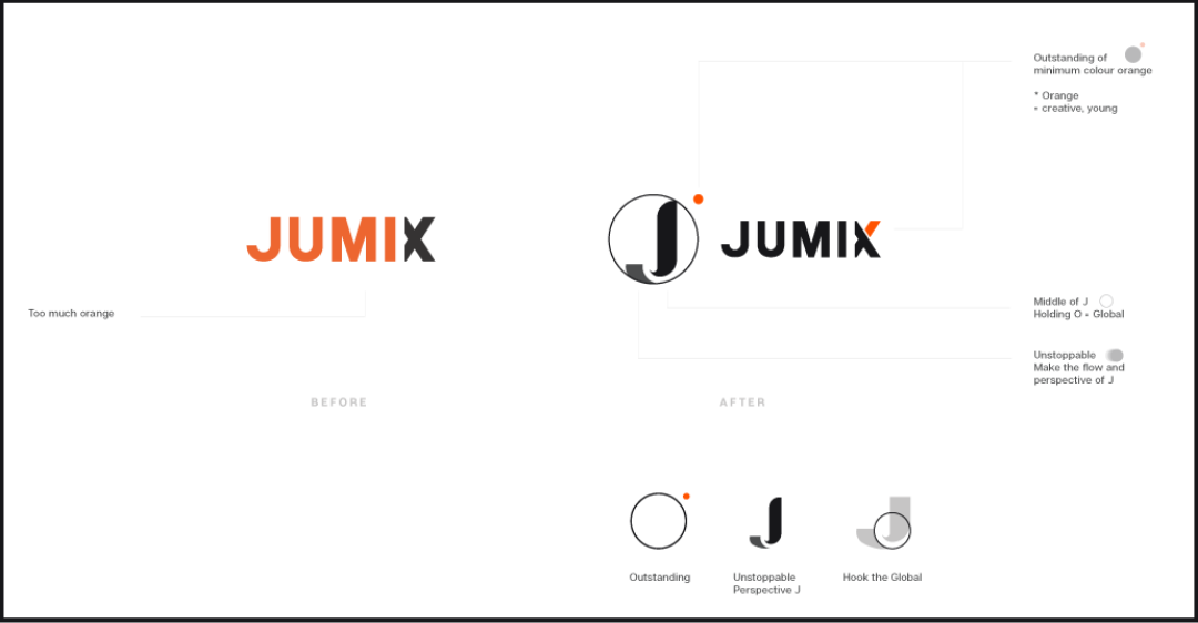
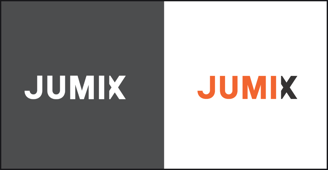
We started with a ‘?’ at first. We thought the old logo was too …. Rigid. Simple. BORING. And a little too orangy.
So, we gave it a makeover.
A tweak to the logo we already had.
Jun
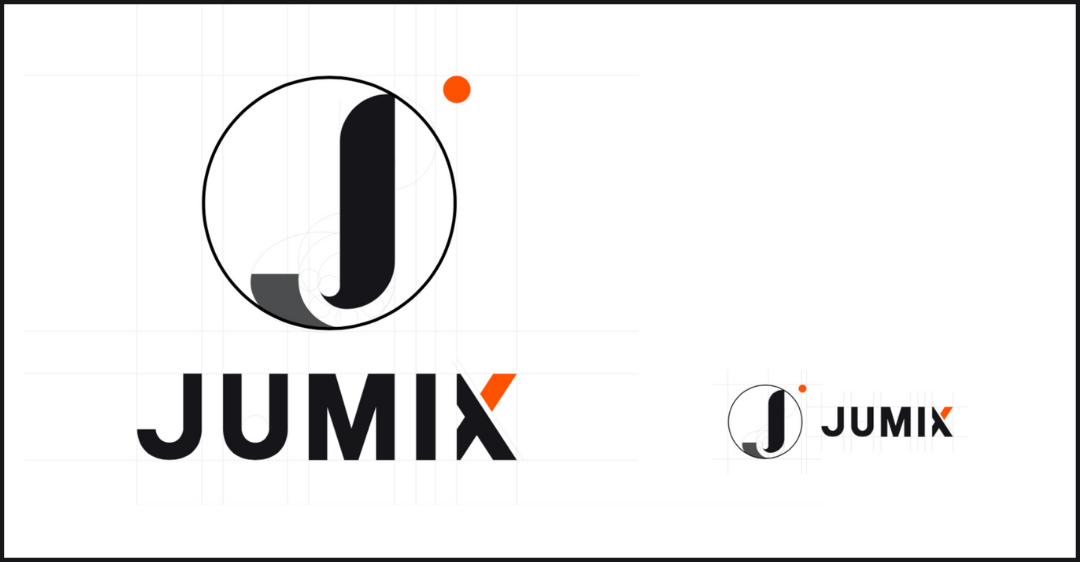
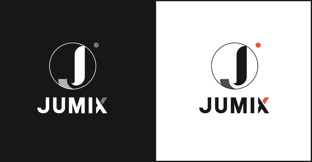
Introducing Jun. The new brand mark Jun we have created above the original ‘Jumix’ logo portrays the spirit of our unique identifiers as a creative, purposeful yet trustworthy individuals.
The alterations were subtle. Less orange, a bit of space there but the effect was to tell different perspectives.
Question: When you see the brand mark, what do you see?
Some say a ladle. Some say, just a brand mark with no meaning.
Some sees the alphabet “J”, some sees 2 shapes put together.
Now, we all see things differently. Isn’t it?
Here is what the brand mark is about:
The shapes in the circle is actually a ‘J‘ that represents Jumix while the orange dot represents ‘us’- The Maker out of the box. We strive to think, create and make differently, that stands out from the crowd.
Our Brand Colours
We figured there is NO perfect colour.
Which is why there isn’t any new-NEW colour.
We realized that we have used too much of the orange in the first place as it was the primary colour.
The new primary colour we have settled for would be non-other than the colour white.
Sounds boring? True. We picked the colour white as it conveys simplicity and bright which matches our style.
While we may need to team up with other colours to give the whole style a crisp look, to not look boring as it may sound, we came out with a few secondary colours.
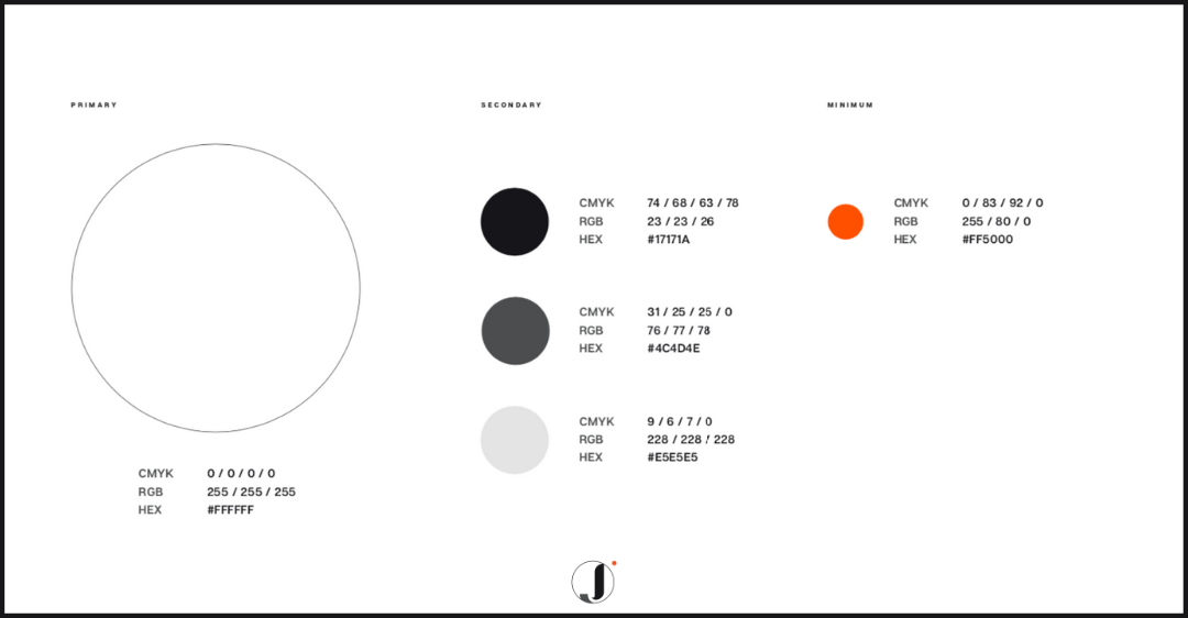
And of course, we are keeping the orange. Somehow ‘orange’ just felt more like Jumix.
But it is going to be ‘just a touch’ you know, salt bae kinda thing?

We wanted to pursue a consistent brand colouring to build a strong brand identity. Therefore, just the 5 solid colours.
Our Website
During this time, we decided to revamp our website too! Visit here.
As it is a 180° change, we have made it into a more functional, interactive yet aesthetically pleasing website.
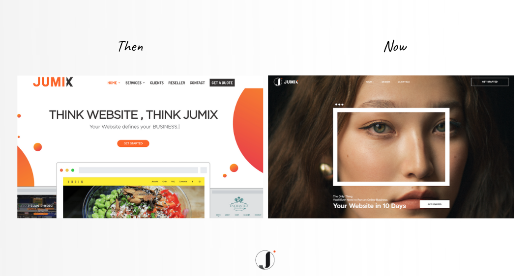
Check out our newly redesigned website!
Hold up, that is not all.
We also did a refresh on our office layout. I mean, brands affect both clients and employees, so too can office achieve the same effect.
Earlier on, we did not put much effort into our office space as we didn’t think it was important to create a happy work culture.
We then realized we should not only consider conveying Jumix’s core values through online but also our physical office space.
So here it is,
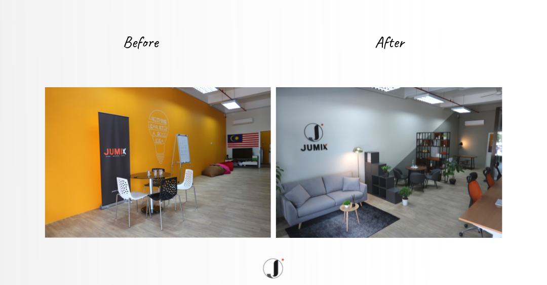
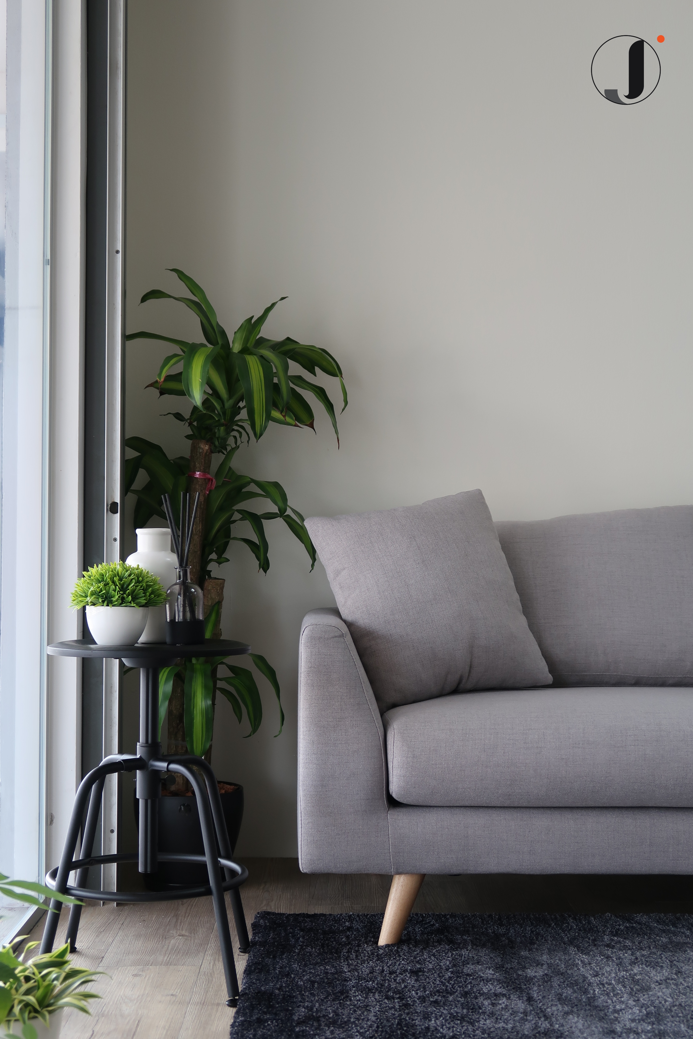
The new space is a lot more warm, cosy and full of positive vibes! Loving it!
What is going to happen next?
Over the next few months, you will see all the other visuals around Jumix aligning around this new direction: on the website, in advertising, and in some places in the services we provide (though not in a way that will keep you from the important business of getting things done, of course).
We are still Jumix. But more consistent and, we hope, more instantly recognizable.
Also, check our social media (Facebook & Instagram) because we are super active there! Daily updates and a chance to get a free website. Who knows right?
Note: This rebrand would not have been possible without the help of the entire Jumix team, especially the creative design team, passionate web developer and the ambitious marketing and sales team.
Sanz Teoh
Latest posts by Sanz Teoh (see all)
- 10 Questions to Ask Before Hiring a Web Page Designer Near You - October 23, 2025
- The Cost of Search Engine Marketing in Malaysia: What Business Owners Should Budget (2026 Guide) - October 12, 2025
- Malaysia eCommerce Company Guide: How to Start and Scale Your Online Business (2026 Edition) - September 30, 2025

