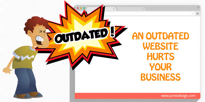
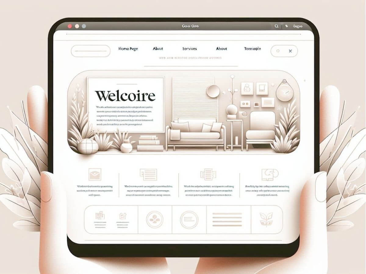
Websites, blogs and web portals, as they bind to internet technology, are evolving consistently. Website design is not timeless, it’s the same as your smartphone, it gets outdated after some time when there are tons of new features available.
What are the bad things about outdated website design? It shows that your business is outdated as well, and old. Remember how we talked about your website represent your business profile and image? That’s why!
Examples of What Makes a Bad Website in Malaysia
If you’ve ever stumbled upon a website that leaves you feeling more confused than when you arrived, you’re not alone. In Malaysia, as elsewhere, bad websites can be spotted by several glaring signs. It’s like walking into a store and finding everything in disarray; it just feels off.
So, what makes a bad website? Look for the clues below.
1. The website is designed about 3-5 years ago

Is your website designed 3-5 years ago or more? Then your website is most probably outdated by now, or at least when we hit 2024. The basic HTML that we used in designing website is now in version 5, so if your website is designed 5 years ago, it is stuck in HTML4.
It does matter because browsers are constantly updating as well, your website may not display properly or optimized when new version of browsers are rolling out.
On top of that, your visitors may already have gotten bored of your old design,, it is time to put on a new clothes for your website.
2. Complicated design / Low quality design / Tons of tables
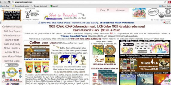
Old and outdated websites are mostly constructed by tons of tables and your website look complicated. Browsing through the Internet today, have you realized how websites are now slimming down? Simple and clean design is the new trend.
Your visitors hate to spend more than 5 seconds to find a button or navigate from one page to another, so a simpler website makes so much sense now.
3. Website traffic is dropping
If you have installed Google Analytics or any other web traffic analytic tools in your website and realized that your visitors’ number have dropped, this is a hint that your website is outdated.
One of the main thing you can check is the bounce rate. A low quality and outdated web design will have a high bounce rate, because people are disgusted by poor website design. Once they have a glance of website with old design and chunky content, they leave straight away.
4. Not mobile friendly
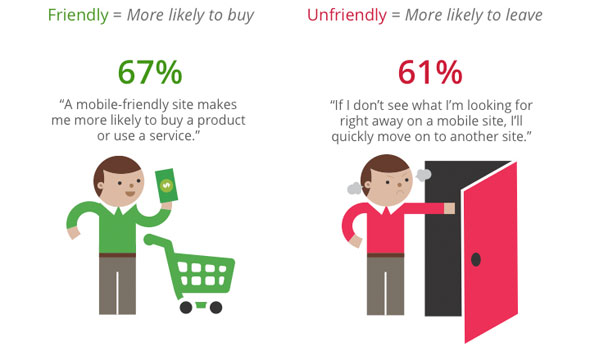
Your website is unable to render properly in mobile devices or there is no mobile version of your website. How many people are browsing the web with their smartphones and tablets these days?
Imagine when you are out meeting with customers and they ask for more information or want to take a look at your website. They then browse your website with their smartphone but just to be disgusted by how poor your website is designed. Shame, isn’t it?
We have reached 2024, there is no reason that your website is not mobile friendly or non-responsive.
Read more: How to Make Website Responsive.
5. Fancy flash content

So much flash, such Wow. Excuse the meme, but having fancy flash content on your home page is just so OUTDATED.
We can go on and talk about how bad it is to have flash content on your home page, about how it slows down your load time, non SEO friendly, mobile browsers incompatibility but we will stop here now before we go on and write another 2,000 words in this post.
A flash content that slaps on your home page is a big clue of your website is outdated. The insecurity of flash content has made some browsers dropped the support, so your website will display at all in some browsers, especially in Apple iDevices.
6. Slow loading speed
Imagine this: you’re in a hurry, trying to find information quickly online. You click on a link, anticipating swift access. But instead, you’re watching the seconds tick away as the page sluggishly loads. It’s beyond frustrating; it tests your patience and often leads you to abandon the site altogether.
Slow loading speeds are a major deterrent for users, contributing to high bounce rates – that’s when visitors leave your site before exploring what you have to offer.
In today’s fast-paced digital world, where instant gratification is almost the norm, websites need to keep up. Ensuring your site is optimized for speed not only keeps potential customers engaged but also helps with search engine rankings.
7. Small text
Have you ever stumbled upon a website where the text appears so tiny or crammed together that making sense of it feels like deciphering an ancient script?
This isn’t just an inconvenience; it strains your eyes and dampens your enthusiasm for engaging with the content, no matter how compelling it might be. A well-designed website considers ease of reading as paramount.
This includes using legible font sizes and appropriate spacing to guide readers through their content fluidly. Remember, if accessing the information becomes an effort in itself, users will likely move on rather than struggle through.
8. Background music
Moving on to another aspect that can catch any visitor off guard – automatic background music or videos that start playing upon entering a site.
Sure, the intention might be to create an immersive experience or set a certain mood but think about it: how often have you been startled by sudden noises from your computer or rushed to mute tabs because something started playing unexpectedly?
Rather than enhancing user experience, unsolicited audio can be intrusive and annoying, prompting users to leave the site post-haste.
If incorporating audio elements is crucial for your brand or message, consider giving visitors control by allowing them to opt-in rather than bombarding them with sounds as soon as they arrive.
9. Overwhelming visuals and cluttered interface
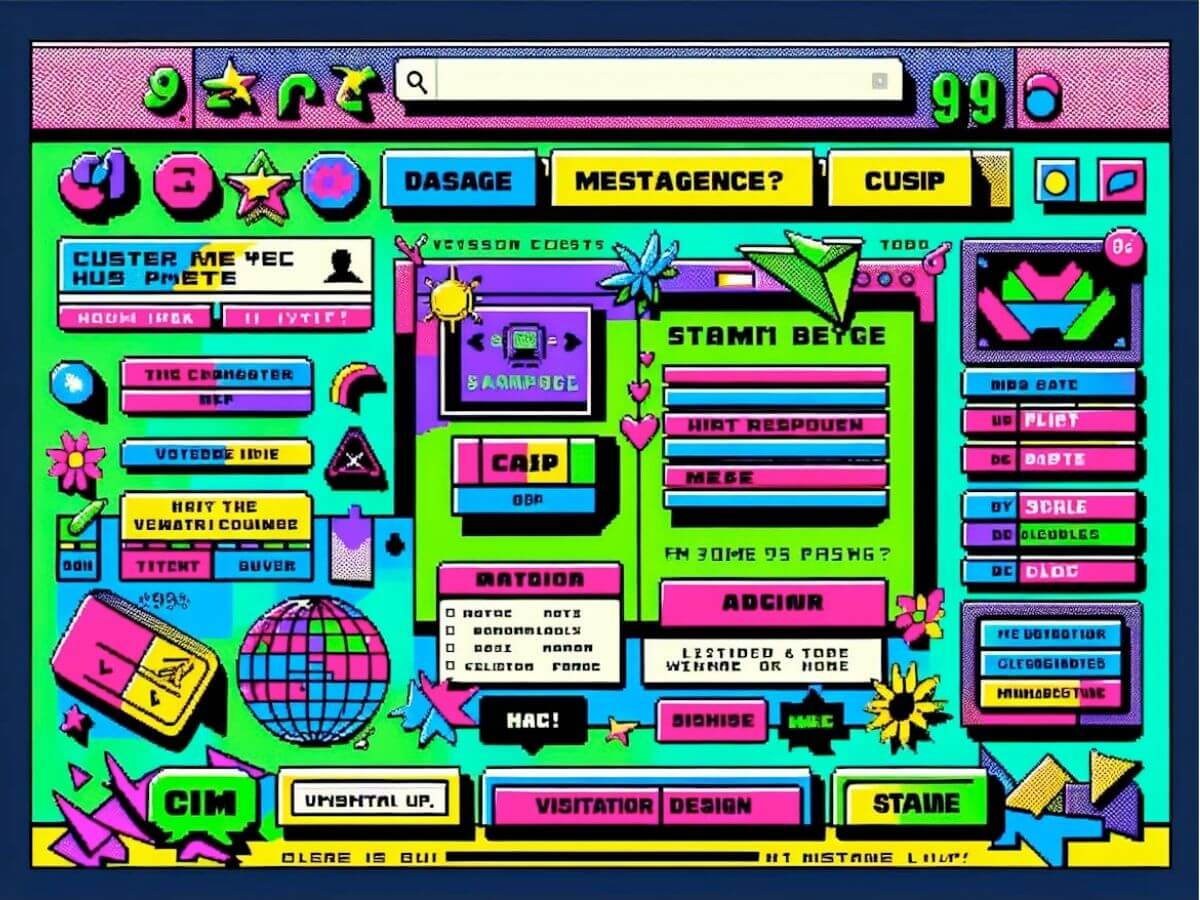
Not to mention, websites crammed with blazing colors and animations, it feels like stepping into a virtual fireworks display.
This kind of overwhelming visual experience, where every inch of the screen fights for your attention, can make visitors want to turn around and leave before they’ve even gotten to know what you’re offering.
It’s not just about being flashy; a cluttered interface makes it hard for users to navigate or find what they need, turning what should be a simple task into an online equivalent of searching for a needle in a haystack.
Read more: Why Is Color Scheme Important.
10. Pop-up windows
Remember pop-up windows that appear out of nowhere, begging you to subscribe before you’ve even seen what the site offers? Annoying isn’t strong enough a word!
Before you’ve even had a chance to decide if you like the site or not! This tactic is more likely to frustrate visitors than engage them. A vibrant call-to-action (CTA) is one thing, but bombarding people with requests the moment they land on your page is quite another.
It disrupts the user experience and can feel like walking into a store only to be immediately accosted by overly eager salespeople.
11. Generic stock photos

Then there’s an issue that might not seem as glaring but has a subtle impact – the use of generic stock photos. Sure, these images are convenient and often budget-friendly, but if they’re too bland or irrelevant, they could detract from your site’s authenticity.
Users crave genuine connections and engaging experiences when they visit your website. Overly generic or cliché photographs don’t tell your unique story; instead, they make your brand appear unoriginal or insincere.
Investing time in selecting meaningful imagery or even producing custom photos can make all the difference in setting your site apart from competitors and building trust with visitors.
How can I fix a bad website?
A great website should be like a well-organized book – easy to navigate, inviting to readers, and rich in content. Avoiding these mistakes not only enhances user experience but also ensures your website won’t be sectioned off as another example of what not to do in Malaysia’s bustling internet scene.
Read more: How Does Website Design Affect Sales.
First impression is very important but I guess you already know that. Update your website design in order to attract even more visitors and customers today!


Comments are closed for this article!