

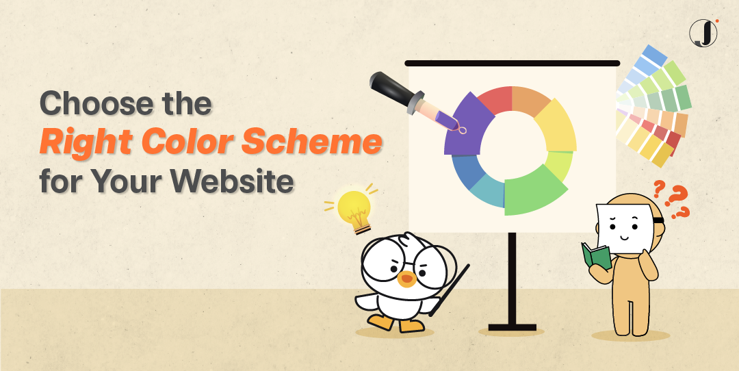
In this digital age, a website is one of the most important platforms where you connect with your audience, and the colour scheme of a website plays a vital role in creating a visually appealing and engaging user experience. One element that can make or break your website’s success is the colour scheme. Choosing the right colour scheme requires a careful understanding of colour theory, the psychology of colours, and considerations specific to your website’s design. It sets the vibe, stirs emotions, and screams your brand’s identity. So, let’s dive into how you can choose the perfect colour scheme for your website design and dominate the game.
Why is Colour Scheme important on a Website?
Understanding why is colour scheme important on a website can impact user experience, accessibility, and usability, which in turn can influence the site’s effectiveness in communicating its message and achieving its goals.
Creating First Impressions
Believe it or not, the colour scheme of your website forms an undeniable part of that crucial first impression. Visitors usually gauge a site within only a few seconds of landing. The colours you choose can either engage them or turn them away. If your site appears visually appealing with harmonious colours, there’s a higher chance viewers will stick around.
User Experience
And let’s not forget about user experience – an essential factor in determining how long visitors stay on your site or how likely they are to return. Skilful application of colour directs users’ eyes towards important content.
Contrast offers easy visibility and differentiation between elements, making navigation simpler. An appropriate colour scheme could even contribute towards reduced eye strain during prolonged usage. Ultimately, mindful colour choice positively influences user engagement and interaction levels.
Mastering Colour Theory Like a Boss

Before diving into the process of selecting a colour scheme, it’s essential to understand the basics of colour theory.
Colours are categorised into three main groups: primary, secondary, and tertiary.
They’re the building blocks of your colour scheme, the secret sauce to your design domination.
Primary Colours: The Foundation
Red, blue, and yellow – the superheroes of the colour wheel. They form the foundation for colour schemes and can be combined to create a wide range of hues.
Secondary Colours: Unleash the Beast
Orange, green, and purple – the fierce sidekicks of the colour party. Mixing them up, and they’ll take your colour scheme to the next level. These colours add depth and variety to a colour scheme.
Tertiary Colours: The Magic Blend
Tertiary colours are formed by mixing a primary colour with a neighbouring secondary colour. For example, red-orange or blue-green. Tertiary colours provide even more versatility when designing a colour scheme.

Colour Combination
Here are 3 types of colour combination tactics you can use.
- Analogous colours are adjacent to each other on the colour wheel. This combination creates a harmonious and unified look. For example, shades of blue and green can be used together to create a calming effect.
- Complementary colours are opposite each other on the colour wheel. This combination creates a high contrast and can be visually striking. For instance, pairing yellow with purple can create an eye-catching effect.
- Monochromatic colours involve using different shades and tints of a single colour. This combination creates a sophisticated and elegant look. It offers versatility while maintaining a cohesive appearance.
Now you know the basics, let’s explore further onto the psychology of colours.
The Psychology of Colours: Mind Control 101

Colours can mess with your mind. Colours have a psychological impact on people, evoking specific emotions and associations. Understanding the psychology of colours can help you choose the right colours that align with your brand’s message and target audience. For instance, blue is often associated with trust and reliability, while red can evoke passion and urgency. Time to tap into the psychology of colours and get into your visitors’ heads.
When selecting a colour scheme for your website, several factors should be taken into account to ensure it resonates with your brand and audience.
1. Brand Identity
Your colour scheme should align with your brand’s identity and values. Consider your brand’s personality and the emotions you want to evoke. For example, a healthcare website might opt for calming and trustworthy colours like blues and greens, while a fashion brand might choose bold and vibrant colours.
You may not want to simply start a website without a well defined brand identity and branding guide.
2. Target Audience
Know your audience like the back of your hand. Different demographics vibe with different colours. For example, younger audiences might appreciate vibrant and energetic colours, while older demographics may prefer more muted tones.
3. Emotional Response

Colours are emotion magnets.
Think about the emotions you want to evoke in your website visitors.
Reds and oranges ignite excitement and urgency, while blues and greens bring the chill.
Tap into those emotions and create a connection with your visitors.
Tools for Choosing Colour Schemes
As much as these tools are helpful in helping you choose a colour scheme for your website, keep it mind that the colours should be coherent with your brand identity.
Getting the branding process done by an expert team will always be better than only relying on these tools.
With that said, here are some online tools that you can use to get inspiration, generate complementary colours, and offer previews of how the colours will look together.
Tips for Choosing the Right Colour Schemes
Here are some additional tips to help you select the perfect colour scheme for your website:
- Keep it simple. Avoid using too many colours that may overwhelm visitors. Less is more.
- Consider accessibility: Ensure your colour scheme meets accessibility standards for individuals with visual impairments. Website accessibility has become an important thing since 2023.
- Test on different screens: Colours can appear differently on various devices, so make sure your colour scheme looks good on mobile, tablets, and desktops. Eg. Samsung devices are known for oversaturation of colours, while some lower-end devices might make your colours look dull. So consider these factors and make your decision.
Boom! You’ve reached the finish line!

P/S: Choosing the right colour scheme is your secret weapon to a killer website.
Embrace colour theory, tap into the psychology of colours, and rock your brand identity and target audience.
Crush it with your colour scheme game!
FAQs
How many colours should I use in my colour scheme?
It’s best to limit your colour scheme to 3-5 colours to maintain consistency and harmony. Remember, less is more.
Can I change my colour scheme later?
Yes, you can always update your colour scheme to refresh your website’s look or align it with rebranding efforts.
Are there any colour schemes that work universally?
While some colour combinations are generally pleasing to the eye, it’s important to consider your brand identity and target audience for the best results.
Should I consider cultural associations with colours?
Yes, different cultures may have specific associations with colours, so it’s essential to research and understand your target audience’s cultural context.
How can I ensure my colour scheme is accessible?
Use colour contrast tools to ensure readability and accessibility standards are met, especially for individuals with visual impairments.
Can you help with my brand’s colour scheme?
Yes, creating the best colour scheme for your brand and website is part of our branding service.
Crafting the Ideal Colour Scheme for Your Website
Ultimately, selecting the appropriate colour scheme for your website is of paramount importance. It not only significantly impacts user experience but also dictates your branding’s perception. So, if you strive to keep your audience engaged and induce positive sentiment towards your brand, start by choosing a suitable colour palette.
Here’s where Jumix Design comes into play. As a leading web design company in Malaysia, we value understanding our client’s requirements before translating them into functional yet aesthetically pleasing platforms. We strongly believe that effective web design extends beyond visuals; it plays a role in user engagement, site navigation ease, and ultimately conversions.
So why wait? Start with us today for a winning blend of style and substance in your colour scheme choice because your website deserves nothing less than the best.


Comments are closed for this article!