Are you experiencing lack of website traffic? Which also means you are not generating sales. If so, everything here is for you.
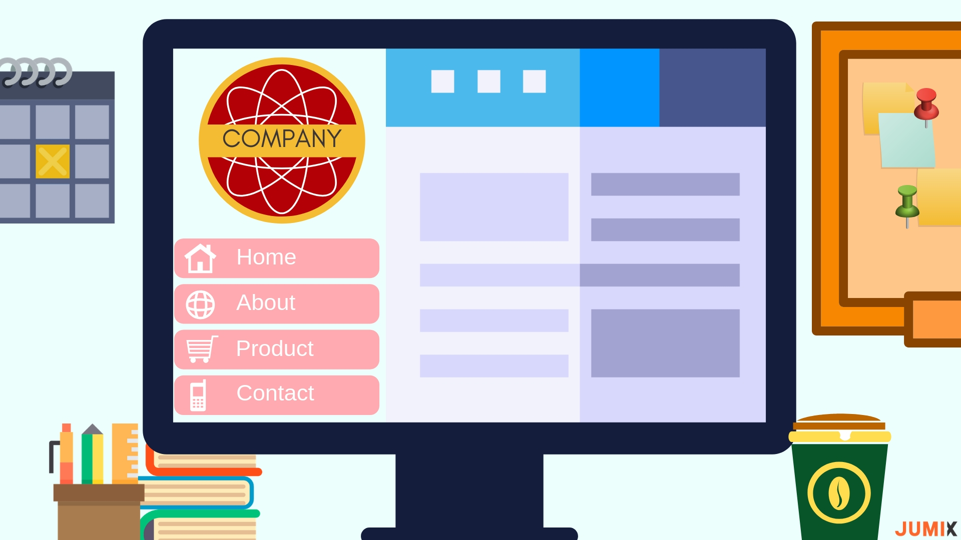
A website’s visual design is often disregarded as an abundant aspect for some. It is viewed as the end-goal of a website. If the design is good, then that’s fine. If it’s ugly, then it’s not too bad.
This is a misconception.
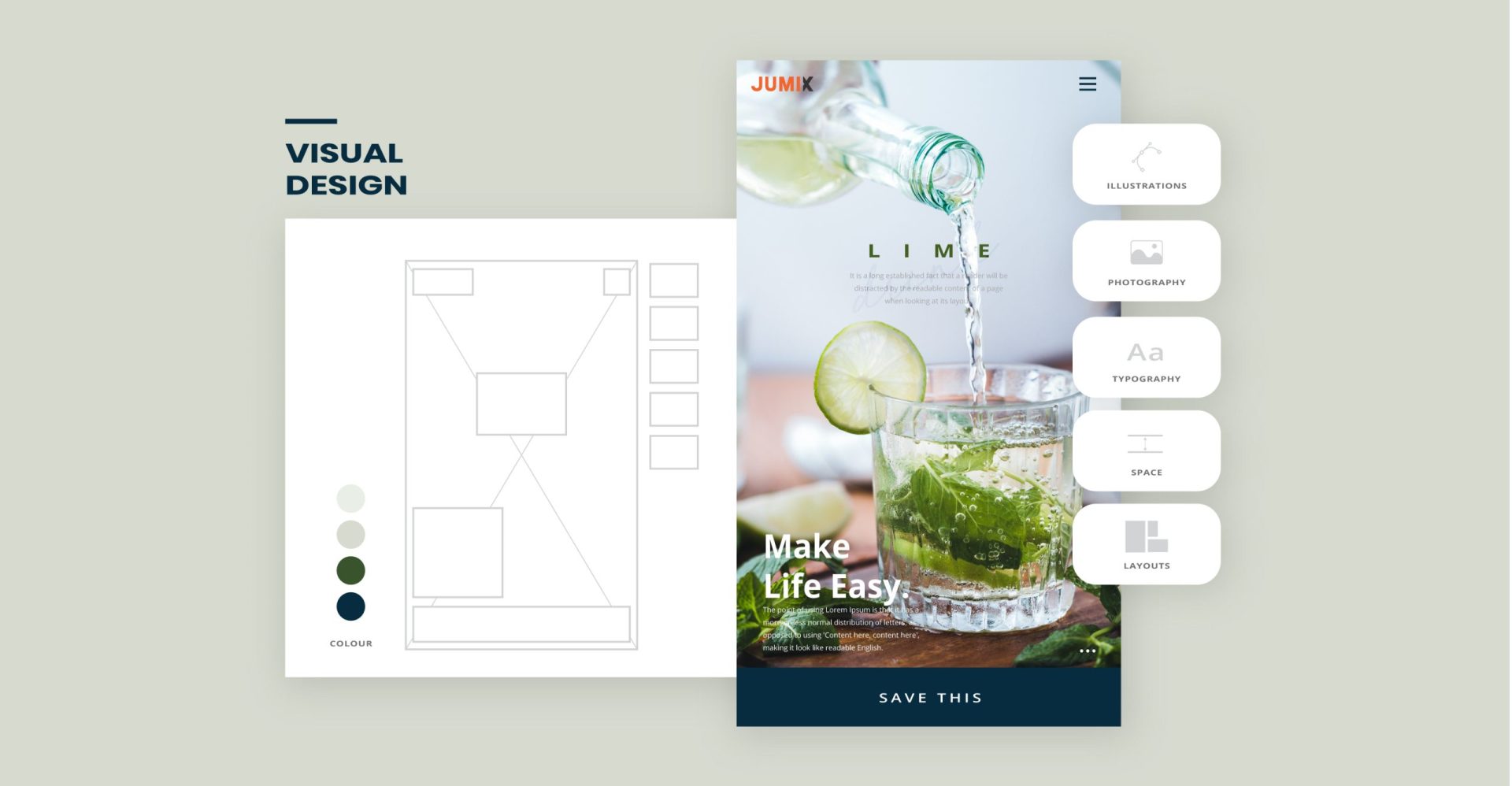
There is a lot more to visual design, it allows the brand to communicate through positioning illustrations, photography, significant font, persuasive yet inspiring colour, comforting spacing, a phrase or wording etc.
Visual design does play a big part in establishing brand affinity with your website visitors.
The Role of Visual Design
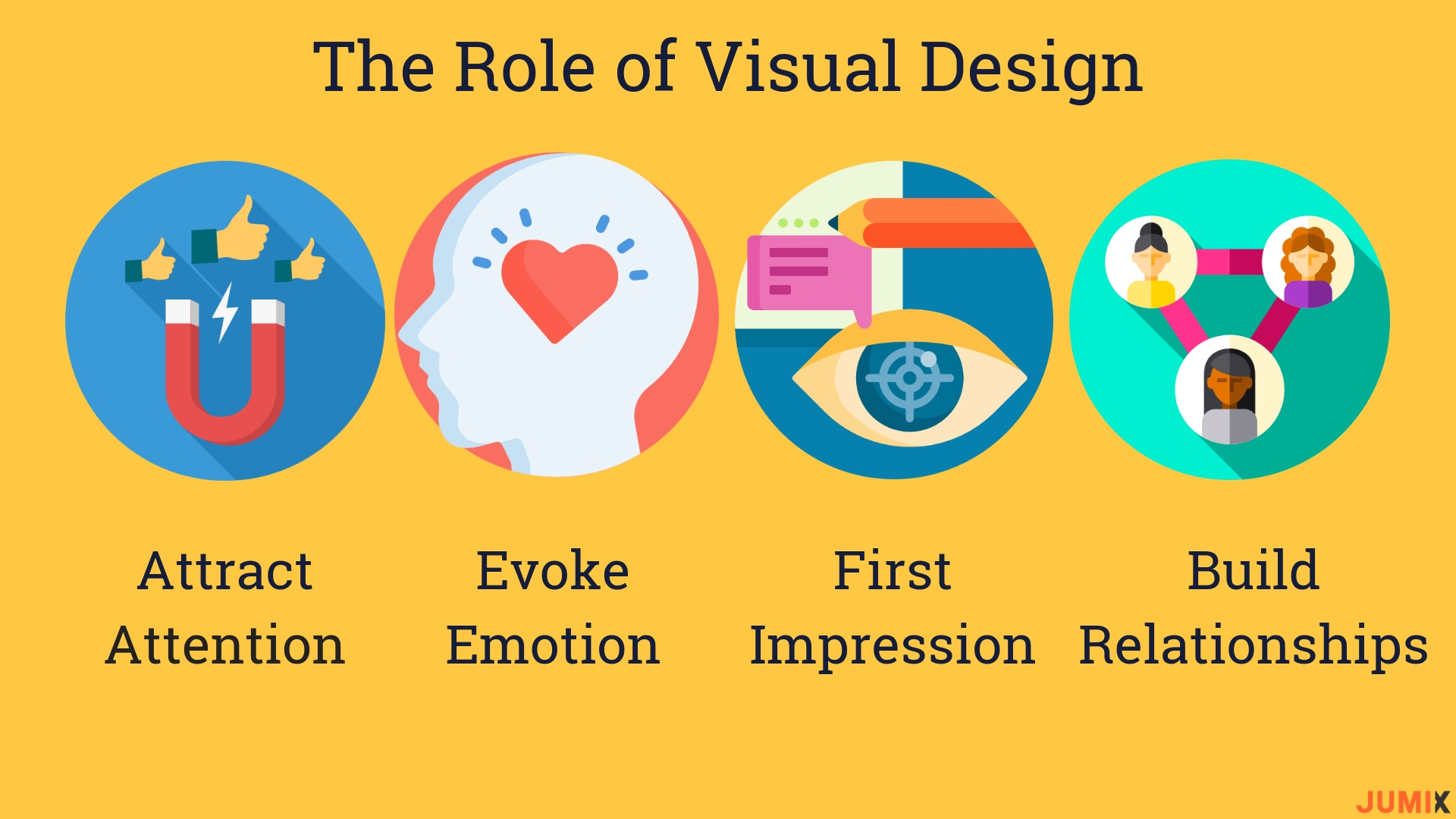
1. Attract Attention
It is no doubt that your website and in fact, your entire digital presence matters more than you think. The objective is to learn about your brand, products or services that you offer, so it is important that you grasp how to capture and hold website visitors’ attention in that few seconds right after they clicked into your website.
Visual design attracts attention and when you can sustain the visitors’ attention, there is a high chance they will convert. There is no doubt you would want your visitors to browse your website and follow the flow towards an action (call up, email or even purchase).
2. Evoke Emotion
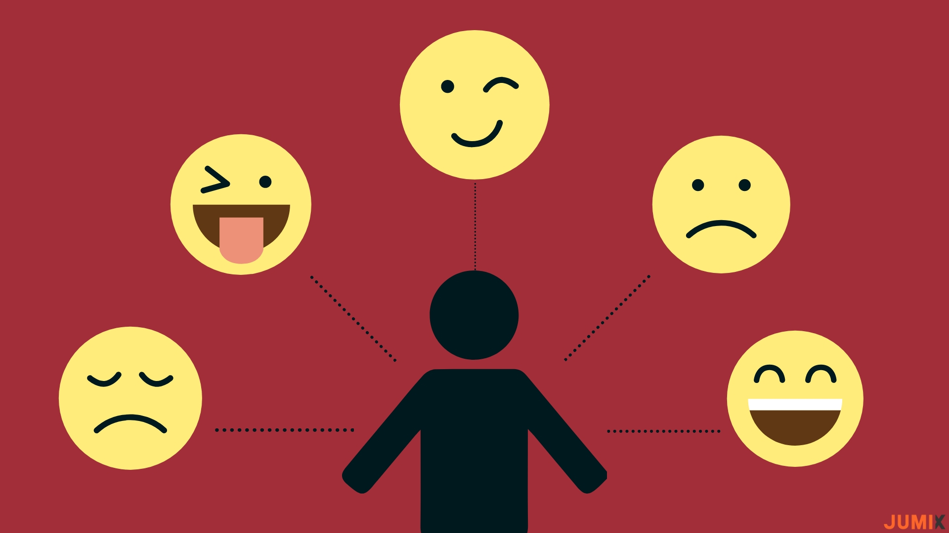 There is a saying ‘A picture paints a thousand words.’ Same goes to the digital space. This is exceptionally relevant when it comes to communicating on a more emotional level.
Businesses can convey their brand culture, feelings such as delight, fun and sad through visual elements. When your website’s visual design is appealing, it can evoke memories and emotions of visitors like trust, comfort and hope.
For example, if your company is selling sportswear, using keywords like strength, determination and achievement can help to enhance the emotion of the visitors. This will ultimately lead to purchase.
3. Create great first impression
People make quick judgments when they first meet a person, and websites are no different. It takes less than 80 milliseconds for visitors to scan your website and make a judgement on whether they like your website or not.
First impression can affect relationships in the long term, if you feel comfortable browsing the website, chances are you will go back and potentially take an action. For instance, a digital marketing company should have a creative and good visual design upfront to present themselves as a professional and creative group of people.
4. Build Relationships
Be surprise that visual design is actually a gateway to building relationships and by relationships, I mean long-term customer relationship. Every business expects incoming website traffic to be as consistent as possible. But how?
That is, designing for trust as trust is a key component of user loyalty. How an overall website looks may impact how visitors feel about it and whether they want to take a step forward from casual visitor to brand loyalist.
However, we all know that the digital space is full of scams, fraudulent schemes and identity theft. It may take some time, patience and effort to establish trust among visitors.
A website appeals to visitors strongly affects how they perceive it, how they use it and how they remember it. I have also put together what are the tricks to start using in website visual design to gain better traffic and converts.
4 tricks to start using in website visual design.
1. Pick your typography
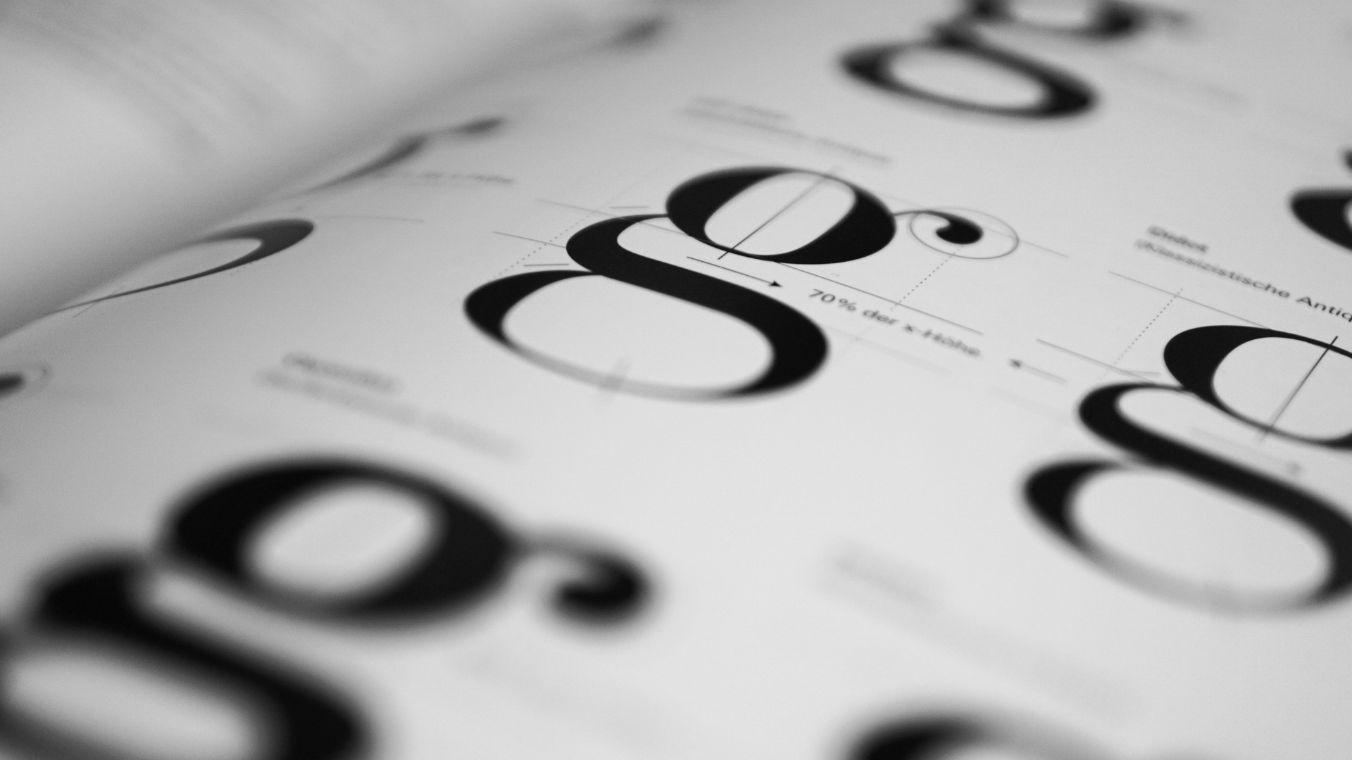
One particular area of visual design that might provoke disruptive opinion of any individual would be fonts and typography. Typography is the text’s tone of voice. It is not just about your content, how your words look like have to look right as well. There are thousands of different typefaces to choose from, so picking the perfect one that speaks your brand and company purpose may be tough, but it all comes down to picking a font that is easy to read, clear and fun. Also, I would recommend using less than three different typefaces in a website to avoid messiness and be sure it is consistent when using!
2. Pick your colour theme
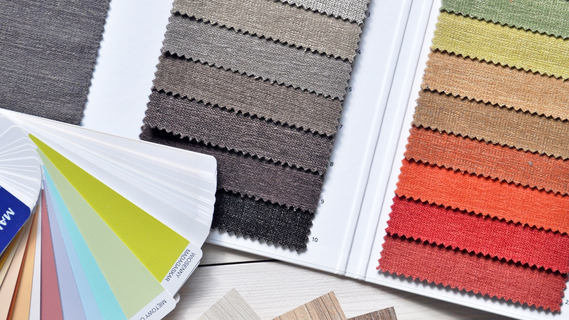
What is next? While you are exploring with typefaces, I suggest that you can also start looking for colours that will be used in the interface, backgrounds and of course, text. I am sure there will be hesitation when picking a set of colours for your website. Fret not, I have created a few palettes which can be used for any websites. Go ahead and check them out!
Palette 1 (Warm tone)

Palette 2 (Light tone)

Palette 3 (Dark tone)

Palette 4 (General tone)

3. Pick your layout
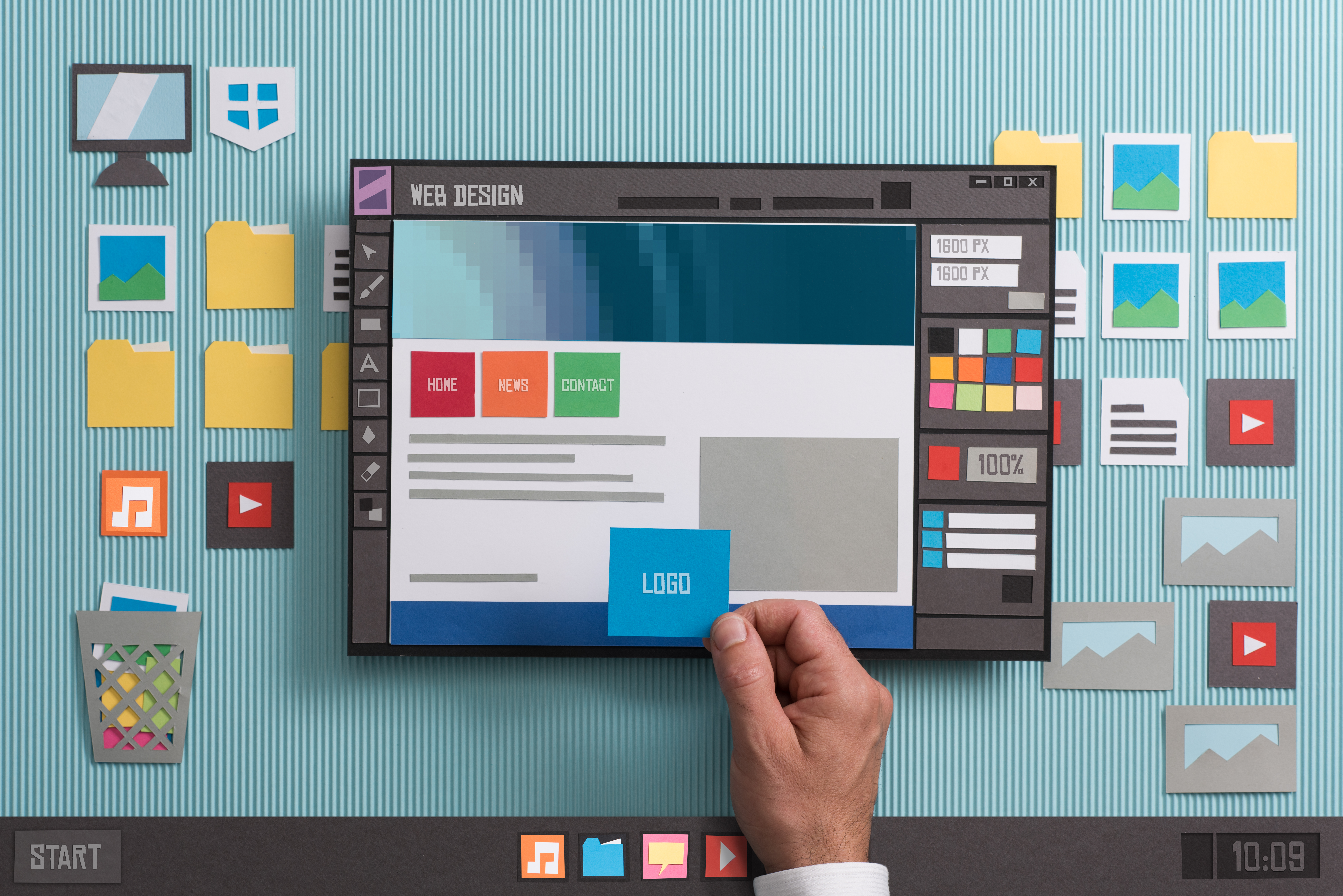
Simplicity is key. The simpler the structure of the website, the easier it is for visitors to navigate and feel comfortable browsing. Every section of your website needs to tell a story where there is a reason and a final result for the visitor.
The website layout should help the content to highlight the important bits of the story. For example, for a clothing company, the story may go ‘Supima cotton’ ‘Everyday wear’.
The reason ‘affordable, soft and comfortable material’ and final result would be what can visitors do here, -the call to action.
4. Pick your own style
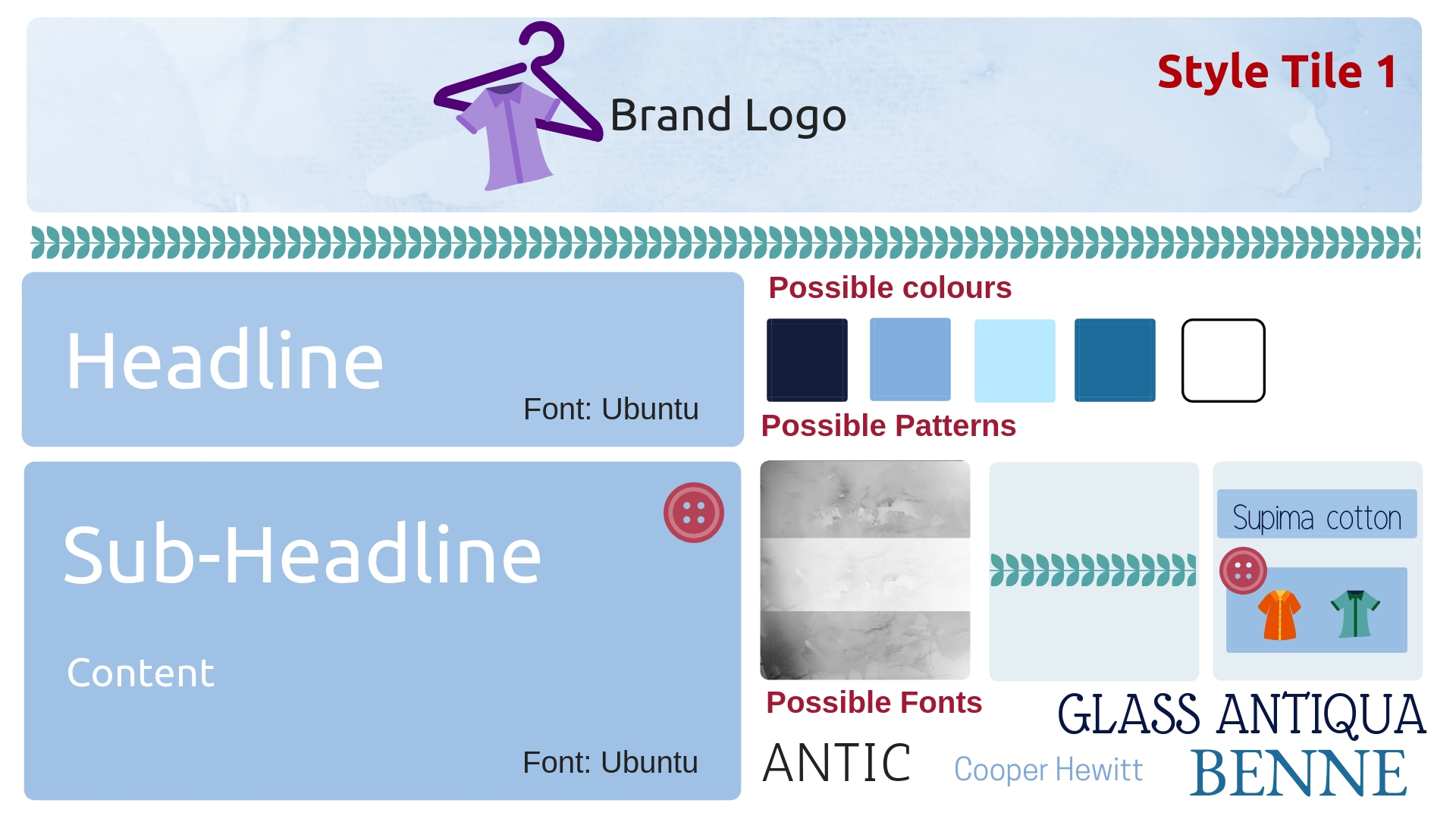
First step to finding your own style, the idea of your whole website is to create a style tile (a collection of visual components used for constructing a design) and put together a list of words or phrases, colour themes and images, you associate with your brand.
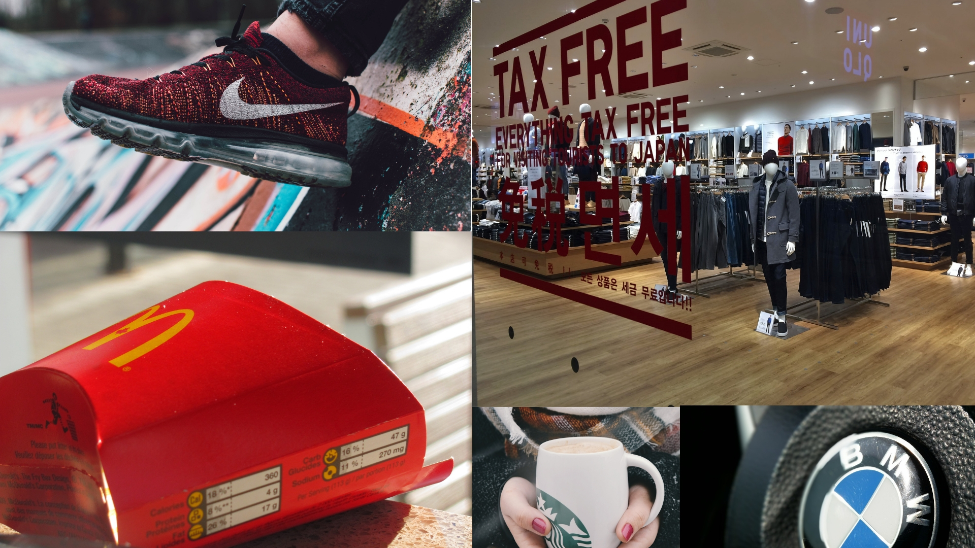
Then you should be able to focus on the immediate feelings or emotions the brand stirs up. Think going to places like Nike, Uniqlo and McDonald’s that are in different countries where you don’t speak the language, but you had known immediately where you were because you had recognised the brands’ typography, graphic design and colours. A website’s design should evoke this same brand recognition.
YES, visual appeal matters.
Take my best advice, do not save money on design. Every visitor may have their own perceptions of what makes a good website design because it is partially in the eye of the beholder, but by using basic design concept, getting clear on the usability and thinking about company brand goals, it is possible for you to create a website that not only looks good but works well for visitors where you can turn each and every one of them into customers.
Now, you know what to do after getting all the tricks! Or…
You are still confused about the whole designing thing. No worries, we are able to help you with creating your ideal website. All you need is just give us a holla!
Get your ideal website by using Jumix’s web design service. Click here.



Comments are closed for this article!