‘Out with the old, in with the new’ we often say to ourselves for our personal growth, and this also applies in the business world too.
Over time, a brand can become out-of-date. That is when you know when a rebranding is due. Even well known companies such as Apple rebranded 5 times, Nike 5 times and Pepsi 11 times.
Rebranding usually happens when a company business decides to go for a change in their significant element of its brand identity. It involves more than making a few changes in brand name or logo design, it requires efforts in making significant changes to your company value and developing new, better strategies that will enrich your business and create communication between you and your audience.
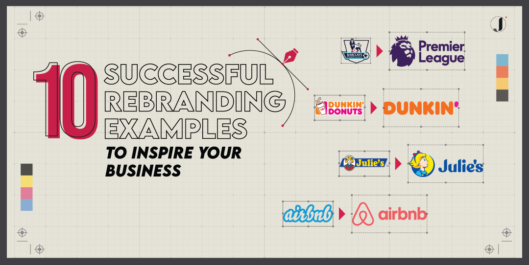
If you are looking for rebranding inspiration, we have rounded up 10 successful companies rebranding stories that could inspire you to make these positive and beneficial changes to your company.
When Instagram quietly unveiled their new logo in 2016, the Instagram world lost their minds. As for my addiction to using the app, I had difficulty in searching the app and thought I accidentally removed it from my phone, but that was not true.
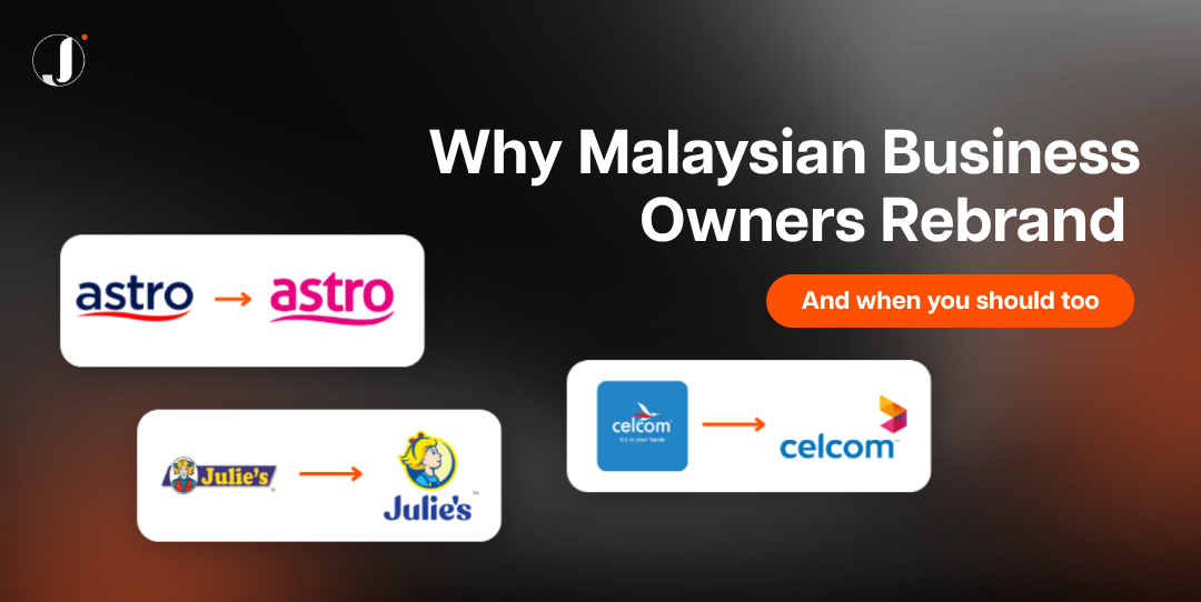
Instagram has swapped out its iconic old school Polaroid-style camera logo for a new logo change, featuring an ombre modern camera to emphasise the ‘less is more’ trend which correlates with their aims for user experience. An easy logo for an easy-to-use app.
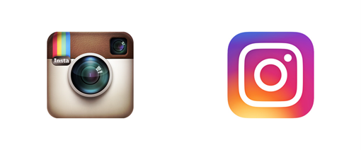
Instagram is no longer a simple photo-sharing app anymore. The brand decided to rebrand not only redesigned their icons but also for its own suite of sub-brands – Layouts, Boomerang and Hyperlapse.
As you can tell from below, the entire suite of brands has been unified to have the same brand identity.
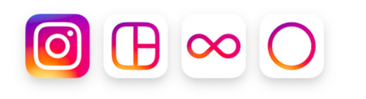
Instagram now has a family of likeminded and related brands. Majority of the users did not notice their existence. Well, thanks to the new rebranded, now people started to pay attention and know they are connected to and integrated with Instagram brand.
Dunkin’
Did you know that Dunkin’ has rebranded from ‘Dunkin Donuts’ to just the word ‘Dunkin’? Not only the name was changed, the font type of the logo also has some adjustment and $100 million was invested to modernize their stores in order to fit their rebranding image. This was a bold move in rebranding strategy and the change feels like an upgrade in my opinion.
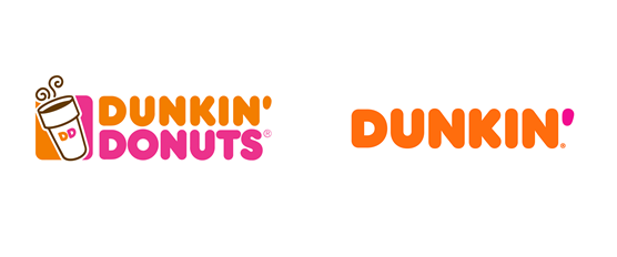
With the strong competitors like Starbucks, Krispy Kreme, Einstein Bros and more, it has pressured Dunkin to rebrand their brand identity to reestablish their dominance as the number one in their market place and making itself known for more than just its doughnuts.
The aim of rebranding is to transform the company into the premier beverage-led, on-the-go brand. According to Tony Weisman Chief Marketing Officer of Dunkin’ – ‘this new branding conveys the company’s focus on serving great coffee fast, while embracing Dunkin’s heritage by retaining its familiar pink and orange colors and iconic font, introduced in 1973.’

The Dunkin’ name appeared on all advertisement, packaging, signage and social media.
Julie’s
Julies’s girl is getting a makeover for the first time after 35 years, giving a fresh and younger look. Julie’s Biscuits is a household confectionary brand from Malaysia.

As you can see from their logo, the Julie’s girl has snipped off her two ponytails to a shorter hair look. Despite the makeover, Julie is still the same girl as evident from her signature blonde hair and blue outfit. Besides, the brand’s primary colours still remain the colour scheme of the previous one, yellow and blue.
According to Julie’s Biscuits director Tzy Horng Sai, the refreshed brand was aimed at staying fresh and to target a younger audience.
“We wanted to make biscuits young again and capture the hearts of the younger audience because we felt that biscuits have become a thing of the older generation. We also wanted to be an aspirational brand, something that can make consumers happy the moment they see us after waking up. We hope the brand icon will inspire hope and make consumers look forward to the day,”
In spite of the rebranded logo being launched during the global pandemic in January 2021, the fans were still giving full support, loving the new look.
https://www.facebook.com/watch/?ref=external&v=406838177170061
Proton
Proton, the pride of the nation Malaysia automotive brand has made a few rebranding attempts in over the 35 years from new brand mark introductions to the new launching products range, with the aim of changing the audiences’ perspective over their branding and I would agree all the rebranding was a successful campaign. Malaysians are proud of Proton’s evaluation.
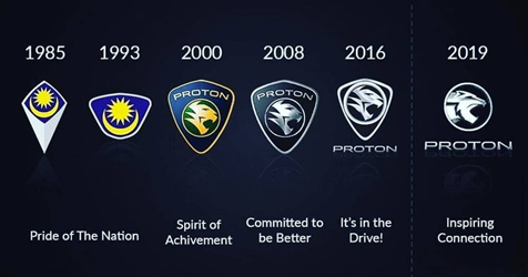
In 2019, the ‘shield’ was finally removed from Proton visual identity after going through six different iterations throughout the years. The logo shows the tiger’s head held high, symbolising Proton like an arrow-head, moving forward success. To go along with the logo, a new tagline was added, “Inspiring Connections” – encapsulates the brand’s aspiration of utilising technology and mobility to help make human connections that inspired a successful life.
As they rebrand themselves, Proton aims to become a truly global automotive brand. They are looking forward to working with international partners, taking advantage of its world-class supply chain, attracting global talents and adopting global technology.
Airbnb
Airbnb was founded in 2007 from the founders, Brian Chesky and Joe Gebbia. When Chesky and Gebbie first designed AIrbnb’s logo back in 2007, they had limited time to consider the aesthetics, featuring a puffy, airbrushed blue-and-white logo and they never expected they were growing so fast to become a globally recognized brand. But I bet you would not realize it is a global brand if you looked at their logo. Hence, they decided to rebrand.
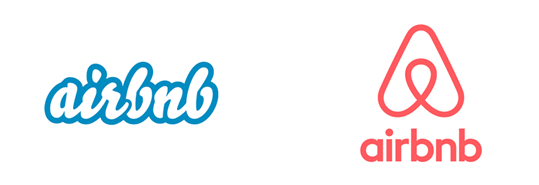
Airbnb wanted a symbol that could transcend language and culture to be recognised. Thus, the new logo was inspired from the tagline ‘Belong Anywhere’, in short Bélo. Airbnb promised to transform the way people travel, enabling them to explore the world, not as a tourist, but to truly ‘Bélo’.
Indeed, Airbnb rebranding campaign was a successful example as the rebranded was on Twitter trending, thanks to the worldwide conversation.
Pringles
Pringle ready to mingle. Pringle refreshed brand logo after 20 years and the response is varied. Some people love it, some people don’t.
The iconic moustached mascot still remains the same, but Mr. Pringle has received a slight makeover. He is now bald and from brownish stache transforms to black stache. Eyebrows were added to enhance his expressive look with a pair of solid-black eyes.
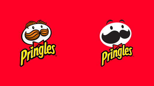
According to Gareth Maguire senior director of marketing for Pringles, they had spent two years in research and design to create a modern look for the brand to reflect the bold flavour in every Pringles crisp and stack.
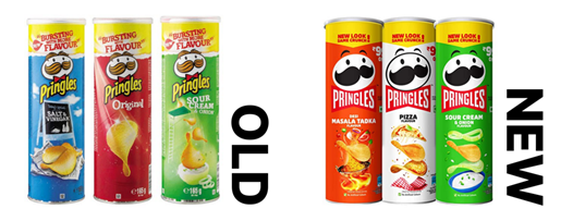
Along with the rebranding the logo, Pringles also have a new can packaging design. The new design packaging has a much cleaner layout and brighter hues to emphasize the chips’ actual shape.
Taco Bell
Taco Bell redesigns logo for first time in over 20 years.
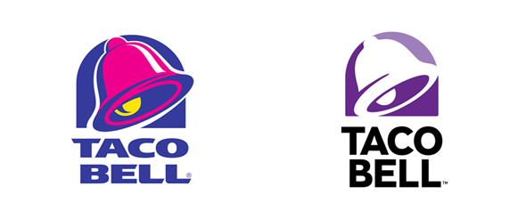
The redesigned logo is a simplified yet minimalized logo which is inspired by the current minimalism logo trend. It features a flatter bell design devoid of the former yellow and fuchsia palette.
In addition, Taco Bell’s typography has some adjustments as well. The previous font was a curious blend of curves and sporadic slants, while the font now is a straightforward black sans-serif font choice, Helvetica. It gives a direct yet simplistic feel.
According to AdvertisingAge, Taco Bell selected the new logo because it “allows for more customization with color, patterns, and textures.” The brand began integrating the new look immediately, changing its social avatars across all platforms.
Chobani
To celebrate Chobani’s 10th anniversary, they chose to rebrand their brand identity including giving a brand more friendly visuals, new and improved company vision and marketing strategies.
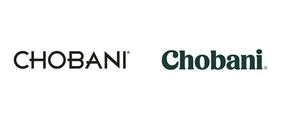
The Chobani typeface logo has transformed from a cold, futuristic, sleek-lined modernist typeface to a lowercase, forest green colour, rounded and bolded serified typeface. Using lowercase letters also make the brand feel friendly and approachable. It gives a completely different feeling as you can tell from the before and after.
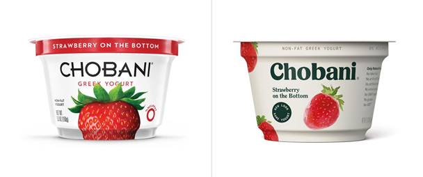
Chobani also redesigned its packaging in order to be more stand out among its competitors. Gone are the pristine, shinny white white packaging and sharp-angled word marks. The new identity features softer and more natural colours.
Peter McGuiness, Chobani Chief Marketing Officer says this redesign is not only a new coat of paint, but it was part of the strategy to maintain themselves as no. 1 standing in yogurt market space.
Slack
Slack’s first logo was created before the company was launched and according to their team, It was an awful design.
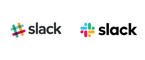
The hashtag’s colour palette was also problematic, “the logo has 11 different colors—and if placed on any color other than white, or at the wrong angle (instead of the precisely prescribed 18º rotation), or with the colors tweaked wrong, it looked terrible. It pained us,” Slack explained in a blog post.
Slack rebranded in 2019, aimed for establishing a more consistent and cohesive brand identity as they also did not want to take risk in loss of brand equity. This occurs with a drastic change of brand visual. Thus, Slack chose four primary colours from the original color palette to create their new icon but similar in shape.
Premier League
The top level of English professional soccer league unveiled their new logo in 2016 and I personally think it is a roaring success.
Premier League has been promoted as Barclays Premier League since 2007/8. After separating from Barclays in 2015, they decided to make a change on their brand identity and this was their first time entering a new broadcast term without having a title sponsor.
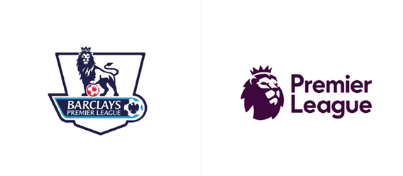
The new logo features a minimal lion head icon only which interestingly never includes the football. I personally think the Premier League has taken such a bold move in removing it, but they have become so well known to be recognized as a soccer league.
They also made a significant change on the typeface. The former branding of Premier League uses a professional and classic typeface while the new typeface is a bold sans-serif typeface which gives a down-to-earth and warm feeling.
Some loyal followers do not like changes, it can be backlash to a drastic change to a brand people are very close with. To avoid this, the Premier League remains the iconic lion motif and uses the similar colour palette to create a modern graphic mark, effectively preserving brand familiarity.
In Conclusion
To conclude, we can tell that several big companies are now slowly going towards more minimal design and simple packaging along with product design in recent years.
Branding is not just about symbols, colors, logos, and fonts. It’s equally about your company marketing strategy with a purpose, so that your brand fuels your performance.
With the correct and complete implementation of a marketing rebranding strategy, it certainly will make a significant difference for your business.


Comments are closed for this article!