

Google have updated their new mobile-friendly algorithm in April 21st, and what have changed this time?
Following the official announcement in Google’s blog, they rolled out this update in order to improve the search engine rankings for mobile friendly websites and pages.
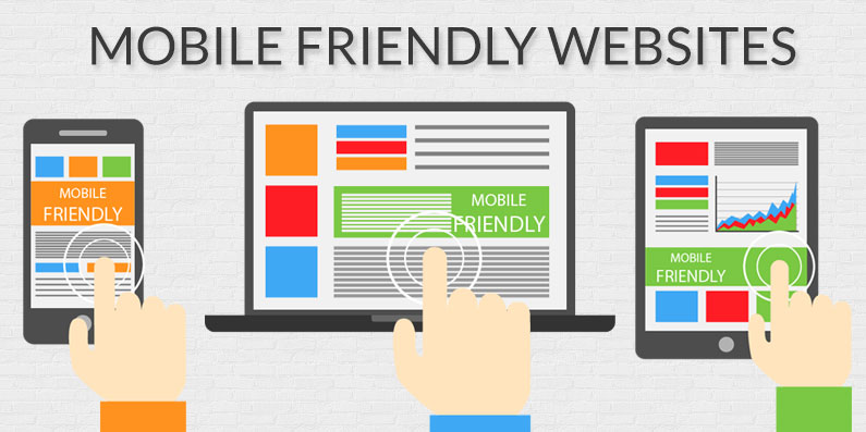
This update is to facilitate and enhance the experience of mobile searchers as they can now easily find high quality and relevant websites with readable texts and images in appropriate size, without going through any zooming or panning.
While Google mentions this update only affects mobile search results, why should you be bothered at all?
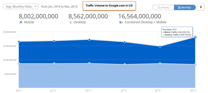
According to a report from Cickz, mobile searches occupy almost 50% of all searches done in Google.com, which means out of 100 people who perform a search on Google, 48 of them are doing it on their mobile devices like a tablet or smartphone.
This is very significant as when most of your traffic are coming from Google organic search result, 48% of your visitors are coming from mobile devices.
The Mighty Mobile-Friendly Label
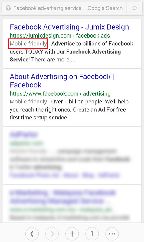
Noticed the “Mobile-friendly”grey color text? If your webpage is mobile friendly, it will carry this label in Google search result.
In a user perspective, this label is useful as it gives you the expectation that this particular website can be easily readable even when you are browsing it in a small screen device.
Once mobile searchers get used this new label over time, the behaviour will change and they will start to skip on any pages that do not have this ‘Mobile-friendly’ label.
Is your website mobile friendly?
If your website is about 5 years old, chances are that it is not mobile friendly. If you get your website designed recently by a web designer, it might be mobile friendly or it might not.
In order to check and confirm this, simply head to Mobile Friendly Test Tool, developed by Google and mainly for the purpose of checking the mobile friendliness of your website.
Type in the website or webpage address that you want to check and wait for it to run.
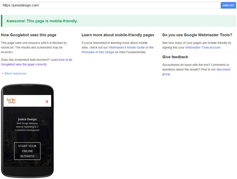
If the webpage you put on test is mobile friendly, it will display the result like the image above.
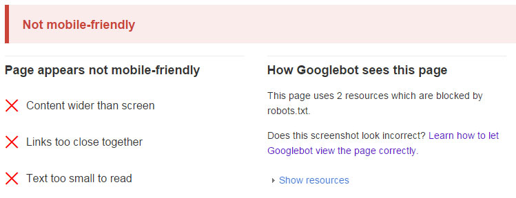
If it displays the screen as below, then unfortunately your webpage is not mobile friendly and it will not get the ‘Mobile-Friendly’ label in Google mobile search results.
The worse thing about this is your mobile visitors are having a bad experience when they browse your website in their mobile devices, so you might want to take some actions real quick.
How to create a mobile friendly website?
If you still do not have a website, then it’s better you straight start off with a responsive design website.
A responsive design website will automatically scales itself to provide an optimal viewing experience, which make reading and navigation easy across a wide range of mobile devices.
Websites that we build and design for our customers are all responsive and come with a content management system, so it saves you the trouble of converting your website to a mobile friendly version in the future.
If you have experience in web design and development, you can also do it yourself. The easiest way is to adopt a responsive design theme and then develop and customize on it.
There are a lot of factors to take note when you are designing in responsive format and we’ll try to cover this topic in our future blog posts.
Themes that are reponsive and we recommend to use are mostly from Elegant Themes.

Well if you already have a website and you are reluctant to redesign (which is a shame), you can consider mobile builder solution like GoMobi.
GoMobi allows you to create a separate version of your website as a mobile friendly website, for example you can place it in http://m.yourwebsite.com and it will automatically redirect all mobile visitors to this mobile site.
It has a easy to use drag-and-drop builder and also come with 30 days free trial, so no harm trying it first before you decide to employ it on your website.
However, we still recommend you to redesign your website in a responsive format so that the theme can stitch together nicely.
I’ve updated my website to be mobile friendly, what’s next?
If you have just recently updated your website to mobile friendly one (before April 21st), you should login to your Google Webmaster Tools and then use Fetch as Google with Submit to Index feature to speed up the crawling rate of your new mobile friendly website, so Google can update it in their mobile search result. Remember to update and submit your sitemap too while you are on it.
Google regards that this mobile friendly update as important, so you should update your website as soon as you can to avoid a drop in ranking.
If you need help in creating a mobile friendly website, you can contact us.


Comments are closed for this article!